
A slow approval flow can stop a B2B order before it starts. The buyer may be ready, but the workflow gets in the way.
That friction often shows up in small ways, like unclear statuses, missing context, or approvals that vanish into email. A strong order approval workflow gives buyers, managers, and procurement teams a clear path, so they can move faster without losing control.
Why approval workflow UX matters in B2B ecommerce
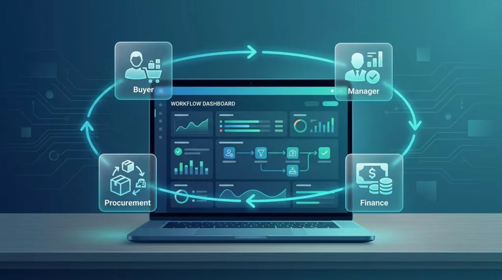
B2B buying rarely involves one person. A request may pass through an end user, a manager, finance, and procurement before anyone places the order.
When the workflow is hard to read, each handoff creates delay. People ask the same questions twice. Approvers chase details. Buyers lose confidence and start over.
Good UX reduces that drag. It gives each person the right view at the right time. It also lowers support load, because fewer users need help understanding what happens next.
Most teams focus on the order form first. That makes sense, but approvals often decide whether the sale completes at all. If the workflow feels like a black box, buyers hesitate. If it feels clear, they keep moving.
Map the real approval chain before you design screens
A common mistake is designing for a single approver. In B2B, that rarely matches reality.
Start by mapping the full path of the order. Who creates it? Who reviews it? Who can edit it? Who gets notified if the amount changes? Who can reject it, and who can override it?
You may find that the workflow has more branches than expected. For example, a request under a budget limit may auto-approve, while a larger one goes to a manager first and then to finance. That pattern should be visible in the interface, not hidden in policy docs.
Use plain language for each step. “Pending manager review” is better than “Stage 2.” “Waiting on tax verification” is better than “Exception state.” The buyer should never need internal knowledge to understand the process.
A simple mapping exercise helps teams answer hard questions early:
- Which roles need to act, and in what order?
- Which approvals are required by amount, region, or product type?
- Which steps can happen automatically?
- Which steps need manual review?
- Where do users get stuck most often?
That list does more than organize requirements. It exposes where the UX needs the most clarity.
Design approval screens that reduce hesitation
Once the workflow is clear, the interface has to make it readable in seconds. That means status, ownership, and next action should be visible at a glance.

Approvers do not want a mystery list. They want a short summary, a clear action, and enough context to decide. Buyers want the same thing when they check progress.
Use these interface patterns:
Status chips with plain labels help users see where the order stands. “Awaiting finance” or “Approved, awaiting submission” is easy to scan.
A visible owner field shows who holds the next step. That cuts down on “Who has this?” messages.
Time cues matter too. If approval usually takes a day, say so. If it is overdue, mark it clearly.
Primary and secondary actions should be separated. “Approve” or “Reject” should be obvious. “Request more info” can sit beside them, but it should not compete.
One screen should answer three questions: what is happening, who is responsible, and what happens next. If it cannot, the workflow is too hard to use.
If an approver needs to open three pages to understand one order, the workflow already feels broken.
Reduce back-and-forth with the right order details
Approvals slow down when people must leave the workflow to find basic facts. The best systems pull the needed details into the approval screen.
Show the order total, buyer name, company, shipping destination, payment method, and any policy flags. If the request exceeds a budget threshold, say that directly. If it includes restricted products, surface that too.
For larger orders, context is as important as the numbers. A manager may need to see the cost center, internal project name, or business reason for purchase. Put that in a dedicated section, not buried in a note field.
When users submit the request, keep the form short. Ask for only what the approver will need later. If the workflow requires extra context, make the field purposeful. “Reason for exception” works better than a vague comment box.
This is also where workflow and commerce design meet. Pricing, shipping, and account data all affect the approval decision. If you want a deeper look at how pricing presentation shapes B2B decisions, these pricing table UX patterns show how clarity can speed the buying path.
Handle compliance checks without blocking the buyer
Compliance checks are part of the job, but they should not feel like dead ends. Tax IDs, address checks, and account rules can all trigger approval steps.
The key is to separate validation from waiting. If the system needs a VAT number, say so early. If a business account requires extra verification, explain what the buyer must provide and why.
A useful pattern is progressive disclosure. Show only the fields that matter once a business path is selected. Then validate them quickly and give direct feedback. That reduces confusion and keeps the order moving.
For cross-border teams, this matters even more. If tax data is incomplete, buyers should see the issue before they reach final submission. That way they can fix it without redoing the whole order.
When you want more detail on that specific problem, VAT number field UX is a good reference point for reducing friction in tax-sensitive flows.
Make approvals work across roles, devices, and handoffs
B2B buyers do not all sit at a desk. Some approve on mobile between meetings. Others forward requests to finance. A few work in shared inboxes or procurement tools.
So the workflow has to survive handoffs. That means:
- Email notifications should summarize the order in one glance.
- Mobile views should keep the main action near the top.
- Deep links should land people on the exact pending request.
- Rejection and revision paths should preserve the original context.
Each role also needs a slightly different view. Buyers care about progress. Approvers care about risk and policy. Procurement cares about audit history and control. A single generic screen usually satisfies none of them well.
Keep the language consistent across channels. If the dashboard says “pending finance review,” the email should say the same thing. If users see different terms in different places, trust drops fast.
The handoff from approval to checkout matters too. Once the request is approved, the buyer should not face another round of confusion. If your flow includes multi-step checkout, keep the transition clear and consistent with the approval screen. This is where B2B checkout flow optimization becomes part of the same experience, not a separate project.
Connect approval UX to pricing and purchase rules
Approvals often depend on price structure. A buyer may need different approval levels for standard orders, volume orders, or special contract pricing.
That means the workflow should reflect the pricing logic users already see. If a tier change affects approval needs, show that early. If the buyer is on a negotiated account, make the approved pricing visible in the request summary.
The point is simple. Buyers should not have to guess why an order needs review. The interface should connect the number on the page with the policy behind it.
When pricing tables are clear, the order path gets easier. When they are vague, users may submit requests that get blocked later. That creates rework for everyone.
A good approval system also respects budget rules. If an order exceeds a threshold, say which rule triggered the hold. If a request qualifies for auto-approval, explain that too. People trust a system more when it explains itself.
Measure the workflow, not just the approval button
Many teams track clicks on “approve” and stop there. That misses the real story.
You also need to measure time to approval, time spent waiting by step, rejection reasons, revision loops, and support tickets tied to the workflow. Those signals tell you where the UX breaks down.
Look for orders that sit untouched. Look for fields that trigger repeated edits. Look for approval paths that take much longer on mobile. Those are signs that the interface needs work, not just the policy.
It helps to compare performance by order type. Small replenishment orders may move quickly, while custom quotes or regulated products may need more time. The goal is not to force every order through the same lane. The goal is to make each lane clear.
Review the workflow with sales, operations, procurement, and finance. Each group sees a different failure point. Together, they can spot the places where the process feels heavier than it should.
Conclusion
A strong order approval workflow does more than route requests. It gives every participant a clear next step, which cuts friction and reduces the chance of stalled orders.
The best UX makes approval status obvious, keeps supporting details close, and handles compliance without turning the process into a maze. That matters most in B2B, where several people may touch one purchase before it moves forward.
When the workflow explains itself, buyers spend less time guessing and more time ordering. That is the real test of approval UX.