
A shopper picks “Free Shipping” and expects it next week. Your warehouse treats that method as economy mail, the cutoff passed, and the carrier does not move on Sunday. One vague checkout choice just became a support ticket.
That is why shipping option selector UX matters far beyond a radio button group. It affects conversion, customer trust, failed delivery expectations, and how often your team hears “Where is my order?” The biggest problems start when the selector asks shoppers to guess.
When shipping choices force shoppers to guess
Most delivery mistakes begin before fulfillment. They start in interface copy that hides timing, skips constraints, or treats shipping as a simple price choice.
Bad selectors usually look familiar. They show labels like “Standard,” “Express,” or “Free Shipping” with no arrival date. Sometimes the cheapest option sits first, so shoppers assume it is also safe. In other cases, the selector updates after address entry but never explains why the date changed.

Those gaps hurt in four ways. First, people hesitate and leave. Second, buyers stop trusting the promise. Third, support volume rises after checkout. Finally, ops gets blamed for a promise the interface never explained well.
If the selector hides the date, shoppers will invent one, and their guess is usually faster than your actual service.
Operational rules make this sharper. Carrier cutoffs, weekend handling, holiday blackouts, inventory location, and PO box limits all change what “fast” means. A two-day service from one warehouse may turn into four days if stock routes from another node. If address validation flags a missing apartment number, delivery can fail even when the shopper picked the right speed.
Clear costs matter, too. The best selectors borrow the same honesty seen in strong shipping calculator UX patterns, where price and delivery are explained early, not hidden until the last click.
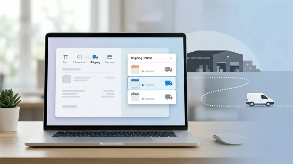
Design shipping options people can compare in one glance
A good selector answers four questions at once: What is this method, what does it cost, when will it arrive, and what conditions apply?
This quick comparison shows the difference:
| What shoppers need | Weak pattern | Better pattern |
|---|---|---|
| Delivery timing | “Standard Shipping” | “Standard, arrives Tue, Apr 28” |
| Price clarity | Price shown elsewhere | “$5.99” on the same line |
| Constraint visibility | Fine print below the fold | “Order by 2 PM local warehouse time” |
| Change explanation | Silent refresh after ZIP change | “Updated because your ZIP changes carrier service” |
The better column reduces guesswork because it pairs method, price, timing, and limits in one place.
Use plain labels. “Arrives by Tue, Apr 28” beats “Fast delivery.” “Estimated Apr 28 to Apr 30” beats “Ships soon.” If confidence is high, show a date. If stock, address, or carrier handoff still adds risk, show a range and say why. Teams refining that promise logic should review these estimated delivery date UX patterns.
Microcopy should remove doubt, not decorate the screen. Good examples include:
- “Order within 1 hour for same-day dispatch.”
- “No Saturday delivery for this address.”
- “One item ships later, so your order may arrive in two packages.”
- “Express is unavailable for PO boxes.”
Bad patterns keep creating the same mistake. “Best value” nudges shoppers without telling them what they give up. “Free” can hide a slower service. “2-day shipping” may describe carrier transit only, not warehouse processing. That difference matters on Fridays, during holidays, and when inventory splits across locations.
If your stack supports dynamic delivery logic, refresh options as soon as the address, cart, or fulfillment node changes. Keep the selected option stable while recalculating, then explain any update. Shopify’s UX guidance for delivery methods is useful here because it treats shipping, pickup, and pickup points as one decision flow, not separate UI fragments.
Mobile checkout and accessibility decide whether the promise survives
Shipping mistakes multiply on mobile because the screen is tight and the user is moving fast. Tiny radio buttons, hidden dates, and collapsing accordions force people to scan harder than they should.

On phones, stacked option cards usually work better than dense rows. Keep the selected method, total cost, and arrival date visible near the primary CTA. Make the whole row tappable. Open the numeric keyboard for ZIP and postal code fields. If delivery options recalculate, show “Updating delivery options” instead of a blank flicker.
Accessibility needs equal attention. Group methods inside a proper fieldset with a clear legend such as “Delivery options.” Make price, ETA, and restrictions part of the accessible label, not color or icons alone. Keep focus in place after an update, and announce changed dates with a live region. Error text should say how to fix the issue, for example, “Add apartment or unit number to help delivery.”
For platform teams, Shopify’s UX guidance for delivery options is a practical reference for checkout customizations that still preserve trust.
Use this checklist in design reviews:
- Every option shows method name, full price, and a date or date range.
- Cutoffs use the shopper’s or warehouse’s local time, and weekend or holiday rules are visible.
- Address edits, cart changes, and inventory routing updates refresh the promise right away.
- PO box limits, remote area exclusions, and split-shipment notes appear before payment.
- The selector works with keyboard navigation, screen readers, large text, and clear focus states.
- Copy in checkout matches your shipping policy page design so support does not have to explain conflicts later.
Delivery mistakes often start as design mistakes. When the selector shows cost, timing, and limits in plain view, shoppers choose with confidence and fulfillment can keep the promise.
A shipping selector should not make people guess. It should make the right delivery choice feel obvious, and trust should hold after the order is placed.