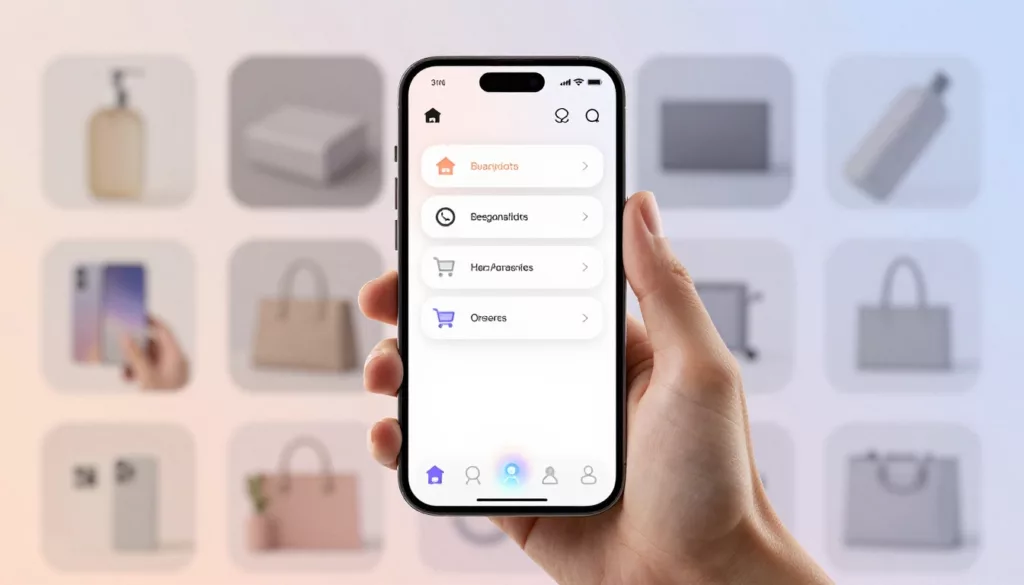
Mobile Bottom Navigation UX for Ecommerce Stores in 2026
On a phone, every extra reach, tap, and pause costs money. That’s why mobile bottom navigation has become one of...
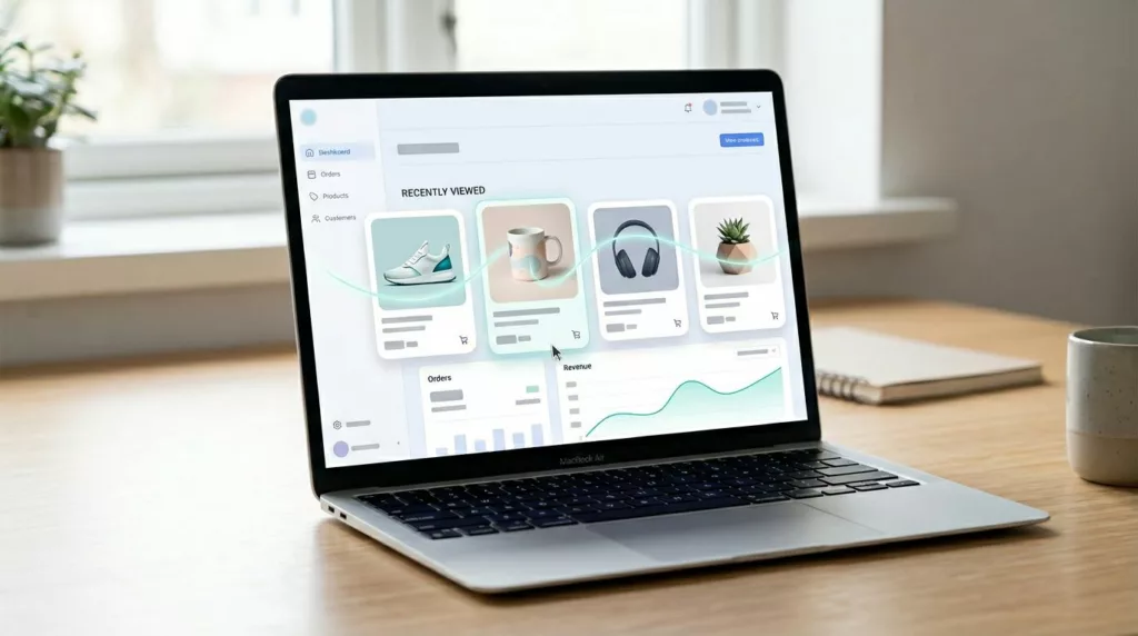
Recently Viewed Products UX That Brings Shoppers Back to Buy
Shoppers rarely leave a product behind because they stopped caring. More often, they leave because your store makes them start...
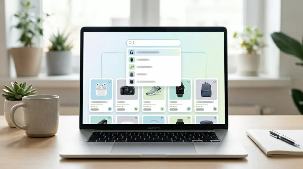
Search Autocomplete UX Patterns That Drive Product Discovery
Most shoppers don’t arrive with a perfect query. They type fragments, brand hints, or a rough need. That is why...
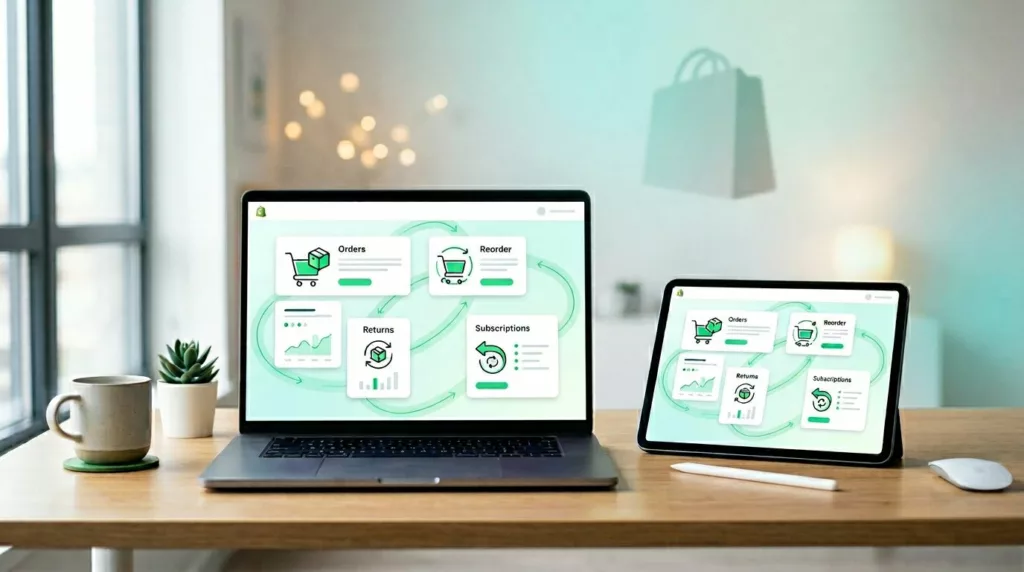
Shopify Customer Account Page UX That Drives Repeat Purchases
Most merchants spend hard to win the first order, then send repeat buyers into an account area that feels like...
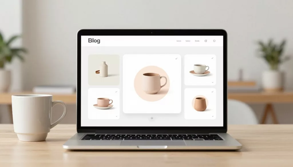
Shopify Bundle Builder UX Patterns That Increase AOV Without Confusion
A bundle can feel like a helpful set menu, or like a complicated order form. The difference is UX. A...
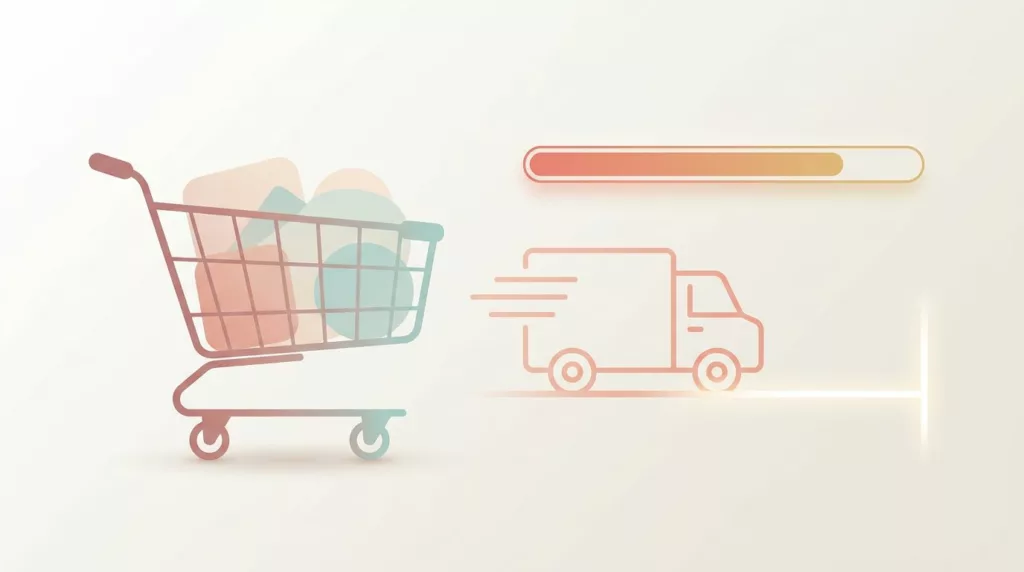
Free Shipping Threshold UX That Increases AOV Without Feeling Pushy
Free shipping can lift average order value, but it can also backfire. Shoppers don’t mind a nudge, they mind feeling...
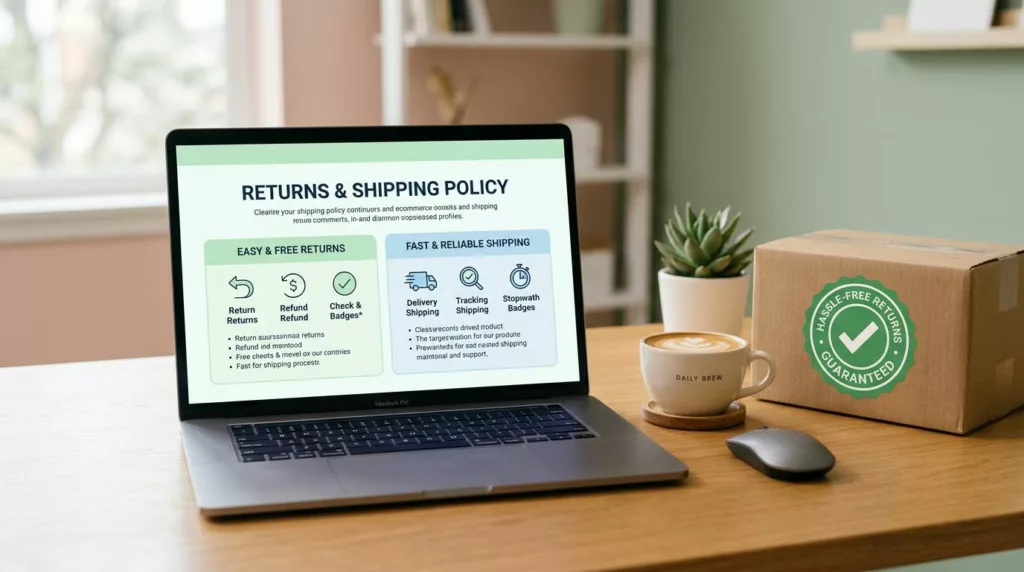
Returns and Shipping Policy Page Design That Builds Trust and Reduces Support Tickets
Most shoppers don’t read ecommerce return policy pages for fun. They read them to decide if they can trust you...

Passwordless Login UX for Ecommerce: Magic Links and OTP
Passwords are like a spare key hidden under the doormat, easy to use, but also easy to misuse. For online...
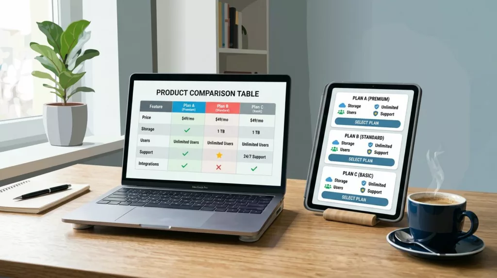
Product Comparison UX: How to Design “Compare” Tables People Actually Use
A comparison table should feel like a helpful salesperson aiding decision making, not a math test. Yet many “compare” tables...
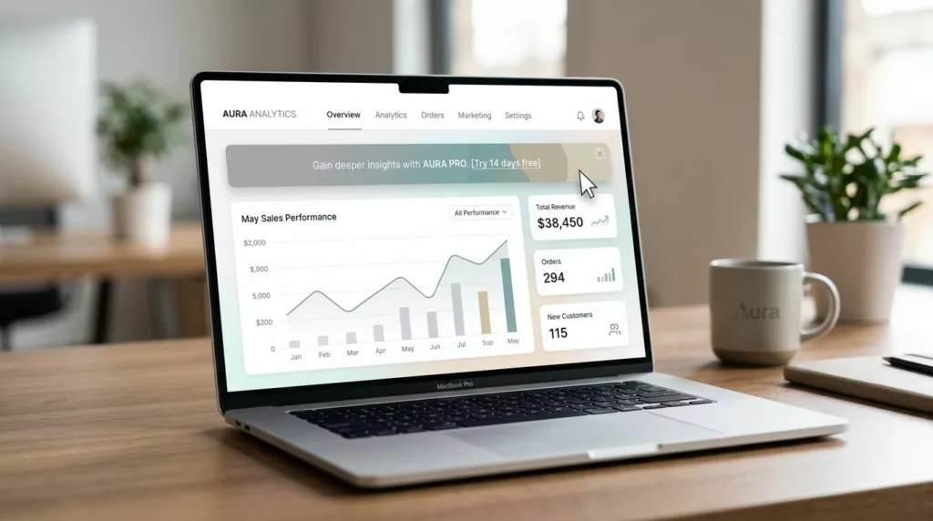
Discount Banner Design: On-Site Promo Banner UX That Boosts Clicks Without Banner Blindness
Most on-site promo banners fail for a simple reason: they look like banners. Users learn the pattern, filter it out,...