
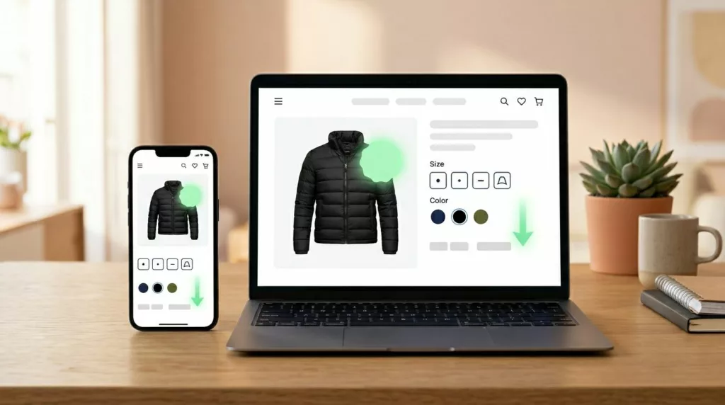
Collection Page Quick Add UX That Lifts Product Adds
Collection pages often decide whether a shopper keeps moving or drops off. A weak quick add ux might save a...
Price Drop Alert UX That Brings Shoppers Back to Buy
A price cut can pull a shopper back faster than most campaigns. Still, the alert only works when it feels...

Order Cancellation UX That Cuts Chargebacks and Support Tickets
Bad cancellation UX turns a simple request into a trust problem. When people can’t tell if an order can still...

Contact Page UX That Gets Shoppers to the Right Help Fast
A contact page can save a sale or stall one. When every shopper lands on the same generic form, pre-purchase...
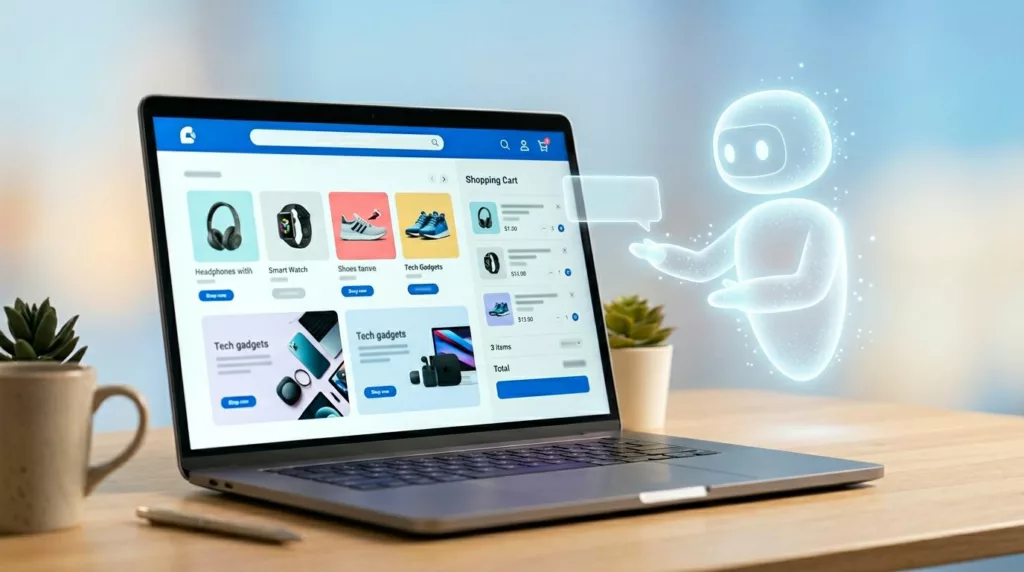
AI Shopping Assistant UX That Helps Without Taking Over
A shopping assistant that talks too much feels like a pushy sales clerk. One that acts on its own feels...
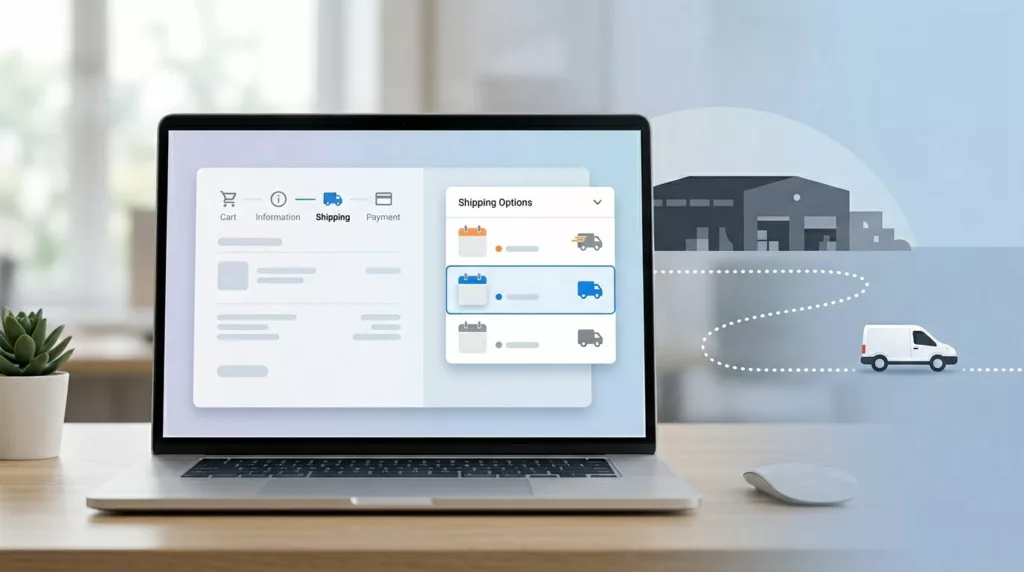
Shipping Option Selector UX That Prevents Delivery Mistakes
A shopper picks “Free Shipping” and expects it next week. Your warehouse treats that method as economy mail, the cutoff...
Search Results Page UX That Turns Intent Into Orders
A shopper uses site search when browsing has stopped working. They want an answer fast, and your results page has...
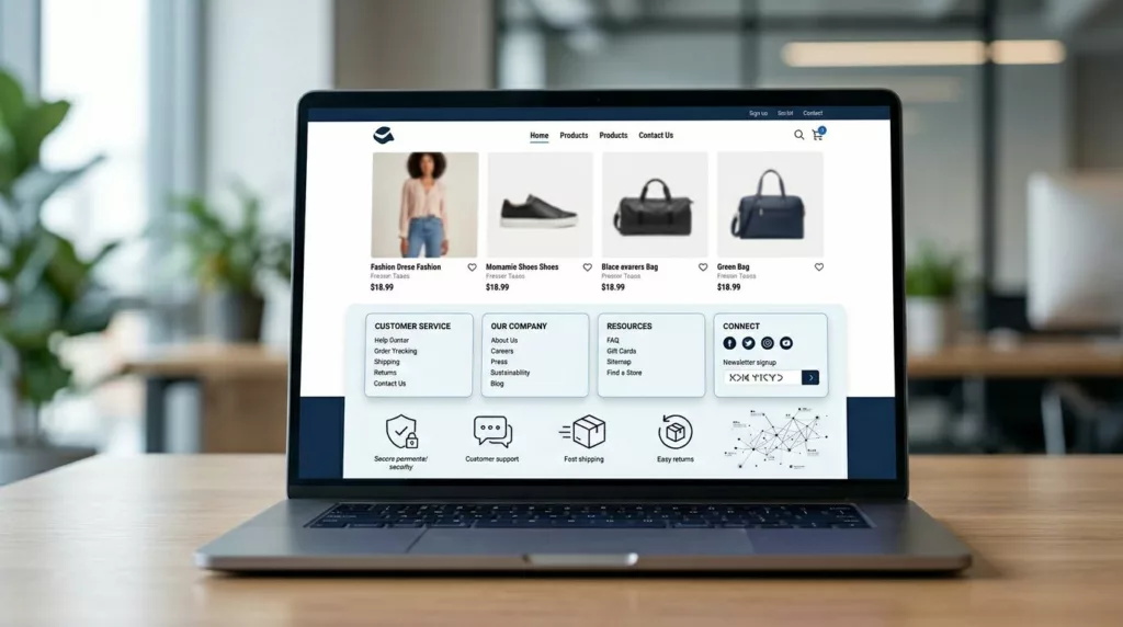
Ecommerce Footer UX for Trust, SEO, and Faster Support
Most footers get designed last. Yet a smart ecommerce footer ux setup can calm doubt, guide support, and strengthen internal...
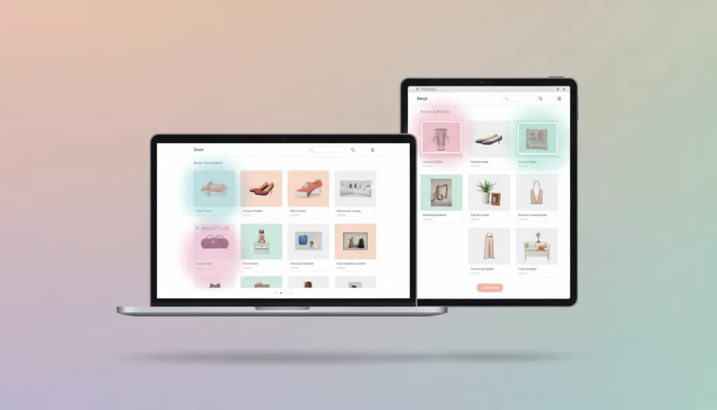
New Arrivals Page UX That Earns More Repeat Visits
A new arrivals page has one job: show change fast. If a returning shopper lands there and can’t tell what’s...

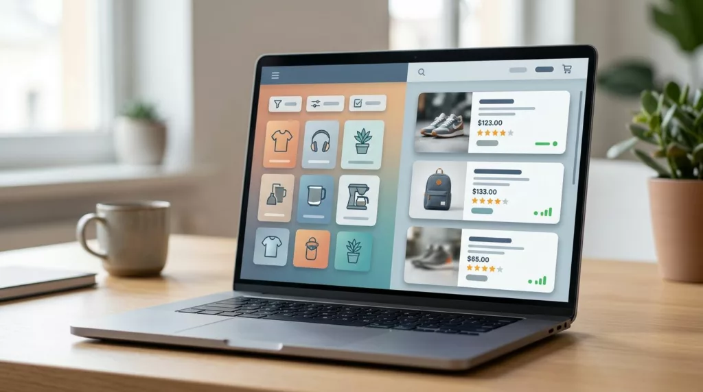
Mobile Filter Drawer UX That Helps Shoppers Narrow Faster
A crowded product grid on a phone feels like hunting through a messy shelf. Shoppers open filters because they want...