

A shopper uses site search when browsing has stopped working. They want an answer fast, and your results page has to feel like one.
That is why search results page UX has such a direct effect on sales. When results match intent quickly, CTR, add-to-cart rate, conversion rate, and revenue per visitor tend to rise. When they do not, search exits and zero-result rate climb.
The page works best when it responds to what the query means, not only what it says.
Match the results page to the shopper’s intent
Not every search deserves the same layout, ranking, or card detail. A broad query like “running shoes” signals category-level intent. A query like “Nike Pegasus 41 men’s 10” signals product intent and asks for precision.
Your search results page UX should react to that difference. Broad intent needs range, helpful filters, and a quick visual scan. Specific intent needs exact matches first, plus variant, stock, and price cues that help the shopper buy without extra hunting.
This quick framework keeps the page aligned with intent:
| Query type | What the SRP should show first | Metric to watch |
|---|---|---|
| Broad category query | Diverse relevant products, visible filters, useful sort options | CTR, search exits |
| Attribute-rich query | Cards that match the key attributes, active filter chips | Add-to-cart rate, refinement rate |
| Exact product or SKU query | Exact match first, close variants, stock and delivery cues | Conversion rate, zero-result rate |
The ranking rules matter as much as the layout. For a broad query, relevance should still lead, but diversity helps shoppers compare. For a specific query, burying the exact match under boosted items often hurts both CTR and conversion rate.
The work also starts before the results page loads. Strong search autocomplete UX patterns reduce weak queries, guide messy intent, and lower the odds of a dead-end search. That means the SRP receives cleaner signals and can do a better job.
Design result cards and filters for fast decisions
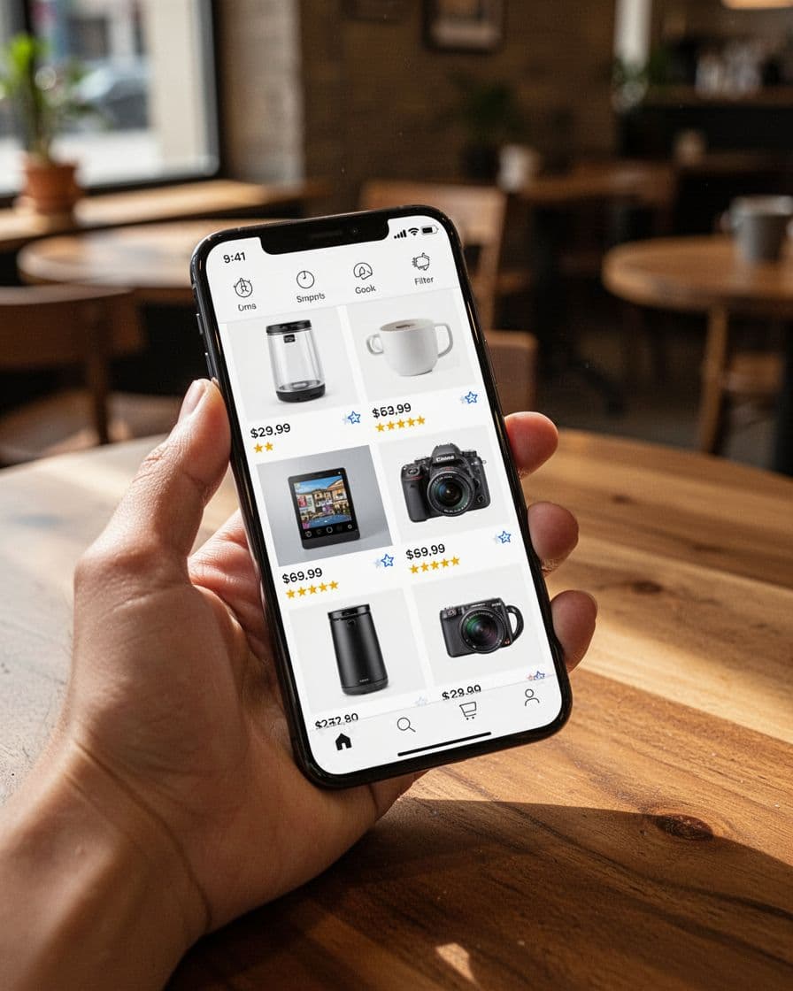
Once the shopper lands on results, every card has to answer a simple question: “Is this worth my next click?” A useful card usually shows a clear image, a short title with meaningful attributes, price, and a trust cue like reviews when those reviews are reliable. If stock or pickup status is fresh, that can help high-intent shoppers move faster.

Clutter slows decisions. Too many badges, long titles, or mixed promotional labels make cards harder to scan. On desktop, you usually have room for richer cards and a left-side filter rail. On mobile, card content should tighten up, because crowded cards raise mis-taps and slow comparison.
Filters do more than narrow results. They reassure the shopper that the right product is probably here. A broad query should expose the filters people expect most, such as brand, price, size, color, and availability. An attribute-heavy query should pre-align with that wording, so a search for “black leather tote” does not force the shopper to re-apply the same idea through filters.
The best SRPs help shoppers narrow choices without making them start over.
Sort order deserves the same care. Relevance should stay the default for most searches. “Best selling” or “new arrivals” may help category browsing, but they can damage specific product searches. Strong research-backed ecommerce UX guidance from Baymard repeatedly points to the same issue: shoppers leave when product-finding feels harder than it should.
Finally, treat zero results as a recovery moment, not a blank wall. Offer spelling correction, close matches, related categories, and in-stock alternatives. That change alone can lower zero-result rate and recover revenue that would otherwise vanish into search exits.
Mobile SRP UX needs shorter paths and cleaner feedback
Mobile shoppers pay a higher penalty for every extra tap. The search box should stay easy to reach, and the filter and sort controls should stay visible without taking over the screen. When the keyboard opens, the page should not hide top results or jump around.
Good mobile search results page UX also protects context. If a shopper opens a product and comes back, return them to the same scroll position with their filters intact. That one detail supports comparison shopping and often improves add-to-cart rate, because users can move between options without rework.
Desktop and mobile should not share the same success story either. A lift in SRP CTR on mobile can look good while conversion rate falls, because the page earned curiosity instead of progress. Segment your reporting by device and by query type. For broad searches, higher filter use may be healthy if search exits drop. For exact searches, more filter use often means the ranking missed the mark.
Track the SRP like a buying surface, not a utility screen. Watch CTR from search to product, add-to-cart rate from results, conversion rate, revenue per visitor, search exits, and zero-result rate together. For broader site-search context, this ecommerce site search overview pairs well with NN/g’s research on search, filters, and routing pages.
Shoppers use search when they have moved past browsing and want a clear path to a product. Your SRP should meet that mindset with relevance, clarity, and short decision paths.
When the page matches intent at card level, filter level, and device level, the numbers usually follow. Fewer exits, fewer dead ends, more carts, and more orders are the natural result.