
Net Terms Application UX That Speeds B2B Account Approval
Every extra field in a net terms application can slow a sale. Buyers expect trade credit approval for net terms...
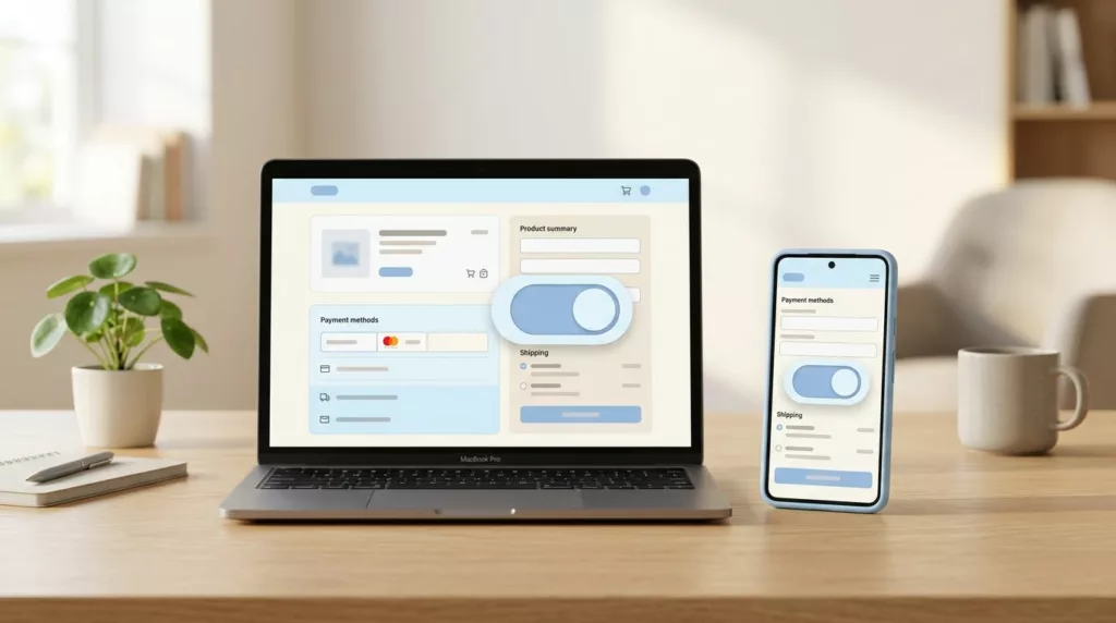
Billing Address Toggle UX That Cuts Checkout Errors
A billing address toggle can save more checkout sessions and improve the checkout experience more than a long list of...

Fit Finder UX to Reduce Returns
In apparel e-commerce, returns usually start before checkout, not after delivery. When shoppers can’t tell how a garment will fit,...

Tiered Pricing Table UX That Speeds B2B Buying Decisions
Buyers rarely leave a pricing page because the price is too high. They leave because poor pricing page design hurts...

Product Specifications Table UX for Faster Buying Decisions
Shoppers don’t read product pages top to bottom. They scan, compare, and look for the one detail that removes doubt....

Compatibility Checker UX That Prevents Wrong Part Orders
A wrong part order is rarely a data problem alone. More often, it starts with a poor user experience on...

Request a Quote UX Patterns for B2B Product Pages
When a B2B eCommerce product needs a quote, the page has one job, move a buyer from interest to a...

B2B VAT Number Field UX That Reduces Cross-Border Checkout Friction
A VAT (Value Added Tax) field can look small, but it changes the tax logic behind the order in B2B...
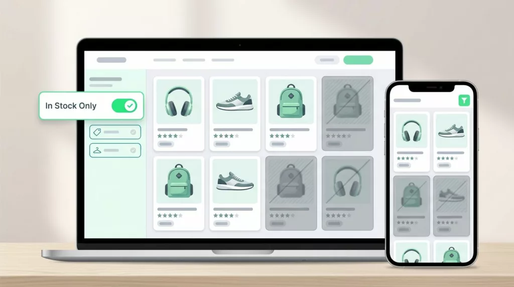
In-Stock Filter UX That Cuts Dead-End Product Browsing
Shoppers do not mind narrowing their options through sorting and filtering in filter UX. They mind wasting time on products...
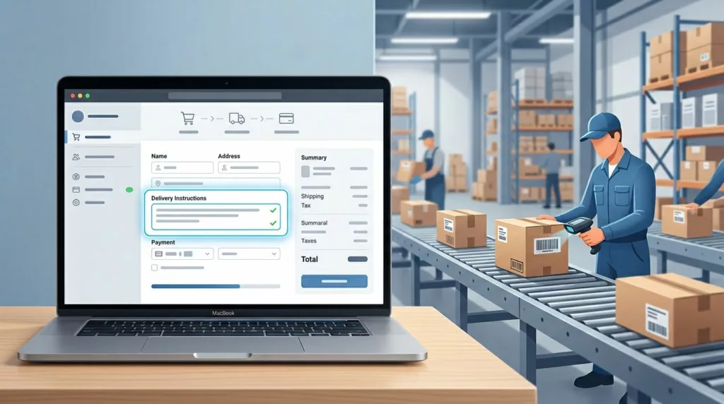
Delivery Instructions UX That Prevents Fulfillment Mistakes
One bad delivery note can send a package to the wrong door, the wrong gate, or the wrong person. That...