


A crowded product grid on a phone feels like hunting through a messy shelf. Shoppers open filters because they want fewer choices, not more work.
Good mobile filter drawer ux cuts decision time at the exact moment intent is highest. It makes options easy to scan, keeps changes obvious, and returns people to relevant products fast.
That improvement starts with a simple idea: the drawer should feel lighter than the product list, not heavier.
Why small-screen filtering breaks so often
On mobile, every extra tap has a cost. The screen is tight, the thumb zone is limited, and attention drops fast when a drawer looks like a long form.
Many filter drawers fail for the same reasons. They hide the Apply button below the fold, bury key facets under too many accordions, or reset choices when shoppers back out. Others mix sorting and filtering into one overloaded panel. The result is hesitation, then abandonment.
Guidance from LogRocket’s mobile search filter best practices lines up with what most ecommerce teams see in testing: shoppers need clear structure, visible state, and quick recovery when they change their minds.
A strong drawer keeps one job in focus. It opens fast, shows the most useful facets first, and makes the next step obvious. For most product listing pages, that means a full-height drawer, a visible close control, and a sticky footer with the primary action in reach.
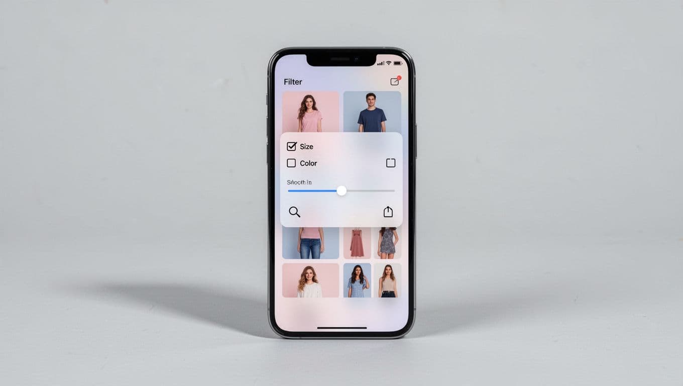
Result counts matter too. If a shopper chooses “Black” and “Medium,” they should know whether that leaves 84 items or 4. That feedback reduces guesswork and helps them decide whether to keep narrowing or back off.
If people have to remember what they selected after closing the drawer, the UI is already asking too much.
Build the drawer around quick, reversible choices
The fastest drawers reduce both thinking and scrolling. That starts with facet order. Put high-intent filters first, based on category behavior, not alphabetic logic. Size, price, color, availability, and brand often beat material, rating, or niche attributes.
Control type matters as much as order. Use chips or pills for short option sets, checkboxes for multi-select lists, and paired min/max inputs with a slider for price. Long lists also need search inside the facet. Nobody wants to scroll past 60 brands on a phone.
These defaults usually work well:
| Pattern | Why it helps |
|---|---|
| Sticky “Apply” bar | Keeps the next step in thumb reach |
| “Clear all” in the header | Gives shoppers a safe reset |
| Counts beside options | Sets result expectations early |
| Active filter chips above results | Makes edits fast after close |
Together, those patterns reduce backtracking. They also keep shoppers in browsing mode instead of forcing them to reopen the drawer for every small change.
The same rule shows up in mobile variant picker UX patterns: visible state prevents wrong taps. Filters need that same clarity. A selected brand, size, or price range should look unmistakably selected. Don’t rely on color alone. Add a checkmark, fill state, or strong border.
Just as important, keep filter choices reversible. When shoppers close the drawer, show active chips above the grid so they can remove one filter without reopening the panel. Practical roundups like BTNG’s ecommerce filter UX patterns stress this because active-filter visibility shortens the path from “too few” back to “just right.”
If your team also works on product detail pages, a related mobile product variant UX guide is worth reviewing. The same habits apply on both screens: clear labels, strong selected states, and no silent resets.
Accessibility and performance decide whether filters convert
A drawer can look clean and still fail in real use. Fast narrowing depends on touch targets, focus behavior, and update speed.
Each tappable option needs enough space, ideally 44 x 44 px or larger. Focus should stay inside the drawer while it’s open. Screen readers need clear labels like “Color, Black, selected” or “Price, under $50.” After filters change results, announce the new count. That small detail helps people stay oriented.
Performance matters just as much. Apply changes without a full page reload when possible, keep the product list scroll position stable, and preserve filters on back navigation. Mobile shoppers often compare, jump into a product, then return. If the page forgets their narrowed set, it forces them to start over.
Teams usually find the same trouble spots in audits:
- Apply buttons that sit below long facet lists
- Hidden active filters after the drawer closes
- Facets that reset when a new one is chosen
- “No results” states with no recovery path
Guides like Sobooster’s mobile filter UX patterns highlight these issues because they hurt both usability and conversion. A shopper who hits a dead end rarely files a bug report. They leave.
Measure the drawer like a funnel step, not a visual component. Track filter use rate, time to first filtered result, zero-results rate, filter removal rate, and product click-through after filtering. Those numbers show whether the drawer helps people narrow faster or traps them in extra work.
The best filter drawer feels like a shortcut. Shoppers can see what changed, what remains, and how to adjust course without friction.
If one fix gets priority, make state clarity the standard. When selected filters, result counts, and edit paths stay visible, mobile shoppers move with more confidence, and the product list starts doing its job.