


Collection pages often decide whether a shopper keeps moving or drops off. A weak quick add ux might save a click, yet it can also create doubt, wrong picks, and messy carts.
The winning pattern is faster than a product page, but it still protects choice and confidence. On collection pages, speed only helps when the next decision stays clear.
Match the quick add pattern to the product’s decision depth
Quick add works best when the shopper already has enough information to act. That usually means low variant complexity, familiar products, or repeat buys. A lip balm, candle, or refill pouch can often support a direct add. A dress, foundation shade, or sofa usually can’t.
Quick add should remove a page load, not remove a needed decision.
This simple matrix helps teams choose the right pattern:
| Category | Best quick add pattern | Main risk |
|---|---|---|
| Apparel | Size-first sheet or quick view | Wrong size, higher returns |
| Beauty | Direct add for single-SKU items, compact shade picker for short ranges | Wrong shade or finish |
| Home | Direct add for simple decor, quick view for dimensions and materials | Missing scale or spec details |
| General ecommerce | Match the pattern to variant count and decision stakes | Hiding required choices |
As a rule, direct add fits products with zero or one meaningful choice. If the product has two to five common options, use a light chooser, such as a size sheet, swatch row, or bottom drawer. Once choices get dense, move to quick view add to cart modals instead of cramming a mini PDP into the card.
Apparel needs the most restraint. Don’t auto-select size to chase more adds, because that often turns into more returns. Beauty can handle a short shade selector if availability is obvious. Home products need care when size, finish, or material changes the decision. On phones, choice UI should follow the same logic as strong mobile product variant pickers, with visible stock states and clear feedback.
Quick add can also hurt. Spec-heavy gear, made-to-order items, subscriptions, and products with long reassurance needs often perform better when the collection card pushes discovery first and the PDP handles commitment.
Design the product card so fast adds still feel safe
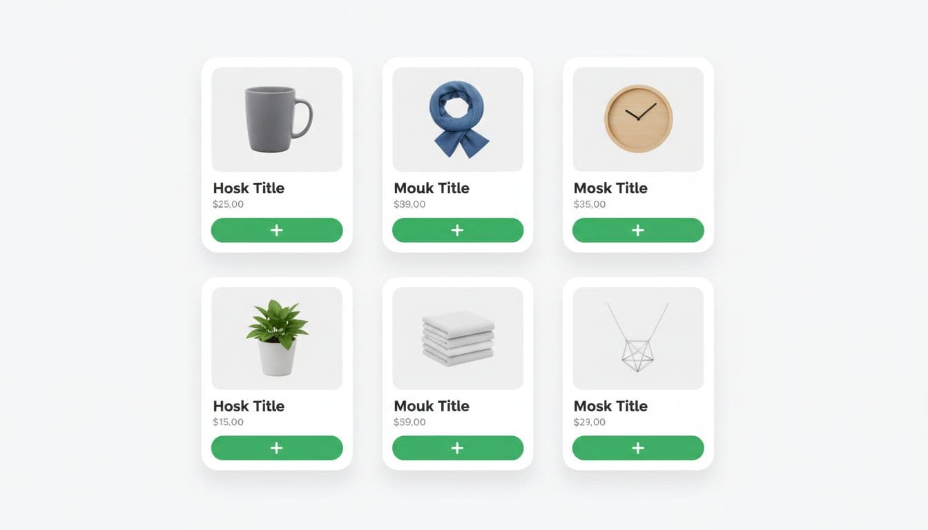
The card has to answer one silent question: “Can I add this without regretting it?” That means the quick add button can’t work alone. Price, variant cues, availability, and feedback all have to support it.
Place the primary action close to price and key product signals. If the button sits too low, it gets buried by long titles or badges. If it only appears on hover, touch users lose it. Keep one clear primary action per card, and give it enough spacing from wishlist or compare actions to reduce mis-taps.
Inventory visibility matters before the tap, not after it. Show sold-out states on the card. Show low stock only when it helps urgency without causing noise. For apparel, disabled size chips are better than hiding missing sizes. For beauty, out-of-stock shades should stay visible if the range is small. For home, a card may need a compact cue like “2 sizes” or “3 finishes” so people know the add is not final.
Button states do a lot of conversion work. Good quick add ux includes a pressed state, a loading state, a success state, and a clear error state. Keep button width stable, so labels don’t shift the layout. Disable repeat taps during loading. If the add fails, keep the message near the card and tell the shopper what to fix.
Accessibility isn’t extra polish here, it’s core function. Use visible focus styles, strong color contrast, and accessible names that reflect the current state. Success messages should announce through an aria-live region, especially if the cart updates off-screen. Also, don’t rely on a toast alone. Toasts vanish, get missed, and often create doubt about whether the product was added.
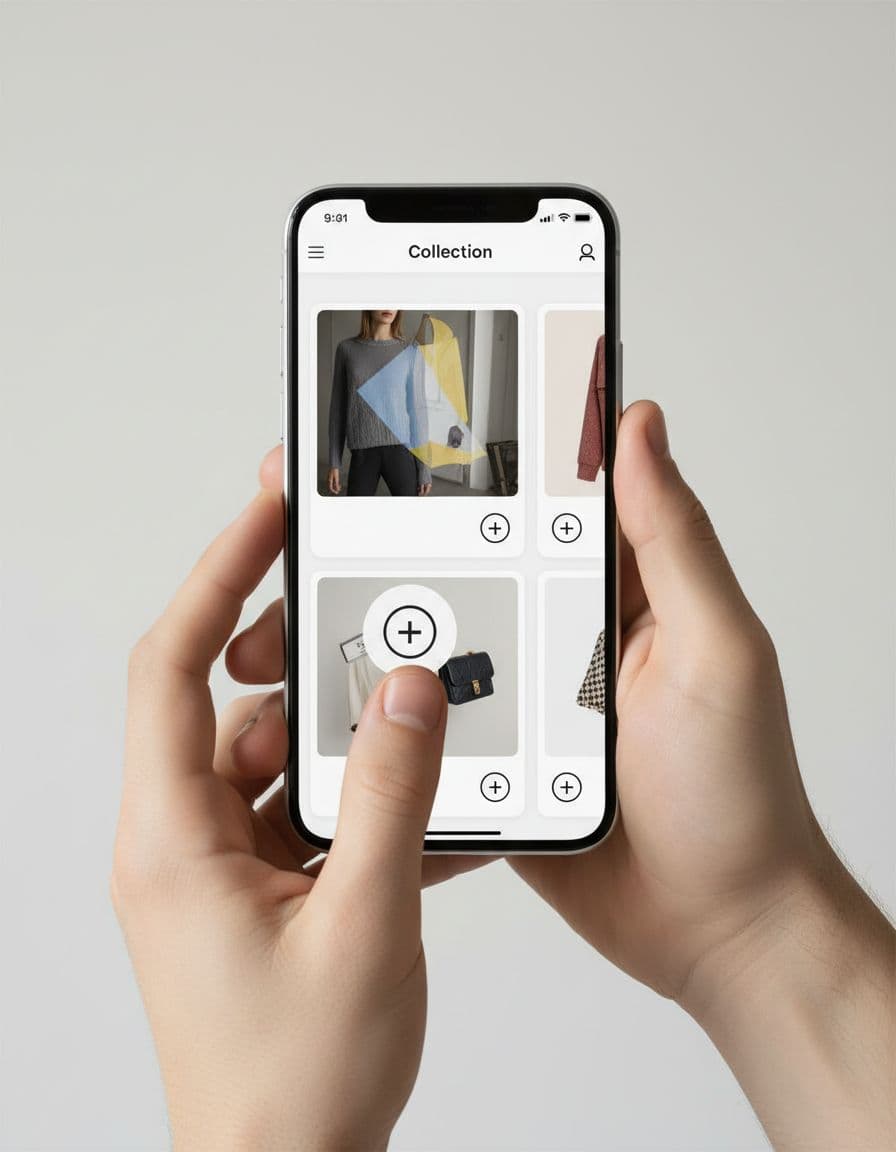
Make mobile quick add ux thumb-friendly and measurable
On mobile, collection quick add lives inside a traffic jam. Filters, sticky bars, badges, and cart drawers all compete for space. That’s why the button needs to be easy to hit with one thumb and hard to tap by mistake.
Aim for touch targets of at least 44 x 44 px. Wide buttons work well in one-column or large-card layouts. In tighter two-column grids, a full-width card action often beats tiny icon buttons. Keep the control in the thumb zone, and make sure it doesn’t clash with sticky filter UI. If your collection page still makes narrowing hard, fix that alongside mobile filter drawer UX best practices, because quick add can’t rescue a cluttered browse path.
Loading and recovery flows matter more on phones. Reserve space for success messages or mini cart hints, so the grid doesn’t jump. If the item adds to a cart drawer, keep the collection context intact. Shoppers should be able to close the drawer and continue where they were. That gets even more important on long lists, where Shopify collection pagination vs. infinite scroll affects scroll recovery, product position tracking, and list fatigue.
Track quick add like a funnel, not a single click:
collection_quick_add_impressioncollection_quick_add_clickcollection_variant_openadd_to_cart_successadd_to_cart_errormini_cart_open_after_quick_add
Then test patterns close to the money. Compare direct add versus size sheet for apparel. Test inventory cues on versus off. Try inline success on the card against opening the cart drawer. Watch guardrails, too: duplicate adds, return rate, cart removals, PDP click-through, and revenue per session. A higher add rate with more wrong-item friction isn’t a win.
A strong quick add ux shortens the path from interest to action without hiding the reason someone might hesitate. That balance is what lifts product adds and keeps the cart clean.
If your collection page adds feel jumpy, noisy, or fragile, the fix usually isn’t a louder button. It’s a better match between product complexity, card design, and mobile behavior.