

B2B buyers don’t open an account portal to browse. They open it because they need an answer fast.
When the open orders dashboard is hard to read, a simple task turns into an email chain or a support call. Procurement wants status, finance wants documents, and customer service wants context. Buyers want to know what happens next.
A strong dashboard cuts that back-and-forth. It shows the right order data, makes the next step obvious, and gives each role a clean path forward.
Why the open orders dashboard matters to every account role
An open orders page is the front desk of the account portal. It is where people check progress, spot problems, and decide what to do next. If the page feels vague, every team around it feels slower.
A buyer may want to confirm a shipment date. An approver may need to review an order on hold. A finance user may need an invoice before month end. Each one comes with a different job, so the interface has to support more than one mental model.
A simple table helps keep those needs clear:
| Role | What they need first | What frustrates them most |
|---|---|---|
| Buyer | Order status, promised date, and next step | Hunting through long lists |
| Finance | Invoice, PO, and payment status | Missing documents or unclear labels |
| Customer service | Order context and issue history | No quick way to see why an order is blocked |
That table points to a simple rule. The dashboard should answer the same three questions for everyone: what is open, what is blocked, and what can I do now?
Put order data in the order people use it
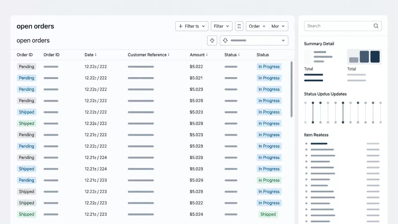
The first screen should show the details people check most often. That usually means order number, PO number, status, date, shipment stage, and any warning tied to the order. If those fields sit behind extra clicks, the page feels heavier than it should.
Start with the data that helps a user act. Then move everything else into a detail panel or row expansion. Long shipping notes, item lists, and internal comments belong in the second layer.
A good row layout often follows this pattern:
- Identity: order number, PO number, and account name
- State: status, hold reason, or shipment stage
- Timing: order date, promised date, or last update
- Action: view details, reorder, download, or contact support
If a buyer has to open a second screen to find the PO or promised date, the table is doing too little.
Status labels need care as well. A chip that says “Open” is too vague for many B2B workflows. “Awaiting approval”, “Backordered”, and “Partially shipped” tell a better story. The language should match the tasks buyers and service teams use every day.
Make search and filters work for real procurement tasks
Most B2B users do not scan every row. They search for a specific order, an invoice, or a shipment that still needs attention. That means search and filters have to feel reliable, fast, and predictable.
Support search by PO number, order number, SKU, invoice number, and customer reference. Then add filters for status, date range, ship-to location, branch, and approval state. Keep the most-used filters visible so users do not need to dig for them.
If your current filters feel weak, the patterns in designing efficient order search and filtering UX are a good model for B2B account portals.
Saved views help here too. A procurement manager may return to the same “Needs approval” view every morning. A finance user may want “Invoices due this week”. When the dashboard remembers those views, it saves time and reduces repeat setup.
Search should also handle partial input well. Users often type only the last few digits of a PO or invoice. If the system can match loose search terms, the experience feels far more forgiving.
Design for clarity, not decoration
The best open orders dashboard feels like a working tool, not a marketing page. Dense tables can still feel calm when spacing, hierarchy, and action states are handled well.
Color should support meaning, not carry it alone. A red badge can flag a hold, but the text must explain why. The same goes for muted or disabled actions. If a user cannot act, the page should say why and point to the next step.
A detail drawer works well because it keeps the list visible. Users can review one order without losing their place in the queue. That matters when someone is comparing several orders at once.
In this section, the layout should answer four questions at a glance:
- What order is this?
- What is its current state?
- What changed most recently?
- What can I do next?
That kind of clarity keeps the page from turning into a spreadsheet copy. It gives the table a job, and it keeps the portal focused on action.
Support the work that follows the order list
An open orders dashboard should not stop at status. It should help users finish common follow-up work without starting over somewhere else.
A buyer may need to reorder the same items. A finance user may need to download an invoice. A service rep may need to copy order details into a case note. These tasks happen often, so they belong close to the order record.
For repeat buying patterns, UX strategies for repeat purchase experiences can help shape the path from order review to the next purchase. The dashboard should make that move feel natural.
Keep the action set tight. Too many buttons on every row create noise, and users stop trusting the layout. Show the highest-value actions first, then tuck the rest into a menu or detail panel. Good candidates are reorder, download invoice, view shipment, and contact support.
When an order is on hold, show the reason in plain language. “Pending tax review” is better than a code or internal note. If the user can fix the issue, tell them who needs to act. If they cannot, show the contact path.
Respect roles, permissions, and approval paths
B2B portals rarely serve one kind of user. Buyers, approvers, admins, and service teams often share the same account space, but they do not need the same controls. The dashboard has to reflect that.
The cleanest approach is to keep the action visible and the authority clear. If a user can view an order but not edit it, say so. If a request needs approval before reorder, show that path near the action itself. That reduces guesswork and support calls.
For deeper role patterns, designing clear user roles and access controls is worth aligning with the dashboard design. Access rules should feel like part of the order experience, not a separate admin problem.
A few cues help a lot:
- Show the approval owner when an order is waiting.
- Explain why an action is blocked.
- Keep admin-only controls out of the buyer view.
- Surface company, branch, or location context when it changes the workflow.
That keeps users from chasing the wrong action. It also protects trust, because the screen behaves the way the organization works.
Measure the dashboard against real tasks
The open orders dashboard should be judged by task success, not by how full it looks. Track how fast users find an order, how often they use search, and how many support tickets come from status confusion.
Watch the top tasks during testing. Can a buyer find a delayed order in seconds? Can finance download the right invoice without help? Can an approver see what needs review and why? If those tasks fail, the design needs another pass.
The best dashboards reduce friction in the moments that matter most. They make order status visible, next steps obvious, and follow-up work easier to finish.
Conclusion
A strong open orders dashboard gives B2B users control without making them work for it. It shows the right data first, keeps filters dependable, and makes actions match real business tasks.
When buyers, finance teams, and service reps can all read the same page with less effort, the portal becomes more than a list. It becomes a working part of the order process, and that is where good UX earns its place.