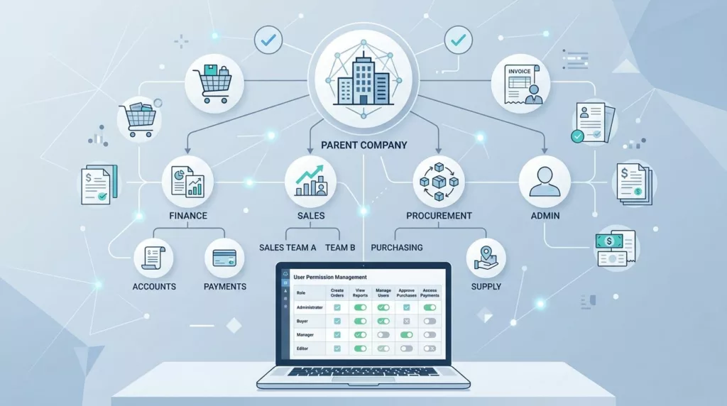
One wrong permission can stall a whole B2B order. A buyer may have the cart ready, but can’t submit it. Or an approver can see the total, but not the shipping change that caused the problem.
That is why account permissions UX matters so much in B2B ecommerce. The best systems protect spending rules without making every task feel like a support ticket. They also keep finance, sales, and ops working from the same account data.
Start with the company structure, not the user list
B2B buying rarely happens at the person level. It happens inside a company, across branches, departments, cost centers, and approval chains. If your account model starts with a single user, the rest of the experience gets awkward fast.
A better starting point is the business structure. That means a parent account for the organization, child accounts for sites or departments, and roles that match real work. A branch buyer may create carts. A regional manager may approve them. A finance lead may see invoices and terms. A company admin may manage users and budgets.
That structure is common in platforms that support multi-user buying. A good reference is Adobe Commerce’s B2B account hierarchy playbook, which shows how parent accounts, child accounts, and buyer types fit together.
The UX goal is simple. Users should see the rules of their company account without having to decode them. If they need to ask, “Which account am I in?” the design has already slipped.
Separate what people can do from what they can approve
Many B2B teams mix two different ideas: operational access and financial authority. That creates confusion. A user can build a cart, but not submit it. Another can approve spend, but not edit shipping details. Those are different permissions, and the interface should treat them that way.
The clearest account setups keep the action and the authority apart. A buyer sees the ordering tools they need. An approver sees the queue and the approval limit. An admin sees the user list, budget settings, and role rules. When those controls blend together, users waste time guessing what will happen next.
A useful lens is roles, budgets, and approval logic. The article makes the same core point, budgets and approval rules are not the same as cart access.
A permissions matrix can still feel human if it is built around jobs people do, not fields in a database.

When product, ops, and finance all use the same account, permission clarity becomes a daily need, not a nice extra.
Show permissions at the point of action
The fastest way to reduce confusion is to show access rules where users feel them. If a buyer hits a wall at checkout, the product has waited too long to explain the rule.
The table below shows how common permission areas should behave in the interface.
| Permission area | Good UX pattern | Common mistake |
|---|---|---|
| Ordering | Let buyers build carts and save drafts, then show a clear submit action only when they have access. | Hiding the submit control without explaining why. |
| Approvals | Show who approves, what threshold applies, and what happens after submission. | Sending the order into a black box. |
| Budgets | Display remaining budget beside cart totals or approval notices. | Forcing users to check another system. |
| Billing visibility | Let the right roles view invoices, tax status, and payment terms. | Exposing payment data to every buyer. |
| Shipping access | Show which addresses, carriers, or delivery methods each role can use. | Revealing shipping limits only after checkout starts. |
| Account management | Give admins control over users, locations, and role changes. | Hiding admin tools inside support tickets. |
The big lesson is consistency. If a user can’t change a shipping address, say so before they reach the final step. If a role can’t see invoices, hide that area or explain the limit clearly.
For billing details that overlap with tax fields, optimizing VAT field UX for B2B checkout is a useful companion. Permissions and billing rules often collide in the same flow, so the copy and field logic need to work together.
Give teams control without turning setup into a maze
Granular permissions can help, but too many options slow everyone down. If each company has to build access from scratch, admin setup turns into a chore. If every role is hard-coded, the platform becomes rigid and full of workarounds.
Granular control helps only when people can understand it at a glance.
The best middle ground is usually a set of useful defaults with room for exceptions. Start with role templates that match common B2B jobs, then let admins adjust the parts that matter most. That might include approval thresholds, shipping destinations, invoice visibility, or branch-level buying limits.
This is where account permissions UX earns trust. People don’t want endless choices. They want the right level of control for their business, with clear labels and a predictable result.
A few practical design habits help:
- Use plain role names. “Buyer,” “Approver,” and “Admin” are easier than internal policy terms.
- Group settings by task. Users think in carts, orders, budgets, and users, not in backend tables.
- Hide advanced controls until needed. Progressive disclosure keeps the first setup pass shorter.
- Show the impact of a change. If a new role removes invoice access, say so right away.
- Keep temporary overrides visible. Expired exceptions should not stay buried in the system.
For teams that care most about reorders and self-serve account work, designing user-friendly B2B account management portals is a good reference point. The same rule applies there, admin tools should feel powerful without becoming hard to reach.
Common mistakes that push users toward workarounds
When permissions are unclear, people do not wait politely. They email sales, copy finance, or share login details. That creates risk and slows the buying cycle.
These mistakes show up often:
- Mixing operational roles with approval rules, so users can’t tell what they are allowed to do.
- Hiding denied actions instead of explaining the limit.
- Making shipping or billing changes invisible until the last checkout step.
- Letting admin settings live in a separate system that buyers never see.
- Skipping audit logs, which makes it hard to trace who changed a role or budget.
- Treating all accounts the same, even when one company has branches, subsidiaries, or different buying teams.
The fix is not more complexity for its own sake. It is better structure, clearer labels, and stronger defaults. A buyer should know what happens next before they click submit. An approver should know what they are approving. An admin should know which setting changed and why.
The implementation side matters too. Permissions should live in a data model that can handle company hierarchies, role templates, approval limits, and address rules. They should also sync with ERP, CRM, and identity tools when those systems own parts of the account. If those systems disagree, users feel the gap first.
Testing should cover edge cases, not just happy paths. Try a branch buyer with a limited ship-to list. Try an approver who is out of office. Try a company that needs VAT collection, invoice visibility, and location-specific budgets in one account.
Conclusion
B2B buyers do not need permission screens that impress them. They need account rules that make sense the first time they see them. When the structure is right, ordering stays fast, approvals stay clear, and finance keeps control without constant back-and-forth.
The strongest account permissions UX feels invisible during normal buying and obvious when someone needs to manage it. That balance is what keeps company accounts usable, trustworthy, and worth returning to.