
Blanket orders look simple on paper. In a portal, they can turn into a mess of dates, quantities, approvals, and partial shipments if the interface hides the wrong details. Blanket order release UX matters because buyers need to move fast without guessing what they can release, what still needs approval, and what will ship next.
That pressure shows up in manufacturers, distributors, and wholesale accounts every day. When the portal feels like an ERP screen squeezed into a browser, people fall back to email, phone calls, and manual checks. The release flow should remove that friction, not add another layer.
What buyers need to see before they release anything
A blanket order release starts with clarity. Buyers want to know how much remains on the contract, which lines are open, and what dates are available right now.
The first screen should answer three questions fast:
- How much can I release?
- Which items are eligible today?
- What happens if I release less than the full amount?
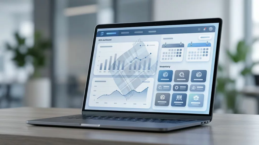
That means the portal needs more than a static order summary. It needs a working view of contract balance, release history, available quantity by line, requested ship dates, and any hold conditions. If a buyer has to open another tab or call support, the design has already failed.
A strong layout usually puts the contract header at the top, then line items beneath it. Each line should show ordered quantity, released quantity, remaining quantity, and next available date. If pricing changes by release, show that too. Buyers do not want to hunt for hidden fields that matter only after the order is submitted.
The release view should also tell users what is not available. Backorder states, minimum release rules, credit holds, and ship-to limits should appear near the line, not buried in a footer note. When constraints sit too far away from the decision point, users make bad choices.
A portal can still feel clean even when the business rules are complex. The trick is to show the right fields at the right time.
Make line-item selection feel controlled, not fragile
Blanket releases often fail when the portal treats every line like a simple shopping cart item. A buyer may need to release part of a line, split quantities across dates, or hold a line for later. The interface should support those choices without making the user do math in their head.
Good line-item UX gives users direct control over quantity and ship date on each row. A buyer can enter a release amount, see the remaining balance update instantly, and choose a date from the dates the system actually supports. If the requested quantity exceeds what is available, the portal should stop the action before checkout.
Validation needs to be visible and specific. A vague message like “Invalid release” is useless. A better message says, “Only 120 units are available for release this week. The remaining 30 units can ship next week.” That kind of feedback helps the user recover without a support ticket.
Partial releases need special care. Many teams hide them behind an advanced screen, but they are part of normal buying behavior in B2B. When demand shifts, buyers need to release some items now and keep others open. The portal should make that state obvious in the cart, order review, and confirmation screen.
A simple pattern works well:
- Select the contract lines.
- Enter release quantities.
- Review ship dates and exceptions.
- Confirm any partial or split releases.
- Submit the release with a visible record.
That flow keeps the buyer in control. It also lowers the chance that someone releases the wrong quantity because the screen gave no feedback until the end.
Show constraints where users make decisions
Many release portals fail because they surface rules too late. The buyer learns about a minimum release quantity, cutoff time, or ship-to restriction after they have already filled the form. That creates frustration and rework.
The better pattern is to place constraints next to the field that depends on them. If a line has a minimum release of 50 units, show that rule beside the quantity box. If the chosen ship date misses the warehouse cutoff, say so before submission. If a product requires pallet quantities or a specific shipping method, state that in plain language.
This is also where legacy ERP-driven portals often break down. ERP data is accurate, but the presentation is rough. Users get field codes, abbreviations, and screen terms that make sense to operations teams but not to buyers. The portal should translate those rules into language that a planner or purchasing manager can act on in seconds.
A few design details make a real difference:
- Use plain labels like “Available to release” instead of system codes.
- Show dates in the same format across every step.
- Keep error messages tied to the exact line item.
- Highlight blocked actions before the user clicks submit.
Support tickets drop when the portal explains the rule before the user hits a wall. That saves time for both sides.
Handle approvals and ship-to rules without slowing the buyer
In many companies, blanket order releases pass through more than one person. A buyer enters the release, an approver checks the spend or volume, and a warehouse or operations team receives the shipment details. If the portal blurs those roles, the release process gets messy fast.
This is where B2B account permissions UX becomes part of the release flow. The buyer should see only the actions they can take, while approvers see the pending items that need attention. When roles are clear, users stop guessing who can submit, edit, or approve a release.
The portal should also make the approval state visible at every stage. If a release is waiting for sign-off, say that on the summary screen and in the confirmation message. If the company account requires a PO number or manager approval over a threshold, show that rule before submission.
Shipping instructions deserve the same treatment. Blanket orders often include site-specific notes, delivery windows, dock instructions, or packaging rules. These fields should appear close to the release confirmation, not hidden behind a generic comments box. A buyer should know whether the note is attached to the line, the release, or the full contract.
When the UX makes authority and delivery rules clear, the portal feels trustworthy. That trust matters more than a polished surface.
Confirmation screens should remove doubt
A confirmation screen is not a receipt for decoration. It is the final chance to catch a mistake before it becomes a shipment problem.
After release submission, the portal should confirm exactly what the buyer did. Show the contract number, released lines, quantities, ship dates, approval status, and any exceptions. If the release is partial, say what remains open. If one line failed while others succeeded, split the result clearly instead of showing a generic success banner.
This is also the right moment to offer next steps. Buyers may want to print the release, email it, download a PDF, or send it to a plant or location manager. Those actions should be easy to find, because many teams still need a copy outside the portal.
A useful confirmation screen has three jobs. It reassures the buyer, it creates a clean record, and it reduces follow-up emails. If the screen leaves out one of those jobs, someone else will fill the gap later with a phone call.
Audit history should be easy to scan, not buried
Blanket orders live for a long time. Buyers may release against them many times, so the history matters. A strong portal should show who released what, when it happened, what changed, and whether approval was involved.
That history should be easy to filter by date, status, line item, and ship-to location. A messy log is almost as bad as no log at all. If the buyer cannot answer, “What changed on Tuesday?” the audit trail is not doing its job. For a useful reference point on history views, see UX strategies for B2B order history.
The best audit view reads like a clean activity timeline. Each entry should show the release amount, the remaining balance, and the reason for any hold or change. If the system allows edits before approval, show those edits clearly. If a release was split across dates, keep both entries linked.
This is where portal UX helps teams beyond the buyer. Customer service, finance, and operations all need the same facts. When those facts sit in a searchable history, teams spend less time reconstructing events from emails.
Where legacy ERP portals lose users
Legacy ERP-driven portals often show too much system logic and too little buying logic. The screen may be accurate, but it still feels hard to use. Buyers see codes instead of names, tabs instead of tasks, and warnings that appear after they have already done the work.
The most common pain points are easy to spot:
- Quantity fields that do not show remaining balance.
- Ship dates that are locked until the end.
- Partial releases that need manual workarounds.
- Approval states that are unclear.
- Notes and instructions that disappear in the handoff.
Each one creates a small delay. Put them together, and the portal becomes the place people avoid. That is when procurement friction grows. Buyers send more emails. Operations field more questions. Support spends time fixing preventable release errors.
Better UX does not remove business rules. It makes them visible and usable. The portal can still respect credit checks, inventory rules, shipping cutoffs, and account permissions. It just presents those rules in the flow of the task.
Conclusion
Blanket order release UX works when the portal helps buyers act with confidence. The screen should show available quantities, valid dates, approval steps, partial release status, and a clear audit trail without making users chase the details.
When that happens, ordering errors fall, support tickets drop, and procurement teams spend less time cleaning up preventable mistakes. The best portals treat blanket releases as a real workflow, not a stripped-down ERP form.
A release screen that answers the next question before the buyer asks it saves time for everyone involved.