
Seasonal Ecommerce Checklist for High-Pressure Sales
Seasonal campaigns can bring your store its biggest traffic spike of the year, or expose every weak point in the...

Invoice Reconciliation UX for Faster PO Matching
Invoice discrepancies can turn a two-minute approval into a long chain of emails, spreadsheets, and repeated data entry. Modern invoice...

B2B Account Hierarchies Buyers Can Actually Use
Managing a complex company structure is a significant challenge for modern businesses. A single organization may have one legal owner,...
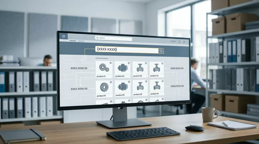
Customer Part Number Mapping for B2B Catalog UX
Buyers rarely search B2B catalogs by product name first. They paste a customer part number, a legacy code, a customer...
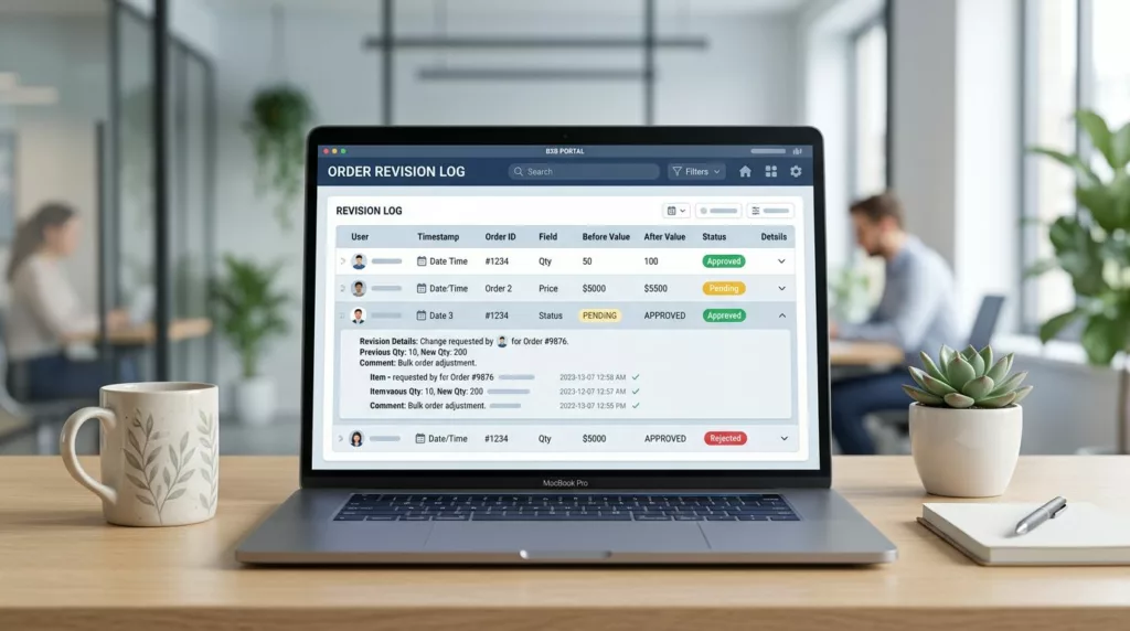
Order Revision History UX for B2B Portals
B2B buyers rarely open an account portal to admire a list of past orders. They open it because a PO...

Statement Download UX for B2B Account Portals
A statement download can make or break a finance task in under a minute. Business users are not opening a...

Order Acknowledgment Download UX for B2B Portals
When a buyer needs an order acknowledgment, they usually need it right away. They are checking a PO match, confirming...

Job Name Field UX in Contractor Checkout
A blank job name field can cause trouble long after the order is placed. In contractor ecommerce, that small text...

Proof of Delivery UX for B2B Account Portals
Customers do not open account portals for decoration. They open them when a shipment needs proof, a finance team needs...
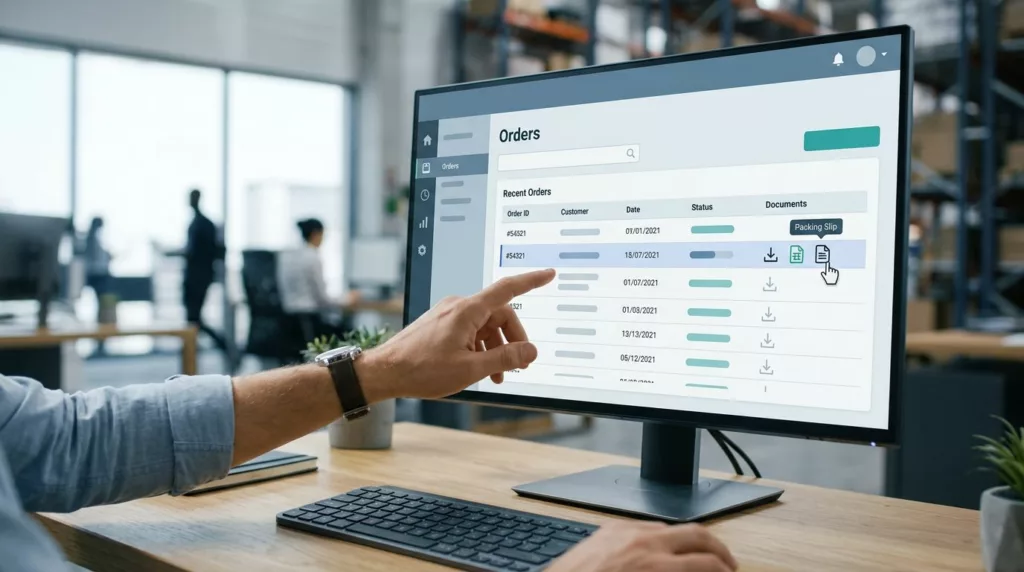
Packing Slip Download UX for B2B Portals
A packing slip gets ignored until someone can’t find one. Then it turns into a dock delay, a support ticket,...