
B2B buyers do not open account dashboards to browse. They open them to find a purchase history, check a PO, download an invoice, or place the same order again. When order history filters are weak, each of those tasks becomes a difficult search. By understanding customer behavior, you can design a dashboard that reduces support requests, speeds up finance checks, and makes repeat purchases easier.
That matters because B2B accounts are shared, messy, and time-sensitive. A procurement lead, a service rep, and a finance manager all need different answers from the same order table. The best dashboard gives each of them a fast path to the information they require.
Key Takeaways
- Align filters with user jobs: Design your filter sets around the actual tasks B2B users perform—such as procurement, reconciliation, and status checks—rather than just mirroring database fields.
- Prioritize the first layer: Keep the most frequently used filters visible to prevent interface clutter, moving advanced or niche options into a secondary menu.
- Enable role-based efficiency: Use saved views and persistent settings so finance, procurement, and support teams can instantly access the specific order data relevant to their workflows.
- Maintain filter transparency: Utilize clear, language-based filter chips that allow users to identify, add, or remove specific criteria without resetting the entire search state.
Start with the jobs buyers actually need
Good filter design starts with real work, not with database fields. A buyer does not care how your order system stores data. They care about whether they can efficiently filter order history to find the right information before a meeting starts.
The most common B2B tasks are easy to spot. Someone needs a date range for month-end review. Someone else needs a PO number for reconciliation. A plant manager wants a product title filter to locate the exact item ordered last quarter. A support agent wants to check the order status for a package that was marked shipped, then delayed, then replaced.
That is why the filter set should reflect the main jobs in the account. If repeat purchases matter, tie the dashboard to reorder behavior for the returning customer. Best practices for B2B reorder design show how the last order can do most of the heavy lifting when the right history data is easy to find.
The strongest dashboards keep the first layer simple. Users should see the filters they use every week, not every possible field. Advanced options can stay hidden until needed. That keeps the page useful without making it feel crowded.
A useful test is simple. If a person can explain why each filter exists in one sentence, it probably belongs. If they need a system tour, it probably belongs behind “More filters.”
Choose filters that match real order data
The best order history filters usually map to the same data people use in conversations with sales, support, and finance. When selecting which order fields to include, the trick is to surface the most valuable ones first and keep the rest accessible within an advanced filter panel.
| Filter | Best use | UX risk if missing |
|---|---|---|
| Date range filtering | Month-end checks, returns, and audit work | Users scroll too much and miss orders |
| Order status | Tracking open, shipped, or cancelled items | Support and service teams lose time |
| SKU or product | Repeat buys and exact replacements | Reorders take longer than they should |
| PO number | Procurement and finance matching | Teams cannot reconcile records fast |
| Shipping information | Identifying specific branches or job sites | Multi-location accounts get confused |
| Payment status | Managing open balances and overdue accounts | Finance teams leave the dashboard to confirm status |
| Customer name | Managing shared accounts with many users | Ownership gets lost in large organizations |
| Billing information | Verifying invoice details for finance teams | Reconciliation delays occur during audit cycles |
Your order list table should not feel like a spreadsheet copy. Instead, it should function as a control panel for common tasks. Keep the most-used filters visible, then group the rest under an advanced filter section.
A few patterns help here. When using an order date range, provide common presets such as last 30 days, this quarter, and last year. Status filters should use plain business language rather than internal system codes. SKU search should support partial matches, as buyers rarely remember the full item number. Similarly, PO search should accept pasted text without requiring extra cleanup.
This is also where account page UX best practices matter. A strong account page keeps the core actions and the order list table in plain sight, so your filters support the page functionality instead of taking it over.

Make the default view work without effort
A dashboard should load in a way that provides immediate value. The first screen should answer the basic question, “What can I do right now?” If the answer is hidden behind several clicks, the filtering interface is doing too much work.
Persistent settings are a great way to handle this. When a buyer returns to the dashboard, their last useful state should remain visible, unless their role or permissions have changed. Using advanced order filtering to create saved views is even better for efficiency. A finance user may want one view for open invoices, while a support agent wants another for delayed shipments. If a user needs to find a specific transaction quickly, the search bar should remain prominent and ready to accept input.
Clear filter chips are essential for the user experience. Users should be able to see active filters at a glance. They should also be able to remove one specific filter without clearing the entire set. That functionality may seem minor, but it saves significant time on every repeated task.
The reset state needs care as well. A single “Clear all” action is useful, but it should not be the only escape hatch. If someone applies six filters, then wants to remove just one, the interface should not force a full page refresh or wipe their progress.
The strongest default view usually shows:
- The most recent or most relevant orders at the top of the list.
- A visible count of matching orders.
- Applied filters displayed in plain language.
- A quick path back to reorder, invoice download, or order details.
That pattern keeps the dashboard legible and intuitive. It also reduces the feeling that buyers need to learn a complex system before they can manage their accounts effectively.
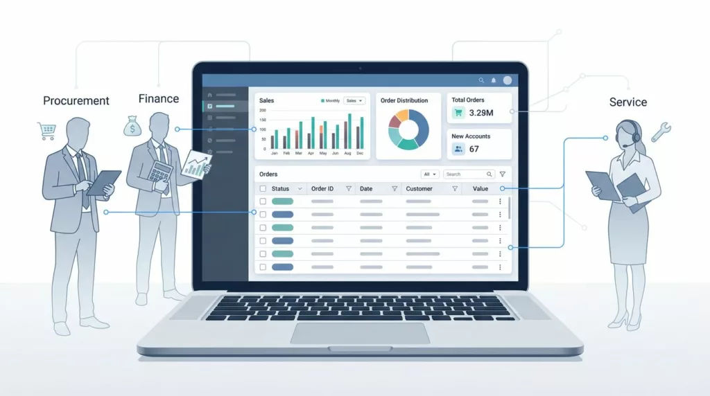
Design for finance, procurement, and support
Different teams use the same order history for different reasons, and your filters should respect that reality.
Finance teams typically prioritize payment status, invoice dates, and the ability to export purchase orders for their audit trails. Procurement teams focus on order type, supplier names, ship-to locations, and repeat ordering patterns. Meanwhile, support teams prioritize order status, tracking information, and return history to resolve inquiries quickly.
A high-performing dashboard supports these diverse workflows without cramming everything onto a single screen. Role-based saved views are an ideal solution here. A shared account can maintain one global default, then allow each individual team to save its own preferred setup.
The interface also needs language that aligns with the buyer. Terms like fulfillment status sound technical inside a backend system, but labels like Shipped or Cancelled are much easier to scan. In B2B environments, plain language saves time because users often read the page under pressure. Furthermore, providing clear filter options for payment method helps streamline reconciliation and reporting tasks.
You also need to consider how teams handle handoffs. A buyer might start with a reorder, then finance may need the invoice, and finally, support may need to check the shipment record. If the order detail page keeps these paths connected, the dashboard feels dependable. If each step leads to a different dead end, the filter layer becomes part of the problem rather than the solution.
Common mistakes that break trust
The biggest filter problems usually come from too much complexity and too little clarity. When users do not trust what they are seeing, they stop using the dashboard and move to email.
A few mistakes show up again and again:
- Hidden defaults that change without warning.
- Date filters that reset when users switch tabs.
- Technical labels that sound like field names instead of business terms.
- Tiny filter chips that are hard to read or remove.
- Search boxes that work separately from filters, which creates duplicate effort.
- Advanced filter options that appear before the basic ones, overwhelming the user.
- A lack of bulk actions or customizable columns for power users who need to manage high volumes of data.
- Poor visibility of the current order status, leaving users guessing about the phase of their procurement.
While lifetime value is a high-level metric that leadership monitors, the primary job of your dashboard is granular order retrieval. If a user cannot quickly see the correct order status, the system fails.
Accessibility matters here too. Filters need strong contrast, clear focus states, and large enough tap targets. Keyboard users should be able to move through the filter set without getting trapped. If your dashboard has many roles, these details matter even more.
If a buyer has to clear filters just to find the last order, the dashboard already failed.
The best filter systems are predictable. They keep the same order, use the same labels, and preserve state in a way that feels safe. That consistency builds confidence, which matters in every B2B account.
Frequently Asked Questions
How many filters should I show at once?
Display only the filters that are used on a weekly basis by the majority of your users. Place all other specialized or secondary filters inside an “Advanced” section to keep the primary interface clean and focused.
Should filters reset when a user leaves the page?
No, filters should be persistent whenever possible. Users expect their last-used state to remain active so they can resume their workflow without needing to re-apply common criteria.
How do I handle different team requirements?
Use role-based saved views that allow different personas, such as finance or support, to customize their own dashboard layout. This prevents a single “one-size-fits-all” configuration from becoming too complex for any one specific user group.
Why should I use plain language instead of system labels?
Technical database codes often confuse buyers and lead to errors during high-pressure tasks. Using intuitive labels like “Shipped” or “Cancelled” ensures that all users, regardless of their technical background, can interpret the dashboard data instantly.
Conclusion
Effective order history filters do more than just sort rows of data. They empower buyers to verify past purchases, repeat successful orders, and resolve issues without unnecessary friction. When you design an interface that allows users to filter order history with precision, you enable them to quickly pinpoint specific items based on their current order status.
The simplest test for your dashboard is this: can a user find the right information in seconds and move immediately to their next task? If the answer is yes, your order history filters are actively supporting the business goals of your customers. If the answer is no, it is time to refine your search parameters and provide a more intuitive experience.