
A wrong bill-to account can send an order to the wrong tax profile, the wrong invoice queue, and the wrong approval chain. In B2B checkout, that is enough to slow a buyer down or push them to support.
A strong bill-to account selector fixes the decision early. It gives buyers clear choices, protects finance rules, and keeps the order moving without guesswork.
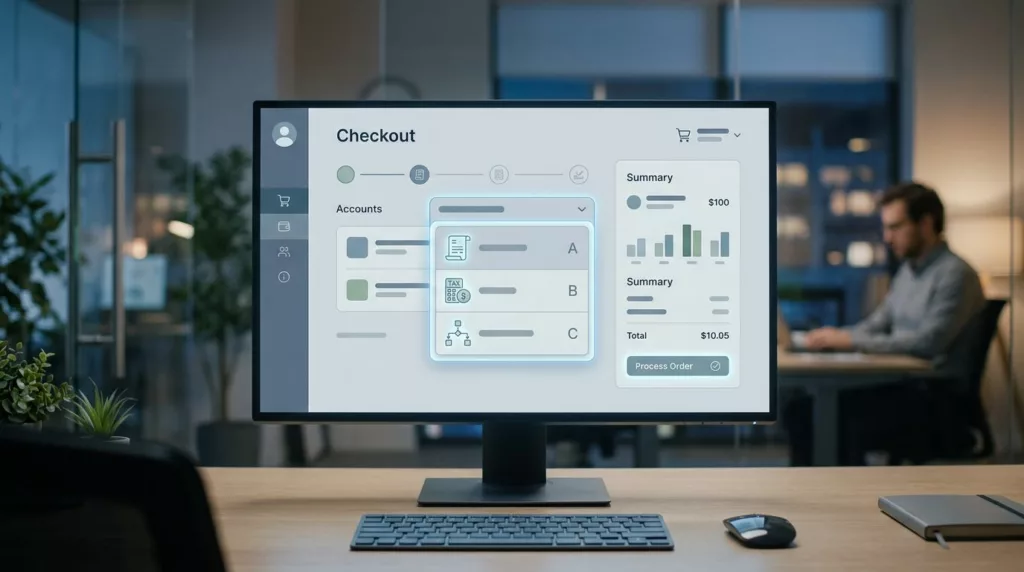
The best designs feel obvious under pressure. The rest of this article shows how to make that happen.
Why the bill-to step causes friction
Billing in B2B is not one field. It is a decision about legal entity, payment terms, tax, and who gets the invoice.
When account names are messy, buyers have to decode them. A branch manager may know “Atlanta Distribution,” while accounting knows “ACME Supply Co. South.” A procurement user may see five nearly identical subsidiaries. If the selector only shows the company name, the wrong choice looks right.
The friction gets worse when the user is buying for another site or business unit. Ship-to and bill-to can differ on purpose, but the UI should not make that feel suspicious. It should make the rule clear.
Finance may want one legal entity. Operations may care about a branch code. Procurement wants a saved default. The selector has to reconcile those views without forcing users to open another tab.
That is why broad checkout advice still matters here. Salesforce’s 2026 checkout guide covers clarity points that still apply when business buyers need to move fast.
In B2B, every extra click has a cost. A checkout that asks users to guess their bill-to account is asking for error, rework, and an invoice fight later.
Selector patterns that fit real account lists
Different account counts call for different selector patterns. A dropdown works for a short list, but it breaks down when the list grows. Search becomes essential once buyers see dozens of bill-to options.
When account lists get long, the visual design has to carry more load than a plain select field can manage.

A clean selector pattern depends on list size, user frequency, and naming quality.
| Pattern | Best fit | Risk | Good UX detail |
|---|---|---|---|
| Dropdown | 1 to 5 bill-to accounts | Becomes hard to scan | Show legal name, city, and last-used date |
| Searchable modal | Dozens or hundreds of accounts | Feels heavy if search is weak | Search by alias, account number, and parent company |
| Account cards | A small set of common accounts | Uses too much space on mobile | Highlight the current account and the change action |
| Recent/default account | Repeat buyers with stable usage | Hides alternatives if poorly labeled | Explain why it is default and how to switch |
The pattern matters, but the labels matter more. If every account looks the same, even the best component will fail.
A dropdown can work well when the buyer only chooses once in a while. Still, it needs more than a raw company name. Add the branch, city, or account code. That small line of context saves time.
Searchable modals fit large enterprise lists better. They help when users know part of the account name, a nickname, or an internal number. They also keep the checkout page from turning into a wall of choices.
Account cards work best when buyers switch among a few familiar accounts. On mobile, they are easier to scan than a compact select box. They also give room for a clear default badge or a recent-use label.
Recent and default account options are useful, but only if the buyer can change them fast. A default should reduce work, not hide the rest of the system.
Prevent billing errors before the order is placed
Every bill-to option should carry the details that prevent a mistake. If the buyer needs a tooltip to tell accounts apart, the row is too thin.
Show the legal name, not just shorthand. Add the branch, division, or site. Include invoice terms when they change by account. If tax or currency depends on the choice, show that too.
When the bill-to account changes payment rules, pair the selector with B2B net terms UX best practices so the buyer sees the terms before the order is locked in. That matters when credit limits, net terms, or approval rules differ by account.
If the selector changes tax, credit, or invoice routing, the change belongs beside the choice, not after submission.
Ship-to and bill-to mismatches need the same level of honesty. A buyer might ship to a hospital in Texas and bill a parent company in Illinois. If that setup is allowed, say so. If it is not, block it early with a direct message.
Good inline error copy sounds like normal business language. “This account can only bill approved U.S. ship-to addresses” is clear. “Invalid billing configuration” is not.
A quick checklist helps keep the selector honest:
- Show the account’s legal name and the common name together.
- Surface tax region, currency, or terms when they affect the order.
- Explain why a bill-to and ship-to pair is blocked.
- Validate the choice before the final review step.
B2B payment flows carry more rules than consumer checkout, and payments in B2B ecommerce makes that plain. The selector should surface those rules before the buyer clicks place order.
The goal is simple. Buyers should feel sure about the billing choice before they reach payment.
Handle permissions, defaults, and downstream fields
Large customer orgs need search that respects permissions. A user may know the account name but still lack access. In that case, show a clear explanation instead of a dead end.
When a customer has dozens or hundreds of bill-to accounts, search needs more than free text. Let buyers search by account number, alias, city, division, or parent company. If several accounts share a brand name, add a secondary line so the difference is obvious.
Recent accounts should rise to the top, but they should not crowd out the full list. A buyer who orders every week may want the last-used account first. A buyer placing a one-off order may need a different branch. The selector should support both behaviors.
The default state should be visible and reversible. If the system preselects a bill-to account, label it clearly. Buyers should always know which account is active before shipping, tax, or PO fields lock in.
This is also where the bill-to selector connects with other checkout fields. If the selected account changes the PO requirement, align that behavior with designing PO number fields so the form updates in one place. The buyer should not discover a missing PO after they are done selecting billing.
A few rules keep the experience stable:
- Hide accounts the user cannot bill to, or label the restriction clearly.
- Keep recent and favorite accounts at the top of the list.
- Search across aliases and internal account numbers.
- Keep the switch action one tap or one click away.
- Save the chosen account to the customer profile when the buyer wants that.
That kind of selector feels calm because it gives people the right answer fast. It does not make them work for a decision they already know how to make.
Conclusion
The bill-to account selector carries more weight than a normal dropdown. It decides where invoices go, which terms apply, and whether the order can close without a back-and-forth email.
The strongest patterns make the right account easy to spot. They surface billing rules early. They also keep permission limits and downstream fields visible.
When buyers can confirm the right bill-to account in seconds, checkout feels lighter. More importantly, finance gets cleaner orders.