A first-time purchase is a handshake. A second purchase is trust, and trust is where margins get healthier.
In 2026, the best retention UX strategies often aren’t a new campaign. It’s reorder flow UX that removes effort at the exact moment a customer thinks, “I need that again.” That means tighter reorder paths, subscription controls people understand, and account pages that feel like a helpful store associate, not a dead-end settings screen.
This guide focuses on patterns you can ship for reorder journey optimization, the KPIs that prove impact, and the tracking you’ll wish you had later.
High-converting reorder flows feel like a shortcut, not a new checkout
A good reorder experience should feel like grabbing the same item from a familiar shelf. The customer already did the research. Your job is to avoid making them do it twice.
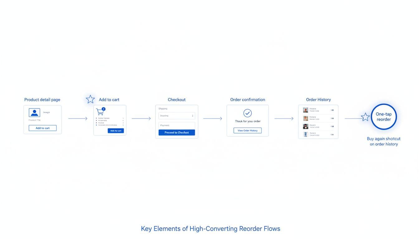
Start by placing “Buy again” in more than one place, identifying entry points where shopper intent shows up: order confirmation, shipping updates, order history, and the account dashboard. Also add it on PDPs as “Previously purchased” so returning shoppers can act fast.
Then make the reorder action intelligent. Preselect the last purchased variant, quantity, and delivery method. If the item is out of stock, offer the closest in-stock substitute or a back-in-stock alert, but don’t dead-end the flow.
Finally, treat ecommerce checkout flow friction like a leak. These patterns reduce user friction. If you force account creation, you’ll lose reorders from people who just want their soap, pet food, or vitamins. Guest reorder can still be safe, for example via magic links or email one-time passcodes. Checkout friction is still a top reason for abandonment, as highlighted in this 2026 checkout optimization UX guide.
A mini checklist for a reorder flow that converts:
- Make it one decision: “Reorder” should add the exact item to cart with defaults and tap targets that meet mobile UX design standards, not open a PDP.
- Show the cost upfront: Include estimated total and shipping before the final step.
- Support address and payment drift: Detect expired cards and missing apartment numbers early.
- Handle partial reorders: For complex orders like bulk B2B, support reordering list items individually via drag and drop interaction with clear drop target feedback, similar to patterns found in enterprise software applications. If a past bundle changed, let customers reorder items individually.
- Confirm with confidence: After purchase, offer “Set reminder” or “Subscribe” while the item is top of mind.
Tracking suggestions (events): buy_again_impression, buy_again_click, reorder_add_to_cart, reorder_checkout_start, reorder_purchase, plus reorder_oos_shown and substitute_selected. For time-to-reorder, measure from delivered timestamp to reorder_purchase.
If reordering feels like shopping, you’re asking customers to “earn” something they already earned.
Subscription management UX that reduces churn without resorting to tricks
Subscriptions work when customers feel in control. They fail when “manage subscription” looks like a maze.
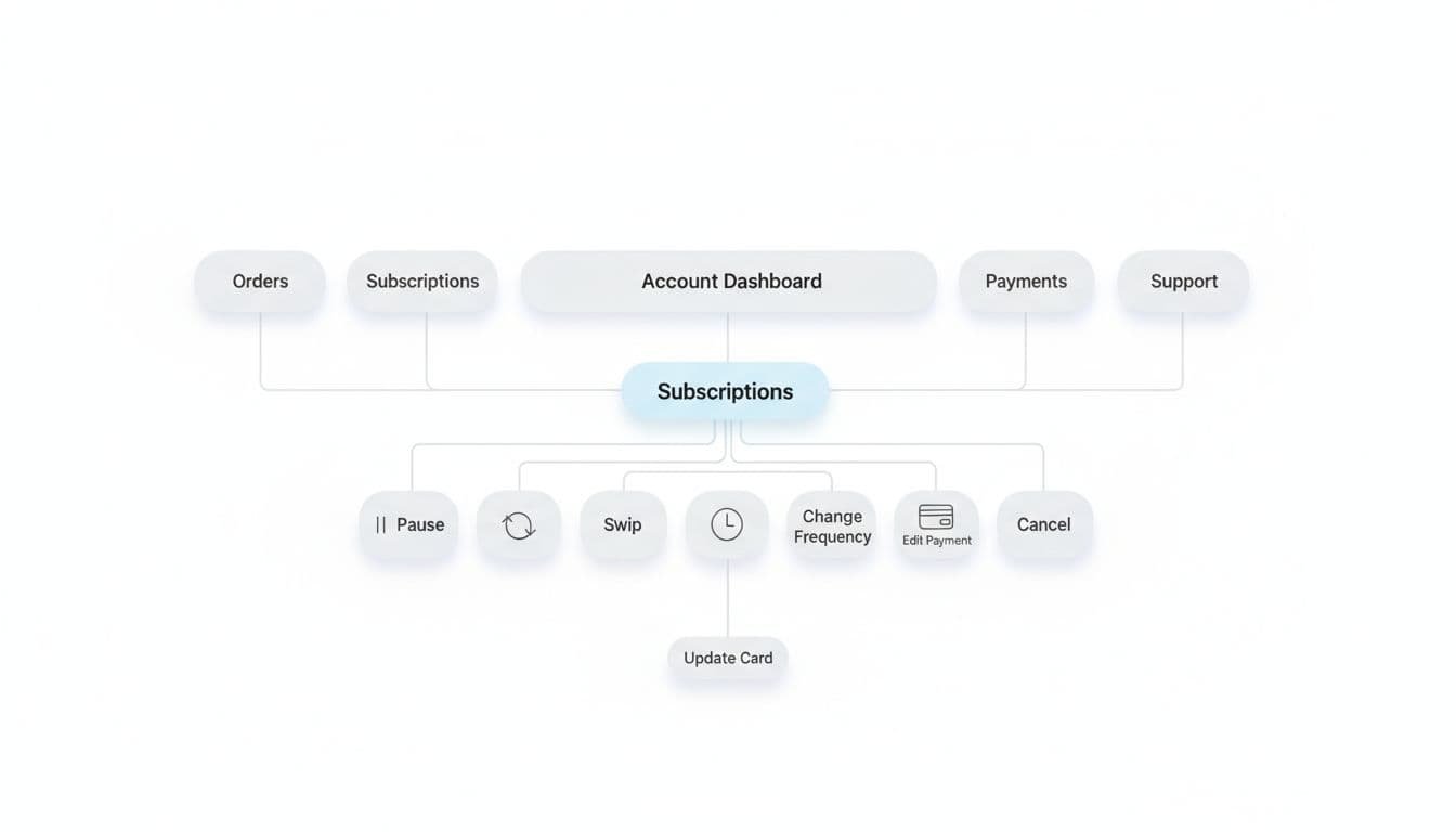
From the customer perspective, separate “subscribe” from “save.” Customers are agreeing to a future schedule, not a discount. So make the schedule visible everywhere: in cart, at checkout, in confirmation, and inside the account page. If you hide the next ship date, churn shows up as angry support tickets.
Next, design subscription editing like a control panel. The core actions should be obvious and fast: pause, skip next, change frequency, swap product, update address, update payment, and cancel. Put the next charge date and next shipment items at the top, clearly communicating system status, with a clear “What happens if I change this?” explanation.
Subscription experiences also improve when they use purchase history. For example, suggest switching a one-time reorder into a subscription only after a customer has bought twice, or when reorder cadence matches a schedule. This matches the broader shift toward subscription-informed UX described in how subscription data shapes ecommerce UX.
Avoid the common pitfalls that quietly raise churn. Avoiding these aligns with classic usability heuristics:
- Dark patterns: Hiding cancel, guilt text, or adding extra steps only for cancellation.
- Confusing edits: “Skip” that actually pauses, or frequency changes that also change price.
- Forced account creation: Don’t require a password reset just to adjust a shipment.
- Silent failures: Payment retries without clear customer actions and timelines.
Mini checklist for subscription management:
- One screen answers “what’s next?”: next ship date, items, total, and address.
- Edits show outcomes: “Skipping moves your next order to Apr 18.”
- Save options are honest: offer pause or skip before cancel, but always allow cancel.
- Support is contextual: link to relevant help from the subscription screen, not a generic FAQ.
KPIs to watch: subscription attach rate, subscription churn, pause rate, skip rate, and save rate (percent of cancel attempts that convert to pause/skip/frequency change). These metrics should inform a robust A/B testing strategy to refine the subscription experience over time. Track events like subscription_attach_click, subscription_start, subscription_skip, subscription_pause, subscription_cancel_start, subscription_cancel_complete, and subscription_save_offer_accepted.
Account pages that sell by being useful (and measurable)
Most account pages are treated like admin. In reality, they’re a repeat-purchase storefront for your best customers.
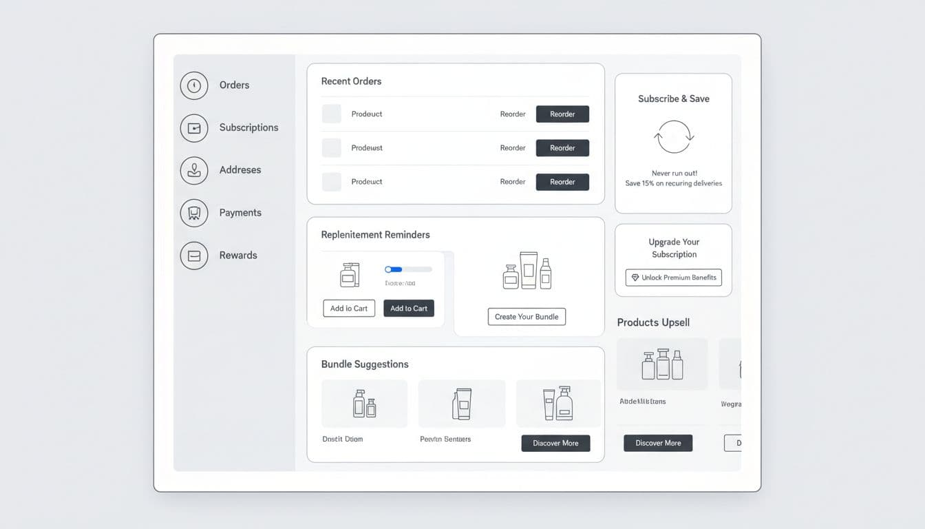
A selling account page has three traits: it prioritizes tasks, it remembers context, and it gives customers a reason to return. The tone of the dashboard relies on effective UX microcopy. Put “Reorder” and “Track order” at the top because those are high-intent actions. Include order history filters to help users find past purchases quickly. If your post-purchase experience is weak, fix tracking first, because trust drives the second purchase. See order tracking UX to reduce WISMO tickets for patterns that keep customers out of support.
Then add revenue modules that feel like help:
- Personalized suggestions for replenishment reminders based on last purchase date (with snooze).
- “Buy again” shelf with last 5 items and quick quantity edits.
- Personalized suggestions for bundle suggestions that match past orders, not generic best-sellers.
- Subscribe-and-save prompts tied to real cadence, with clear control.
Use this table to keep measurement honest and consistent across teams:
| KPI | What it answers | How to measure (example) |
|---|---|---|
| Repeat purchase rate | Are customers coming back? | % customers with 2+ orders in 90 days |
| Reorder conversion | Does the reorder path work? | reorder_purchase / buy_again_click |
| Subscription attach rate | Are subscriptions growing? | subscription_start / eligible checkouts |
| Churn | Are people leaving subscriptions? | cancels / active subs (monthly) |
| Save rate | Do save offers help? | save acceptances / cancel starts |
| Time-to-reorder | How long until they buy again? | median days from delivered to reorder |
Event tracking suggestions: instrument module impressions and clicks on the account page, not just purchases. Track account_dashboard_view, reorder_module_impression, reorder_button_click, bundle_upsell_click, subscription_cta_impression, and subscription_cta_click. Also capture failure reasons like payment_update_required and address_invalid.
These patterns, identified through user research methods and product teardown analysis of leading e-commerce sites, inform a practical roadmap to ship improvements without boiling the ocean:
| Quick wins (1 to 3 sprints) | Longer-term (1 to 2 quarters) |
|---|---|
| Add “Buy again” to order history and confirmation | One-tap reorder with stored payment and address |
| Create a “Reorder” module in account dashboard | Personalized replenishment timing model |
| Make subscription actions visible (pause, skip, cancel) | Full subscription swap and bundle builder |
| Reduce forced logins with magic links or OTP | Unified post-purchase hub (tracking, returns, reorder) |
| Add tracking for reorder and subscription events | Experiment platform for retention flows |
Final QA checklist (reorder, subscriptions, account pages)
- Reorder works on mobile with large tap targets and fast load time.
- “Buy again” preserves variant, size, and quantity by default.
- Out-of-stock paths offer substitute, notify, or remove, never a dead end.
- Guest reorder has a secure option (OTP or magic link), no forced passwords.
- Subscription pages clearly show next ship date, items, and total cost.
- Pause, skip, and frequency change are easy to find and explain outcomes.
- Cancellation is available in the same area, without extra friction.
- Payment update flows are clear, with retry timing and what happens next.
- Account dashboard prioritizes reorder and tracking over low-use settings.
- Tracking includes impressions, clicks, completion, and key error reasons.
- KPIs are defined once, then used consistently across dashboards.
- Support links are contextual, and self-serve actions reduce contacts.
- Accessibility considerations (e.g., screen reader support for reorder buttons).
Conclusion
Following interaction design best practices, repeat revenue grows when customers feel like you remember them. Focus your reorder flow UX on shortcuts to align the interface with the underlying user intent of getting a task done quickly, then make subscriptions feel safe to manage. Finally, turn the account page into a useful home base for digital interface navigation with measurable modules. Ship one improvement, instrument it, then let real customer behavior tell you what to fix next. Capture the outcomes in design rationale documentation for future team alignment.