
VIN Lookup UX That Prevents Wrong Auto Parts Orders
A VIN lookup can fail even when the data is correct. If the interface is clumsy, buyers guess, skip steps,...
Blanket Order Release UX for B2B Account Portals
Blanket orders look simple on paper. In a portal, they can turn into a mess of dates, quantities, approvals, and...

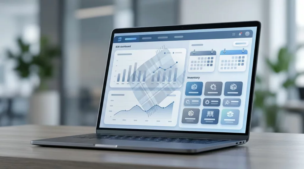
Open Orders Dashboard UX for B2B Account Portals
B2B buyers don’t open an account portal to browse. They open it because they need an answer fast. When the...
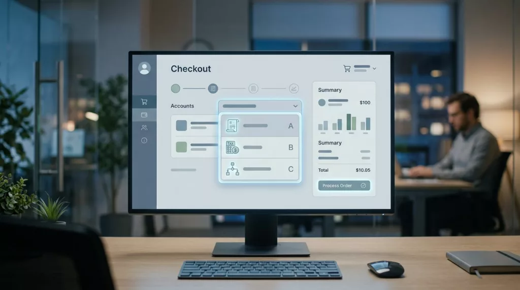
Bill-To Account Selector UX for B2B Checkout
A wrong bill-to account can send an order to the wrong tax profile, the wrong invoice queue, and the wrong...

Core Charge Messaging for Parts Product Pages
A product page can look polished and still lose the sale when the core charge appears too late. Shoppers spot...
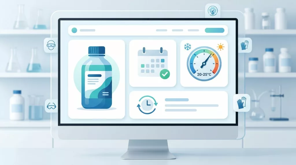
Shelf Life Messaging UX for Chemical Product Pages
Chemical buyers rarely leave because the price is a little high. They leave when they cannot tell whether the product...
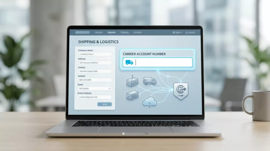
Carrier Account Number Field UX for B2B Checkout
A small field can stall a B2B order when it carries freight billing details, carrier rules, and buyer trust at...

Case Pack Selector UX for Wholesale Product Pages
A wholesale buyer can abandon a page in seconds if the pack math feels unclear. The problem is rarely price...

Product Configurator UX for Custom B2B Product Pages
Custom B2B pages fail when buyers have to guess. One unclear field, one hidden rule, or one surprise cost can...

B2B Return Authorization UX in 2026
A B2B return can touch procurement, warehouse ops, contract pricing, and finance before it ever reaches a dock. That is...