

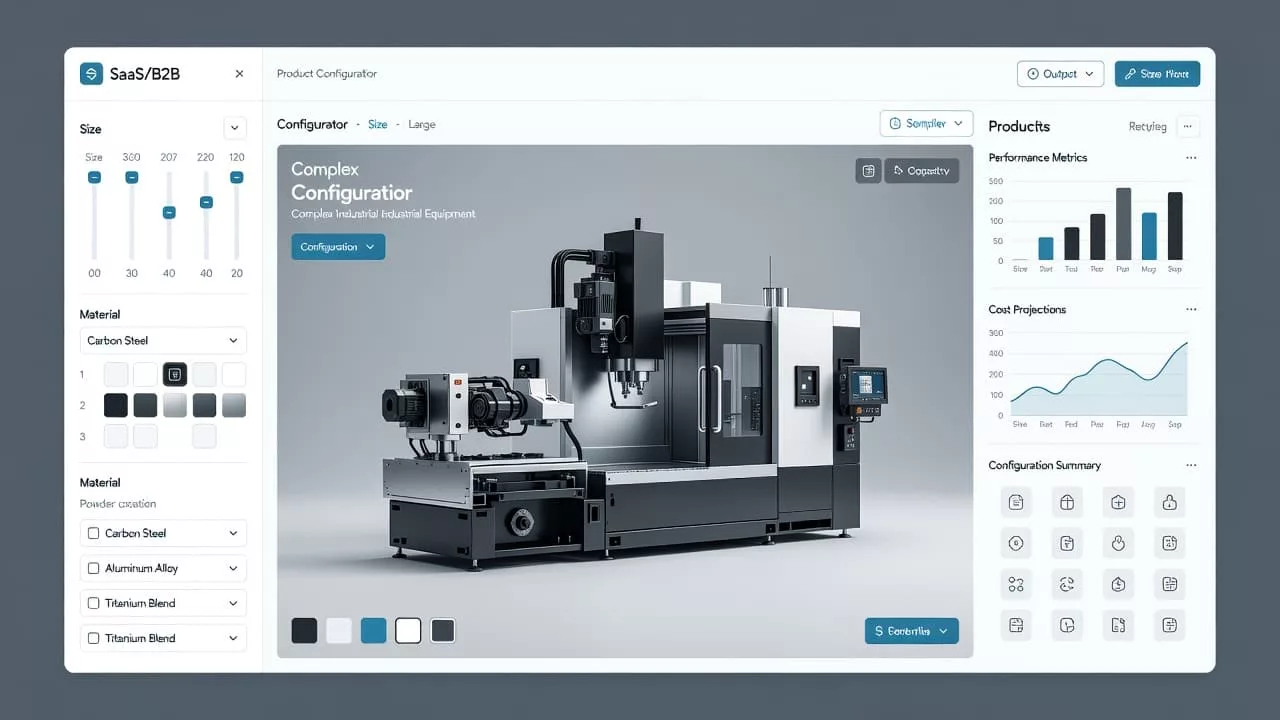
Custom B2B pages fail when buyers have to guess. One unclear field, one hidden rule, or one surprise cost can turn a ready order into a stalled one.
Strong product configurator UX removes that friction before it starts. It gives buyers a clear path, shows tradeoffs early, and makes complex choices feel manageable.
That matters because B2B buyers are not browsing for fun. They are checking fit, specs, lead times, and budget, often with other people waiting on the decision.
What B2B buyers need before they configure anything
Before someone clicks a material, size, or add-on, they need confidence. They want to know the product can work for their use case, and they want to avoid wasting time on dead ends.
A good custom page answers a few core questions fast:
- Can this product fit our spec?
- What happens to price or lead time when I change this?
- Which choices are allowed together?
- How do I save or share this configuration with my team?
When those answers sit in plain sight, the page feels useful instead of heavy. The buyer can move forward with less backtracking, and that keeps the order moving.
B2B pages also need to respect different roles. One person may care about technical fit, while another cares about budget approval. If the page only speaks to one of them, the other has to fill in the gaps later.
Build the flow around the first real decision
The first screen should focus on the choice that changes everything else. If size affects material, price, or compatibility, start there. If format decides the rest, lead with format.
That first decision acts like a fork in the road. Once the buyer picks it, the rest of the page can narrow around a smaller set of valid options.
These patterns make the flow easier to read.
| Page pattern | Better choice | Why it helps |
|---|---|---|
| Every option on one screen | Group options into stages | Reduces overload |
| Hidden rules | Show limits next to controls | Prevents dead ends |
| Static price | Update totals as choices change | Builds trust |
| No progress cue | Show where the buyer is | Lowers drop-off |
Progress indicators help too. A clear step count or section label tells the buyer where they are and what comes next. That matters on long custom orders, where people often pause and return later.
The layout should also match the order of real decisions. If a buyer must choose a base model before accessories, the page should reflect that order. When the UI follows the mental model, the buyer does less guessing.
For broader guidance on layout, hierarchy, and support content, UX-centric product pages shows how page structure shapes attention and action.
Make constraints visible before they become errors
Complex products break when the page hides rules until the last step. Buyers can handle complexity. They cannot handle surprise.
Buyers can tolerate complexity. They won’t tolerate surprise.
A strong configurator shows limits near the input that creates them. If a finish only works with one size, say it there. If a feature removes another option, make the conflict visible before the buyer clicks.
This is where clear error prevention matters. Disabled options should still explain why they are unavailable. If a choice is blocked, the page should name the reason in plain language, not technical shorthand.
When the product includes engraving, dimensions, file uploads, or other custom inputs, product personalization UX is a useful reference point for keeping the process accurate without making it feel rigid.
The best pages also use smart defaults. Start with the most common choice, the in-stock option, or the lowest-risk path. That gives buyers a working setup before they make changes.
If an error does happen, the page should point straight to the problem. Put the message near the field, keep the language short, and say how to fix it. Long alerts and vague red banners slow people down.
Show price, proof, and next steps with no guesswork
B2B buyers need more than the product itself. They need a reason to trust the number on the screen.
Price should update as the configuration changes. Lead time should do the same. If an upgrade adds cost or extends delivery, the buyer should see it right away. Hiding that information until checkout creates friction at the exact point where trust matters most.
These interface pieces carry the most weight.
| Element | What it should show | Why it matters |
|---|---|---|
| Live price | Cost after each selection | Reduces surprise |
| Lead time | Production or delivery impact | Helps internal planning |
| Spec summary | Chosen dimensions, materials, options | Makes review easy |
| Final preview | The configured product as it will ship | Confirms the choice |
A strong summary panel helps too. It gives the buyer a quick scan of everything selected, so they can compare options or send the build to a colleague. That is useful on complex purchases, where approval often happens in stages.
The page should also offer a next step that matches the buyer’s stage. Some people want to save a quote. Others want to download specs or share the configuration. A few want to send the order to sales for a manual review.
If the product page needs support content, ecommerce product page design strategies can help connect visuals, copy, and structure without crowding the main action.
Common UX mistakes that slow B2B buying
Most weak configurators do not fail because they look bad. They fail because they make buyers work too hard.
A few mistakes show up again and again:
- Asking for every detail before the buyer sees any value
- Using vague labels like “custom” or “premium” without context
- Hiding price, taxes, or lead time until the final step
- Resetting selections when the page refreshes
- Designing the whole flow for desktop and treating mobile as an afterthought
Each one adds uncertainty. Each one gives the buyer a reason to stop and revisit the order later.
Session loss is another quiet problem. If the buyer leaves the page and comes back, the configuration should still be there. Saved state is not a bonus. On complex orders, it is part of the job.
Testing with real buyers matters as well. Internal teams often know the product too well. They skip over unclear labels because they already understand them. Outside users do not get that advantage.
The best test is simple. Watch someone complete a custom order without help. Where they pause, hesitate, or ask a question, the UX needs work.
Conclusion
Strong product configurator UX does one job well. It removes uncertainty while the buyer is still paying attention.
When the page shows choices, rules, price, and proof in the right order, the process feels credible. The buyer can move with less friction, and the page does more of the selling.
That is the real goal for custom B2B product pages. Give people enough clarity to decide, then show them they chose right.