
Unit Price Labels for Clearer Ecommerce Comparisons
A larger pack can look like better value before shoppers notice how much it contains, making value comparison difficult. Consistent...
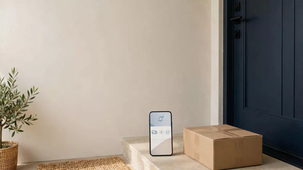
Delivery Exception Messaging That Cuts “Where Is My Order?” Contacts
A delivery exception can turn one delayed parcel into several support conversations. If you wait for the customer to spot...
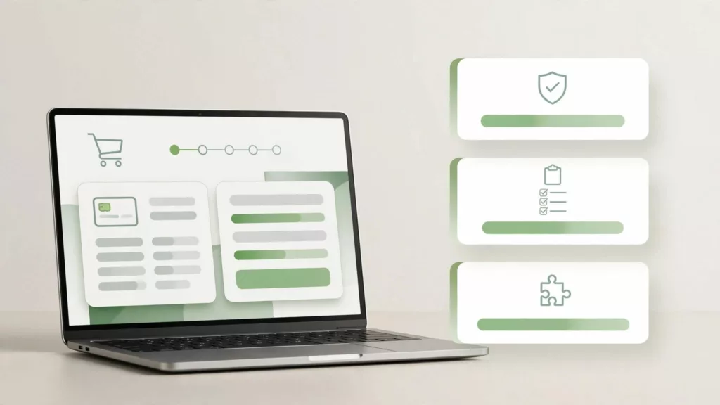
Shopify Checkout Extensibility: An App Review Checklist
A checkout app can look perfect in a demo, yet still fail to appear where your store needs it or...
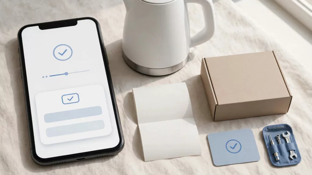
Product Registration UX That Makes Warranty Claims Easier
A customer who registered a product shouldn’t have to hunt for its product identifier again when it breaks. Good product...

Refund Status UX for Fewer Ecommerce WISMO Contacts
A customer can see “Refund issued” on your order page and still see no money in their bank account. If...
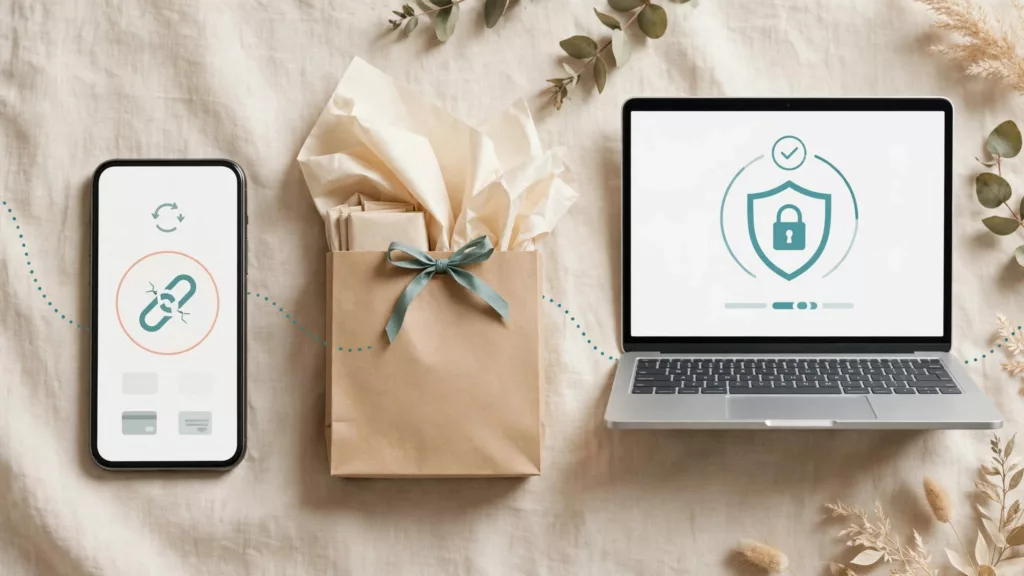
Checkout Session Expiration UX That Prevents Lost Orders
A shopper returns to pay, opens the checkout link you sent, and finds that the session has expired. Their products...

Cart Merge UX That Respects Guest and Account Shoppers
A cart can hold more than products. An anonymous cart captures a shopper’s choices, budget, promotion, and intent to buy...

Ecommerce Search Merchandising Rules for Product Discovery
A shopper who uses site search is often close to buying, yet a poor result can send them elsewhere in...
Promotion Eligibility UX That Prevents Discount Confusion
A discount should reduce the price, not create a second shopping task. Yet shoppers often see a promotion, add an...

3D Secure UX That Reduces Payment Abandonment
A payment authentication screen can interrupt a purchase at the exact moment a shopper is ready to pay. Strong 3D...