

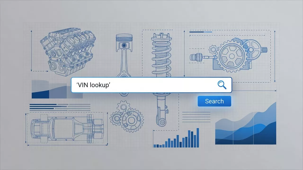
A VIN lookup can fail even when the data is correct. If the interface is clumsy, buyers guess, skip steps, or pick the first part that looks close enough.
That is how wrong auto parts orders begin. Strong VIN lookup UX gives shoppers a clear path from vehicle ID to fitment confidence, so they can buy the right part the first time. The best flows remove doubt before the cart ever appears.
Where VIN lookups go wrong
Most VIN problems start with friction, not with the VIN itself. A shopper may paste a number from a text message, type from a registration card, or scan from a windshield. If the page rejects spaces, hides the next step, or asks for extra judgment too early, the user slows down.
That slowdown matters. Buyers do not think in form fields. They think in one question: does this part fit my vehicle?
A page that makes them work for the answer invites errors. Some people will change a digit to get past validation. Others will choose a nearby part because the lookup feels uncertain. A few will leave and ask support to confirm fitment later.
The page should treat the lookup as a confidence check, not a hurdle. When the interface is unclear, the buyer ends up doing the catalog’s job.
Design the VIN entry flow for speed and confidence
Start with one clear field and plain language. “Enter VIN” is enough in most cases. Add a short hint that says where the VIN usually lives, and keep it close to the field so the user does not hunt for help.
Make paste work cleanly. Accept spaces, auto-format the input, and keep the cursor steady. On desktop, a buyer should be able to paste a 17-character VIN in one move. On mobile, the field should open the right keyboard and stay easy to tap.
If you offer camera capture, treat it as a shortcut. It should not replace manual entry. People often scan in poor light, through glass, or from a photo, so the user needs a quick way to edit the result.
Small design choices make a big difference:
- Show the character count early so users know when the entry is complete.
- Accept uppercase and lowercase input without complaint.
- Tell users what changed if the system removes spaces or symbols.
- Keep the main action button disabled until the VIN is ready.
Do not ask for make, model, year, and engine before the VIN lookup. That creates duplicate work. The VIN already carries the vehicle context, so the form should not make people rebuild it by hand.
Make the fitment result easy to trust
The result page should answer one question fast: will this part fit this vehicle? If the answer takes too long, the page is failing.
Show the decoded vehicle summary near the top of the result. Year, make, model, engine, and trim should be easy to scan. The buyer should not scroll to find the vehicle they just entered. Keep the fitment badge close to the add-to-cart area, because that is where the decision happens.
A good result page makes the fit feel obvious. A weak one makes the user compare tiny details across several cards.
| Pattern | What the buyer sees | Why it lowers errors |
|---|---|---|
| Vehicle summary bar | Year, make, model, engine, trim, and VIN confirmation in one place | It reduces second-guessing |
| Clear fitment badge | “Fits”, “Does not fit”, or “Needs review” | It stops false confidence |
| Reason for match | Notes like engine code, body style, or drivetrain | It explains why the part is correct |
| Filtered part list | Only compatible parts for the decoded vehicle | It keeps wrong options out of view |
The takeaway is simple. If the page shows every near match, the buyer has to become the catalog. If it only shows compatible items, the choice gets much easier.
A short note under the fitment badge can also help. Something like “Confirmed for 2.5L, AWD” gives the shopper a reason to trust the result without reading a spec sheet.
Catch errors before they become cart mistakes
Error states need more than a red border and a generic message. A bad VIN entry, a partial decode, or a catalog mismatch each calls for a different response.
Start by telling the user what happened. Then show what the system accepted. Finally, offer the next move. If the VIN has one wrong character, say so. If the lookup found multiple valid trims, explain the choice instead of forcing a restart.
If the message does not tell the buyer what to do next, it is a dead end.
Good error handling also saves support time. When the interface explains the problem clearly, people do not need to open a ticket or call a counter rep. They can fix the issue on the spot.
A few error patterns are worth planning for:
- The VIN has the wrong length.
- The scan picked up a blurred digit.
- The catalog cannot map a trim with complete confidence.
- The vehicle has multiple compatible engines or body styles.
Each case needs a short, direct response. Avoid vague lines like “something went wrong.” That phrase hides the real issue and pushes the user into trial and error.
Logging matters too. If the same VIN error keeps appearing, the problem may be the helper text, the camera flow, or the field itself. The data will tell you where the friction lives.
Give other lookup types their own path
A strong VIN flow works best when it stays focused. Still, many shoppers already have a part number or a serial number, and they should not be pushed through a vehicle decode first.
That is where clear path design helps. Keep each identifier visible, label it in plain language, and avoid burying the right route under “advanced search.” A buyer with a known number wants a direct answer, not a vehicle quiz.
If you already support other identifiers, compare the flow with serial number lookup design guidelines and optimizing B2B part number search. A user with a known number needs speed, while a VIN user needs fitment context. Mixing those jobs makes both paths slower.
Tabs can work when the labels are clear. A single search bar with vague hints usually does not. The user should know at a glance which path matches their task.
This also helps merchandising. When lookup types stay separate, the results can stay accurate. That reduces confusion, keeps support calls down, and makes repeat orders faster.
Test the flow with real buyers
Internal demos rarely show where a VIN lookup breaks. Real users pause in strange places, enter copied data with hidden spaces, and switch between vehicles faster than most teams expect.
Watch people use the flow on mobile and desktop. Ask them to paste a VIN from a message, scan one from a windshield, and recover from one wrong digit. Then watch what they do when the result shows a fitment warning.
The most useful signals are often small:
- They backspace right after pasting.
- They stop to reread the result card.
- They open support chat before adding to cart.
- They compare two almost identical parts.
Those moments point to confusing labels, weak validation, or a result screen that asks too much. Fix the biggest source of hesitation first.
Measure the numbers that matter too. Track lookup completion, return reasons tied to fitment, and support contacts that mention the wrong part. If those numbers stay high, the flow still leaves room for mistakes.
Fewer Wrong Orders Start at the VIN Field
Wrong auto parts orders rarely begin with bad intent. They start when the page makes the buyer guess. A strong VIN lookup UX gives people a clear entry, a result they can trust, and an error state that keeps them moving.
That is what lowers returns and cuts support work. It also makes the buying process feel calm, which matters when the customer is trying to fix a vehicle fast. When the lookup does its job well, the rest of the order feels easier.