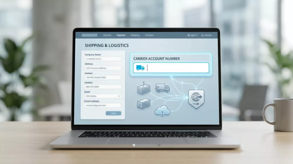

A small field can stall a B2B order when it carries freight billing details, carrier rules, and buyer trust at the same time. If the carrier account number field is vague, hidden, or poorly timed, the order often moves from checkout to manual review.
B2C checkouts rarely ask for this step. B2B checkouts often need it for third-party billing, contract shipping, and freight collect orders, so the form has to feel clear and specific.
The goal is simple, make the field easy to find when it matters, and invisible when it does not.
Why the field matters in B2B checkout
The carrier account number is not just another form input. It tells the carrier who pays, which billing rules apply, and whether the shipment can be priced correctly.
When that number is wrong, the impact spreads fast. Shipping rates can fail, the warehouse may need a manual fix, and finance may see the wrong account billed. Buyers notice that friction, even if they do not see the backend work.
That is why this field affects conversion. A buyer who has to pause and search for an account number may stop the order and come back later, or call a rep before placing it. Clear shipping logic keeps the checkout moving.
It also affects trust. Business buyers expect a checkout to understand their account structure. If the form treats every shipment like a consumer parcel, the experience feels off.
When shipping options depend on contract terms, the field belongs near the choice that triggers it. The same principle applies in shipping option selector UX, where the buyer should see rate, speed, and billing source together.
Some platforms need the account number before they can return a carrier quote. Zenkraft’s B2B shipping costs docs show how a custom field can feed shipping requests tied to the carrier.
Show it only when shipping rules need it
The field should appear only when the selected shipping method needs carrier billing. That usually means “Bill my account”, “Third-party billing”, or a freight option tied to customer-owned rates.
If the buyer chooses standard prepaid shipping, hide the field. Asking for it too early turns a special-case detail into extra work.

That timing matters even more when one order splits into several shipment groups. In those cases, the account number may belong to one shipment but not another, so the field has to follow the shipment logic. Multi-address shipping UX is a good model for that kind of structure.
Branch rules can change the setup too. If one warehouse ships on a different contract than another, branch location selector UX helps surface the right billing rule before the buyer enters the field.
Show the field only on the shipping path that needs it. That keeps the form short and the rule visible.
If the buyer switches from a bill-to-account method to a prepaid one, remove the field and explain why. A short note like “This shipping method does not use a carrier account number” prevents confusion.
Labels and helper text buyers can understand
A good label matches the words the buyer already uses. A poor label makes them guess whether you want a carrier ID, a freight code, or an internal reference number.
The label should fit the shipping context. This table shows the common choices and when each one works best.
| Label | Best use | Why it works |
|---|---|---|
| Carrier account number | Multi-carrier and third-party billing | Clear for buyers who work with UPS, FedEx, DHL, or similar carriers |
| Shipping account number | General B2B checkout flows | Easier to understand when the buyer is not thinking in carrier terms |
| Freight account number | LTL and pallet shipping | Matches freight-heavy orders and warehouse language |
| Bill-to carrier account | Contract billing flows | Makes the payment rule clear right in the label |
The right label depends on the order type. If your buyers move between parcel, freight, and split fulfillment, use the term that fits the selected shipping method, not just the one your team uses internally.
Helper text should answer the buyer’s next question fast. Good examples include:
- “Enter the account number your carrier assigned.”
- “Use the shipping account tied to this method.”
- “If your company pays freight through a shared account, enter that number here.”
- “Only needed for third-party billing.”
Avoid placeholder text that disappears when the buyer starts typing. A visible label and short helper line give better support, especially on mobile and in rushed office settings.
If a branch, division, or ship-to location changes the account, say so in the helper text. Buyers should not have to guess whether the field belongs to their team, their site, or the shipping department.
Validation copy that fixes problems fast
Validation is where many checkouts get blunt. A generic “Invalid number” message does not help a buyer recover, and it creates more support work than it solves.
Start with the format only if the carrier needs a strict pattern. Some accounts are numeric, while others include letters or hyphens. Match the rule to the carrier, not to a guess.
Then validate the business rule. The number may belong to the wrong carrier, the wrong branch, or an account that is no longer active. If the buyer picked UPS but entered a FedEx account, the message should say so plainly.
A few strong examples:
- “Enter a valid UPS account number for this shipping method.”
- “This account number does not match the selected carrier.”
- “Ask your shipping admin to add this account to your profile.”
- “This account is not enabled for third-party billing.”
Keep the error near the field and keep the typed value in place. Buyers should be able to correct the number without retyping it from scratch.
Some checkout systems also pass shipment IDs or order IDs as carrier references. Kibo’s shipping carrier settings show how those reference fields can travel with the shipment data.
The best validation feels precise, not harsh. It tells the buyer what failed, why it failed, and what to do next.
Test the field against real shipping scenarios
This field should be tested with actual B2B order paths, not only with clean demo data. Real buyers switch shipping methods, split orders, and move between accounts more often than test scripts usually expect.
A useful test set includes these cases:
- A buyer knows the account number and enters it on the first try.
- A buyer changes the shipping method after typing the number.
- A split order sends one shipment to a different destination.
- A branch-specific order uses a different carrier account.
- A mobile buyer enters the field with a saved browser keyboard and limited screen space.
Watch for three things during testing. First, does the field appear at the right moment? Second, does it disappear or reset correctly when the shipping method changes? Third, can the buyer still finish checkout without calling support?
Track the same metrics after launch. Field completion rate, shipping rate failures, manual order edits, and support tickets will tell you whether the UX works. If those numbers improve, the field is doing its job.
When branch rules drive the account choice, the field should follow those rules cleanly. The same thinking behind branch location selector UX can keep shipping logic visible instead of buried.
Conclusion
The best carrier account number field feels like part of shipping, not a hurdle before payment. It appears only when needed, uses plain language, and gives buyers a clear way to recover from mistakes.
That matters because B2B checkout has to protect both conversion and operations. A clear field reduces support calls, keeps freight billed to the right account, and helps buyers trust the order flow.
When the next buyer enters a carrier account without hesitation, the UX has done its work.