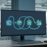

A B2B return can touch procurement, warehouse ops, contract pricing, and finance before it ever reaches a dock. That is why a weak portal turns into emails, phone calls, and manual exceptions fast.
In 2026, buyers expect to start a return inside the account portal, see their options right away, and know what happens next. The best return authorization UX makes that path clear without burying policy or approvals.
Why B2B return authorization feels different
B2C returns usually revolve around one shopper, one card, and one delivery address. B2B returns often involve parent accounts, subaccounts, negotiated terms, and people who do not all have the same permissions.
Here is the difference in practice:
| Area | DTC return flow | B2B return flow |
|---|---|---|
| Account structure | One consumer account | Parent account, subaccounts, buyer roles |
| Pricing outcome | Refund to card | Credit memo, invoice deduction, replacement |
| Eligibility | Simple return window | Contract terms, ship-to site, product class, serial or lot checks |
| Approval | Often automatic | Often reviewed by procurement, ops, or quality |
| Fulfillment | Parcel return label | Freight pickup, dock receiving, cross-dock, or disposal |
| Visibility | Basic order status | RMA status, approval stage, credit timing, next action |
That mix changes the UX. The form is not the job. The job is helping the right person make the right request with the least back-and-forth.
If the portal cannot explain eligibility in one screen, buyers will push the work into email and spreadsheets.
Research patterns for returns often focus on consumer stores, but the same clarity matters here. Baymard’s order returns examples show how visible entry points and progress cues reduce hunt-and-peck behavior, which is useful in any return flow.
Build eligibility around account structure
Most B2B return friction starts before the user submits anything. The portal asks the wrong person, or it asks the right person with the wrong context.
A buyer might have permission to place orders, but not to authorize returns. A plant manager might approve damaged goods, while procurement handles credits. A distributor may also need ship-to level rules, because one branch can return an item while another cannot.
The interface should reflect that structure. Preload the account, the role, and the sites tied to the user. Then show only the orders and items that fit the current rule set.
A solid intake screen should already know:
- the buying account and ship-to location
- the original PO number
- order lines and quantities
- contract terms that affect eligibility
- serial, lot, or batch details when they matter
This is where plain language matters. Hide the logic too long, and the user assumes the portal is broken. Show it too early, and the screen feels noisy. The right balance is a short eligibility summary next to each line item, with a clear reason when something is blocked.
That approach fits the broader thinking behind returns and exchanges portal UX, where policy belongs at the moment of action, not in a buried help page.
Make the portal feel like a control center
A strong B2B portal behaves like a control panel. Users should not have to guess where to begin.
The entry point should sit in order history, account navigation, and invoice views. It should also be visible on the order detail page, where the return decision starts. If the buyer needs to search support docs first, the experience already lost time.
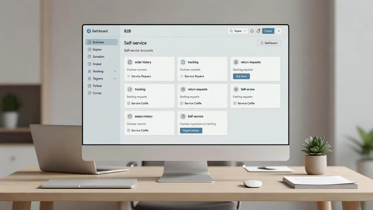
The portal should answer four questions fast, even on a phone:
- Can I return this item?
- Who needs to approve it?
- What do I do next?
- When does the credit land?
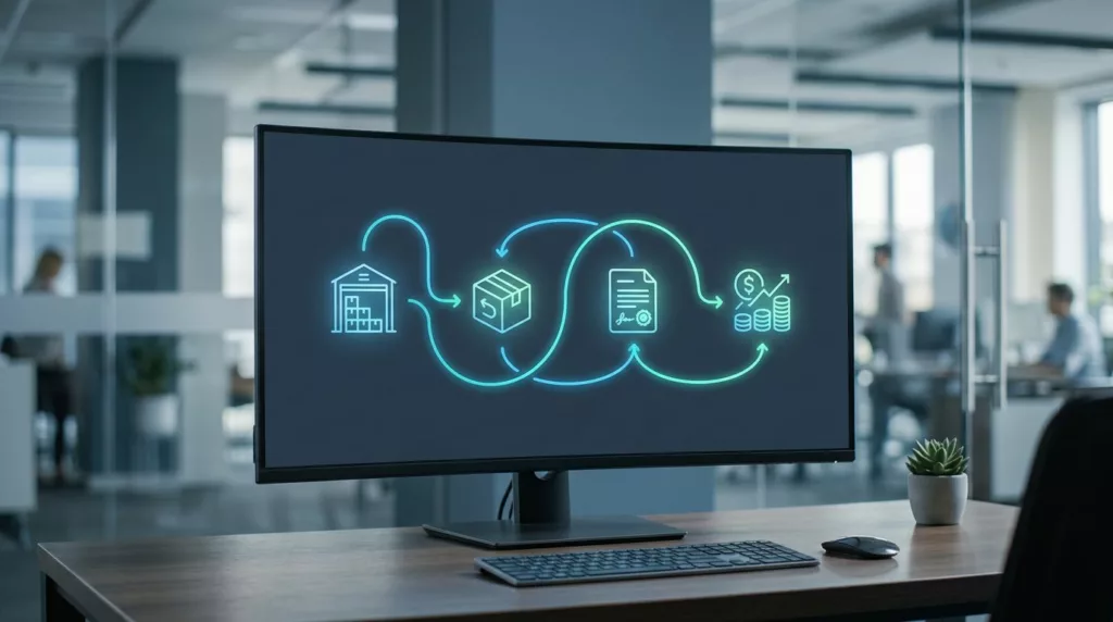
That is why prefilled data matters so much. Order number, SKU, quantity, warehouse, and terms should already be there. The user should edit only what changed.
A useful pattern is the status card. It shows the RMA number, current stage, owner, and expected next step. It can also show whether the user needs to print a label, wait for pickup, or attach photos.
For layout cues, Baymard’s order returns examples show how visible entry points and clear progress states reduce friction. In B2B, that same visibility also lowers internal follow-up.
The same idea applies to the first returns page. If the front door is clear, the rest of the flow feels manageable. A good example is self-service returns page UX, where users get the next step before they ask for help.
Design approvals and exceptions without delays
Approvals are where many B2B return flows stall. The user submits the request, then the portal turns silent while someone in operations checks a spreadsheet.
That delay is avoidable. The approval screen should show the reason for review, the person or team who owns it, and the decision that follows. If the request needs photos, a mismatch note, or an inspection record, the portal should ask for that up front.
A clean approval flow usually includes:
- the exact rule that triggered review
- the owner of the current step
- the missing information, if any
- the expected outcome after approval
Partial approvals matter here too. A buyer may return two items and keep one. A warehouse may accept damaged goods but reject opened packaging. A finance team may issue credit for one line and replacement for another. The interface should not force an all-or-nothing outcome if the business rule does not require one.
Complex workflows like this also show up in other B2B tools. That is why UX/UI design for B2B sales software is a useful reference point, especially when account roles, approvals, and audit trails all need to stay visible at once.
Automation helps when it routes, not when it hides. Rules can send a high-value return to finance, a quality issue to operations, and a defective shipment to the service queue. The user still needs to see why the request moved.
Common failure points that still break return flows
Most broken B2B return portals fail in the same few places. They either ask too much, show too little, or hide the business rule behind generic labels.
The most common failures are:
- a single generic return form for every account
- no mention of credit timing or invoice impact
- missing support for lots, serials, or PO-linked orders
- status screens that stop at “submitted”
- no audit trail for approvals and partial decisions
- labels and pickup options that ignore freight reality
These are not small defects. They create support tickets, slow credits, and trust issues with buyers who expect clear process control.
The fix is usually not a full rebuild. Start with the highest-friction path, then reduce the number of manual handoffs. In many teams, that means order history, eligibility checks, approval routing, and status visibility.
When those pieces work, the rest of the portal gets easier to improve. When they do not, every new feature adds noise.
Conclusion
A good B2B return authorization flow does more than collect a request. It helps the right account, with the right permissions, move through a decision that already matches the business rules.
The strongest portals in 2026 make eligibility, approval routing, and status visibility obvious. They also keep credit timing, account hierarchy, and operational limits in view, so buyers do not have to ask for the same answer twice.
If the portal feels like a control center instead of a ticket form, returns get faster and support gets quieter. That is the standard B2B buyers now expect.