

A wholesale buyer can abandon a page in seconds if the pack math feels unclear. The problem is rarely price alone, it’s the gap between how products are sold and how the page asks people to buy them.
A strong case pack selector closes that gap. It shows pack size, quantity, and pricing in one place, so buyers can order with confidence instead of counting on memory or a calculator.
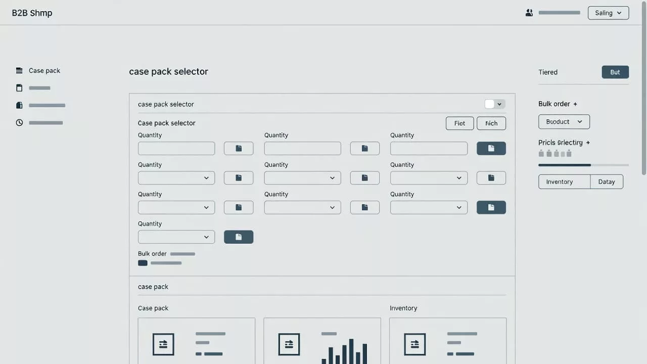
Why wholesale buyers need a clear case pack selector
Wholesale shoppers usually know what they want before they land on the product page. What slows them down is figuring out how the product is sold.
A retail page can get away with a simple quantity box. A wholesale page can’t. Buyers need to know whether they are ordering by each, inner pack, case, pallet, or mix-and-match bundle. If that structure is unclear, the page creates work at the exact moment it should be reducing it.
That’s why the selector matters so much. It acts like the front desk for the product. When it’s clear, the buyer moves on. When it’s vague, they hesitate, misread the order size, or leave to check with sales.
This matters even more when the same item has different case rules by customer group. A distributor, a retailer, and a food service buyer may all look at the same product, but they may not buy it the same way. The page has to make those differences obvious without making the layout feel crowded.
A clean selector also reduces hidden costs. Fewer order errors mean fewer support tickets, fewer corrections, and fewer shipping fixes. That is good for operations and conversion.
Design the selector around buying behavior
The best selector starts with the order the buyer already has in mind. If the most common action is buying full cases, show that first. If the buyer often chooses between pack sizes, put those choices near the top of the purchase area.
The safest pattern is the one that matches the product’s real rules. A single valid pack size should not look like a choice. Multiple pack sizes should not hide inside a tiny dropdown if buyers need to compare them fast. The interface has to reflect the buying logic, not the catalog structure.
Keep the unit visible next to the selection. A buyer should never wonder whether the number refers to cases, units, or boxes. That small detail prevents a lot of mistakes. It also makes the price feel more trustworthy, because the math is visible instead of implied.
When pricing depends on volume or account-specific terms, the selector should still stay connected to the product page. Buyers should not feel pushed into a separate process just to understand what they are ordering. In those cases, optimizing request a quote UX helps keep the decision in context.
Let pack size, quantity, and price work together
A case pack selector should never act alone. It needs to sit beside quantity and pricing, because those three pieces shape the buying decision together.
If a case contains 24 units and the buyer chooses 6 cases, the page should make 144 units obvious. If minimum order quantities apply, the buyer should see that before clicking add to cart. If price changes by case count, the page should show the total early enough to avoid surprise.
That kind of clarity is especially useful for products with dense specs. Buyers often need the size, material, compliance data, or finish before they commit. Designing scannable product specs helps support that decision without making them hunt through long copy.
If the buyer has to calculate case math in their head, the selector is doing too little.
The best wholesale pages show the relationship between pack size and order total in plain language. They do it near the CTA, not buried below the fold. On mobile, this matters even more. A buyer scrolling on a phone should still see the pack unit, the quantity, and the total cost without extra taps.
A helpful formula is simple: selection first, quantity second, total last. That order gives the buyer a path instead of a puzzle.
Choose the right selector pattern for each product
Different products call for different control styles. A narrow set of rules can work well with a simple selector. A broad catalog with many pack options needs more structure.
Here’s a quick comparison of common patterns.
| Pattern | Best for | Watch out for |
|---|---|---|
| Radio buttons for pack sizes | A few fixed pack options | Can crowd the page if there are too many choices |
| Dropdown for case counts | Larger catalogs with limited space | Hides options if labels are vague |
| Stepper with pack label | Single pack size and repeat orders | Needs strong minimum-order guidance |
| Combined variant and pack selector | Products with size, color, and pack rules | Can feel dense without clear grouping |
The takeaway is simple. The more the product varies, the more the interface needs structure. The fewer the options, the more direct the selector can be.
Avoid splitting pack choice and quantity into separate areas of the page. That forces the buyer to jump back and forth between controls. A better layout keeps the primary buying inputs in one block, with the CTA close by.
For products that require a custom order path, the selector can still stay useful. The buyer may choose a pack size, then request a quote based on volume or account terms. That flow works best when the page makes the next step obvious and low-friction.
Prevent ordering mistakes before they happen
Small details make a big difference in wholesale UX. Clear labels, sensible defaults, and strong error states do most of the work.
A good case pack selector usually gets these details right:
- It uses plain labels like “24 units per case” instead of vague shorthand.
- It shows the minimum order and increment rules beside the field.
- It updates the total units and total price as the buyer changes quantity.
- It blocks invalid combinations before the buyer reaches checkout.
- It explains errors in simple language, without vague system messages.
Defaults matter too. If one pack size is most common, set that as the starting point. If the buyer needs to confirm a choice before adding to cart, make the selected state obvious. The goal is to reduce thinking, not force it.
There’s also a trust angle here. When buyers see the page correct itself in real time, they feel safer placing larger orders. That feeling matters in wholesale, where mistakes are expensive.
Mobile layouts need extra care. Touch targets should be large enough, field labels should stay visible, and totals should not disappear below the fold. When the selector gets cramped, buyers start guessing. That’s when cart errors creep in.
A final check is consistency. The selector, the cart, and the order confirmation should all use the same unit language. If the product page says “case” and the cart says “box,” confusion follows fast.
Conclusion
A strong case pack selector makes wholesale buying feel obvious. It shows the pack, the quantity, and the total in one place, so buyers can act without doing the math themselves.
The pages that convert best are usually the ones that remove uncertainty early. When the selector, pricing, and product data all tell the same story, buyers trust the page and move forward faster.