

A buyer who lands on the wrong unit of measure can place a costly order in seconds. On B2B product pages, that choice affects price, pack size, inventory, and trust at the same time.
That’s why a unit of measure selector is more than a dropdown. It can decide whether a customer buys each, box, case, pallet, foot, meter, pound, or kilogram with confidence, or leaves the page unsure. When the selector is clear, buyers move faster and make fewer mistakes.
Why the selector changes conversion and order accuracy
On a B2B product page, the unit is part of the product itself. A case of gloves, a pallet of tiles, or a meter of cable all carry different meanings, different prices, and often different stock rules.
If the selector is buried or vague, buyers start doing math in their heads. That slows the order and invites errors. A distributor buying fasteners by each should not have to wonder whether the price shown is for a box, case, or single item. A facilities team buying cable by foot or meter needs that answer before they trust the page.
The selector also affects inventory visibility. If stock exists in each but the buyer purchases in cases, the page needs to explain the conversion clearly. Otherwise, the available quantity can look wrong even when the data is correct.
That is why the selector belongs in the same conversation as layout, copy, and trust signals. Strong page structure helps here, which is why best practices for product page UX matter so much on B2B PDPs.
If the selector changes the meaning of the price, treat it like a core control, not a minor dropdown.
Design the selector so the choice is obvious
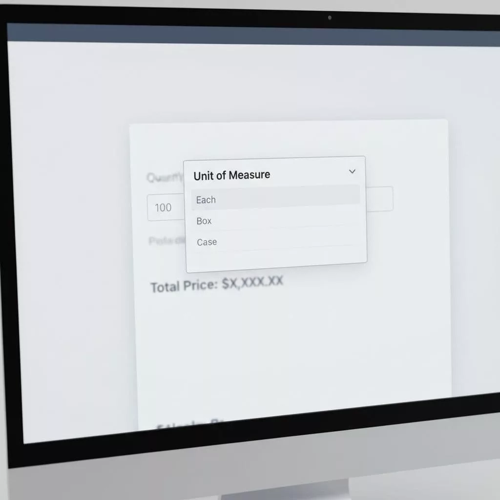
The best selector shows three things fast, the unit, the price, and the effect on quantity. If the buyer picks case, the page should show price per case. If they switch to each, the price should update right away. No guesswork, no hidden conversions.
For a small set of options, segmented buttons or radio buttons work well. A buyer can scan each, box, and case in one glance. For longer lists, a dropdown is cleaner. That often fits products sold by foot, meter, pound, or kilogram, where there may be more valid units and more room for confusion.
Defaults matter too. Start with the most common buying unit for the account or SKU. A regular customer may want case by default, while a sample order might begin with each. A first-time visitor should still be able to spot the current unit without hunting.
The quantity field should stay tied to the selected unit. If the buyer chooses case, the quantity should count cases, not loose items. If the page allows both unit and quantity changes, the control pair needs to feel connected. For a useful pattern comparison on quantity behavior, see quantity field patterns.
The safest rule is simple: keep the selector visible, keep the price update immediate, and keep the label tied to the number.
Patterns that work on real B2B pages
Different products need different controls. A selector that works for one SKU can fail on another, so the page design should match the buying pattern.
| Control type | Best for | Why it helps | Watch-outs |
|---|---|---|---|
| Radio buttons | 2 to 4 units, such as each, box, case | Easy to scan and compare | Takes space on mobile |
| Dropdown | Many valid units or longer labels | Keeps the page compact | Hides options until opened |
| Segmented buttons | A few common choices with equal weight | Fast to tap, clear on desktop and mobile | Can feel crowded if overused |
| Inline default with change link | Repeat buyers with one common unit | Reduces friction for the usual path | Must still make switching easy |
The right pattern depends on the catalog, not taste. A product sold only by case can use a simple static label. A product sold by each, box, or pallet needs more explanation. A long, technical item sold by foot or meter should surface conversion details close to the selector.
One detail gets missed often. The price label should show the same unit as the selector. A buyer should see “$42.00 / case” rather than a number with no context. That small choice prevents a lot of second-guessing.
Handle edge cases before they cause errors
Edge cases are where unit selectors usually break. The page might look fine in the common path, then fail when a buyer changes the unit or enters a strange quantity.
Here are the cases that deserve extra care:
- Fractional units, such as 0.5 meter or 0.25 pound.
- Fixed multiples, such as a case of 12 or a pallet of 48.
- Unit switching that changes the minimum order.
- Account-based rules, where one customer can buy a box but another can only buy a case.
- Inventory that exists in one unit but not another.
- Rounding rules that turn a loose quantity into a pack quantity.
The page should explain these rules before the buyer hits an error. If a product must be ordered in cases of 10, say that near the selector. If the buyer enters 7 when the minimum is 10, show the fix right away.
Validation should feel helpful, not punishing. An inline message like “This item is sold in cases of 12” is better than a generic failure after submit. If the selected unit is unavailable, the page should say so in plain language and suggest the valid choice.
B2B platforms that support this behavior often tie the UI to inventory and pricing rules. Sana Commerce’s UOM guidance shows how closely product selection depends on those back-end settings.
What the selector depends on behind the scenes
A clean selector can hide a messy data model, but it can’t fix one. The front end depends on accurate product setup in ERP, PIM, or catalog tools.
The system needs a base unit, valid alternate units, conversion factors, pricing by unit, and inventory rules that match the way the item is sold. If one SKU is priced per each and another is priced per case, the page logic needs to know that without manual work on every PDP.
That is where many B2B teams run into trouble. The UI may show a choice, but the catalog data behind it is inconsistent. A buyer picks kilogram, while the backend stores pound. Or the page allows box, but the price table only knows each. That mismatch turns into wrong totals, bad stock messages, and support tickets.
Tools like Optimizely’s unit of measure setup show how closely the selector is tied to product data. The page can only offer valid units if the catalog knows which units are valid.
The copy around the selector matters too. Clear product text helps buyers understand what they are buying before they click. That is why the selector should sit beside writing product copy that converts, not replace it. A short line like “Sold by the case, 12 each per case” removes doubt fast.
When the data is clean, the selector feels simple. When the data is weak, the selector exposes every gap.
Make the unit choice feel trustworthy
A unit of measure selector does its best work when it behaves like a promise. The buyer sees the unit, sees the price, and sees the rules before the order goes through. That clarity reduces returns, support calls, and second-guessing.
For B2B product pages, the goal is not to make the selector flashy. The goal is to make it honest. When the control updates price, respects inventory, and matches ERP data, buyers trust the page enough to keep moving.
That trust is what turns a small UI element into a conversion tool.