
A bundle widget can sit on a product page and still do nothing. The difference is often not the offer itself, but the frequently bought together UX around it.
When the layout, copy, and timing all line up, shoppers see the extra item as a useful shortcut. When they do not, the bundle feels like clutter and gets skipped. That is why attach rate is a design problem as much as a merchandising problem.
Why attach rate depends on UX, not just product logic
Attach rate rises when the recommendation appears at the moment of decision. On a product page, that moment usually sits close to the main image, price, and add-to-cart area. On mobile, it may sit even closer, because attention is tighter and scrolling is shorter.
A strong recommendation engine can still underperform if the interface buries the offer below long copy or hides it in a low-contrast box. The shopper has to notice it, trust it, and understand why it matters. If any one of those steps breaks, the add-on stays untouched.
That is where merchandising and UX meet. The offer needs to fit the shopper’s intent, but the design also needs to make the next step feel easy. For a broader view on how product page wording supports that decision, the high-converting product page copy templates guide is a useful companion.
Visibility matters, but relevance closes the sale. If the offer feels off, shoppers ignore it.
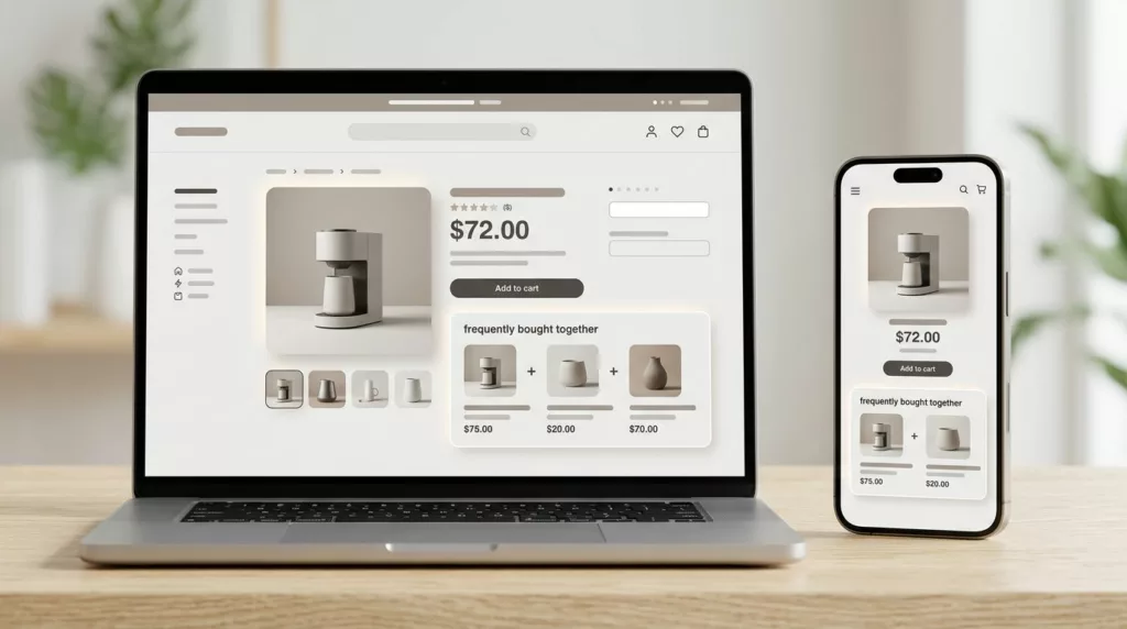
Design the module so it gets noticed fast
The best bundle modules do not fight the page. They sit in a clear spot, use a simple layout, and look native to the product detail page. That means one primary recommendation, a small set of supporting items, and a clear action button.
Place the module where the eye already travels. In many layouts, that is just below the price or near the add-to-cart button. On mobile, keep it above the fold when you can, but do not push the main CTA out of reach. The module should support the purchase path, not interrupt it.
Visual hierarchy matters too. Give the main product more weight, then use smaller cards or rows for add-ons. Keep product images consistent in size. Use enough spacing so the recommendations feel deliberate, not crowded. If the widget looks like a random ad unit, shoppers tune out.
Good headings help as well. Simple labels such as “Pairs well with this item” or “Often bought with” feel more natural than hard-sell language. The Constructor guide to ecommerce recommendations has a good reminder that naming and placement shape how shoppers read the offer.
A clean design also helps the page stay fast. Heavy widgets, extra scripts, and oversized images can slow the page and hurt interaction. If your recommendation block adds visible delay, it can cost more than it earns.

Build trust with copy, price, and proof
Shoppers do not buy bundles because they are shown a bundle. They buy when the suggestion feels sensible. Clear copy does most of that work.
Explain why the items belong together. A camera page might suggest a memory card and spare battery. A coffee machine might pair with filters or cleaning tablets. A skincare item might pair with a refill or applicator. The best bundle copy makes that link obvious in one short line.
Price framing matters, but it needs restraint. If a discount is real, show it. If it is not meaningful, leave it out. Overstated savings can hurt trust faster than they help attach rate. Shoppers are good at spotting fake urgency.
Use product details that remove doubt. Size, compatibility, use case, and what is included all matter. That is especially true for accessories and replenishment items, where one wrong fit can kill the sale. The same clarity that improves product pages also supports bundle performance, which is why optimizing product descriptions for conversion helps here too.
If you want more patterns to model, Contentsquare’s upsell UX best practices shows how recommendation language changes when the offer feels tied to the current cart item. That connection is the point. Shoppers respond better when the add-on feels like part of the original purchase, not a side quest.
Match recommendations to the shopper’s context
The most common mistake is showing the same bundle logic everywhere. A good recommendation for one SKU can be useless on another. Context should drive the offer.
Start with the product type. Consumables pair well with refills and maintenance items. Apparel often works with accessories, care products, or complementary pieces. Electronics usually need cables, cases, memory cards, or protection plans. Home goods can pair with size-related extras or matching pieces from the same set.
Then look at behavior. What do people buy after this item? What do they skip? Which combinations show up in order history without extra discounts? First-party order data usually gives you a stronger signal than broad category rules.
Seasonal timing matters too. A summer outdoor item may attach better to cleaning or storage accessories in spring, then to replacement parts in fall. Inventory matters as well. A perfect recommendation that is often out of stock trains shoppers to ignore the module.
The best teams use rules first, then refine with model-based suggestions later. That keeps the system understandable. If a merchandiser or product manager cannot explain why the recommendation exists, shoppers probably will not trust it either.
Reduce friction at the add-to-cart moment
A bundle can have the right product mix and still lose on mechanics. If shoppers have to click three times to add one extra item, attach rate drops.
The cleanest pattern is one primary CTA with optional add-ons already selected or easy to toggle. Checkboxes work well when the choice is obvious. Small quantity controls help when the add-on is a consumable. A sticky add-to-cart area can also keep the bundle visible while the shopper reads or scrolls.
Cart drawers and mini carts are strong places to reinforce the offer. If the user skipped the product page bundle, the cart can present a lighter version of the same suggestion. The goal is to catch intent without restarting the decision.
Mobile deserves extra care. Recommendation widgets often fail there because they compete with thumb space, page height, and slower connections. A widget that looks fine on desktop can feel cramped on a phone. This is where mobile product page speed optimization checklist becomes relevant, because performance and bundle UX are tied together.
Accessibility matters too. Keep tap targets large. Use clear focus states. Make sure color alone does not carry the meaning of selected or unselected states. If the widget is hard to scan or hard to tap, it will underperform, even if the offer is strong.
Test the placement, wording, and default state
Bundle attach rate usually improves through small tests, not one big redesign. Start with the variables that shape behavior the most.
Try testing these elements one at a time:
- Placement: product page near the CTA, lower on the page, or in the cart drawer.
- Module size: one recommended item versus a small set of two or three.
- Heading language: direct, helpful, or socially framed copy.
- Default state: pre-selected add-ons versus opt-in toggles.
- Value framing: savings, convenience, compatibility, or completeness.
Measure more than attach rate. Watch product page conversion, average order value, cart abandonment, and refund rate. A bundle that lifts AOV but hurts checkout completion is not a win.
Also segment by device and product type. A layout that works for desktop shoppers buying accessories may fail on mobile for high-consideration products. That split often explains why a test looks good overall but weak in one segment.
A good rollout plan uses one control page, one changed variable, and a clear success metric. That keeps the result readable and helps merchandisers learn which parts of the bundle drive action.
Conclusion
The strongest bundle modules feel useful before they feel promotional. That is the heart of better frequently bought together UX.
When the offer is easy to see, easy to trust, and easy to add, shoppers treat it like part of the purchase. When the design adds friction or doubt, attach rate falls fast.
Focus on visibility, relevance, and low-effort action first. Those three pieces usually do more for bundle performance than another round of discounts.