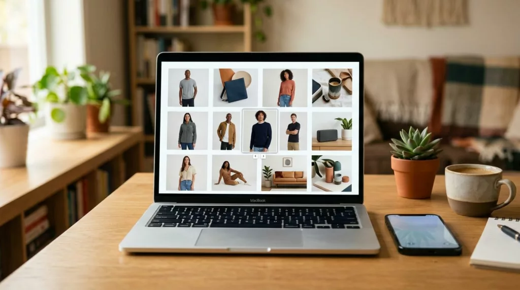

A high-quality image gallery can sell a product or leave shoppers unsure. When images are hard to scan, hard to zoom, or hard to use with a keyboard, people notice fast.
An accessible product gallery helps more than screen-reader users. It gives every shopper a clearer way to inspect color, shape, texture, and detail before they buy.
That matters because product images carry trust. When an image gallery performs consistently across desktop and mobile devices, it builds confidence in the brand and makes the rest of the page much more effective at driving conversions.
Key Takeaways
- Builds Trust and Conversion: A high-quality, accessible product gallery serves as a critical decision-making tool, reducing user hesitation and decreasing returns by providing clear, detailed product views.
- Prioritize Inclusive Design: Following WCAG guidelines—such as using descriptive alt text, ensuring clear focus indicators, and maintaining logical keyboard navigation—is essential for making your gallery usable for everyone.
- Mobile-First Ergonomics: Mobile users require larger touch targets and simplified interaction patterns, such as intuitive swipes instead of tiny, hard-to-click arrows, to maintain a frictionless path to purchase.
- Avoid Common Pitfalls: Design choices like autoplay carousels, hover-only zoom, and lack of visual feedback for active states can alienate users and diminish the professional credibility of your store.
- Rigorous Testing: Real-world testing with keyboard-only navigation, screen readers, and various mobile devices is necessary to identify and fix usability gaps that mockups cannot reveal.
Why product galleries shape trust and conversion
People do not read product pages in a neat line. They scan the image first, then they move to details that answer one question at a time.
That makes your image gallery a critical component of the decision-making process, rather than mere decoration. A jacket photo shows fit. A phone photo shows scale. A furniture image shows finish and context.
When the gallery works well, shoppers can check the product without hunting for clues. That lowers friction and supports confidence. It also reduces the chance that someone leaves because a key detail stayed hidden.
A gallery also works inside a bigger page system. The layout around it matters too, and responsive design ensures that the gallery remains intuitive as it adapts to various screen sizes. When the image area, title, price, size options, and add-to-cart button work together, they create one clear path for the user. These UX-centric product page design principles fit naturally into this approach.
If shoppers cannot inspect a product with confidence, they start filling in the blanks themselves.
That guesswork hurts conversion. It can also increase returns, because people buy without a full picture of what they are getting.
What WCAG-friendly gallery behavior looks like
The WCAG guidelines provide a useful foundation for inclusive gallery design. The core principles are straightforward: images require descriptive information, controls must support keyboard navigation, focus styles need to be clearly visible, and color contrast must meet minimum thresholds for readability.
Alt text is the first place many stores go wrong. Baymard’s guidance on product image alt text makes one point very clear: alt text should describe what the image adds, rather than repeating file names or product titles. When writing this alternative text, prioritize specific descriptions. “Red leather tote bag, front view” provides value, whereas “Image 3” creates a barrier for the user.
Use alt text for meaningful context rather than decoration. If a thumbnail only repeats a view already shown elsewhere, it may need empty alt text. However, if the image highlights a unique detail, that information is essential.
A functional image gallery also requires controls that users can operate without a mouse. Tabs, navigation arrows, zoom buttons, and thumbnails should work seamlessly with the Tab, Enter, Space, and arrow keys. When a user navigates through your site, focus styles must remain obvious at every step; if a user cannot see their current position, the experience fails basic usability.
A short note in e-commerce image standards also helps frame the WCAG guidelines view. Image captions, descriptions, and structural consistency all support clearer shopping decisions for everyone.
The gallery controls shoppers need
Most accessible galleries provide reliable tools that ensure all visitors, including those using a screen reader, have a positive experience:
- Visible thumbnails that display the main views in a predictable order.
- Clear zoom controls that function without relying solely on hover behavior.
- Strong focus styles so users always know which element is currently selected.
- Pause or stop options for any image motion, ensuring compatibility with various assistive technologies.
- A logical reading order that screen reader users can follow without confusion.
Each of these choices reduces friction. Together, they make the gallery feel intuitive and reliable. A gallery can be visually polished and still fail these requirements. Clean design does not help if the user cannot move through the images or understand which one is active.
Mobile gallery patterns that work on small screens
Mobile shoppers are often impatient when dealing with tiny interface elements or hidden gestures. If a touch target is too small or poorly defined, many people will simply miss it. By focusing on ergonomic design, you can ensure a smoother path to purchase.
That is why mobile galleries need a different rhythm compared to desktop versions. Prioritizing large touch targets over dense thumbnail rows is essential, and intuitive swipe support often outweighs the use of fancy transition effects. Implementing a responsive design ensures that your layout remains effective across all screen sizes.
A useful pattern comparison for your ecommerce site looks like this:
| Decision | Desktop pattern | Mobile pattern | Why it matters |
|---|---|---|---|
| Main image area | Large hero image with thumbnails below | Full-width image with swipe support | Responsive design keeps the primary view easy to find |
| Zoom | Hover zoom plus lightbox | Tap-to-zoom or full-screen viewer | Helps shoppers inspect product detail |
| Controls | Visible arrows and labels | Large touch targets and clear icons | Prevents missed taps and frustration |
| Image order | Front, side, detail, lifestyle | Same order, trimmed to the most useful shots | Reduces scanning effort for the user |
The takeaway is simple. Desktop can support more visible options, while mobile requires fewer steps and bigger touch targets.
On phones, touch targets should be generous and easy to hit. Small arrows buried over a photo often fail when used by busy thumbs. Keep the active state obvious as well, because users need to know exactly which image they are currently viewing.
Pinch zoom still matters for certain products. Jewelry, fabric, cosmetics, and electronics often require close inspection. If you use pinch zoom, pair it with a tap-to-open full-screen view so the gesture is not the only path to see details.
Also, watch the layout around the product images. Sticky elements, oversized headers, and pop-ups can crowd the screen on mobile devices. Your image gallery should stay central and clear, not fight for space with other UI components.
If your store sells products with specific size or texture differences, mobile image order matters even more. Show the image that answers the biggest customer doubt first. By optimizing the image gallery for mobile, you reduce friction and help visitors make confident buying decisions.
Common mistakes that hurt both accessibility and sales
Some gallery problems look small in design review, but they show up as lost confidence in real shopping sessions.
- Carousels with autoplay pull attention away from the product. They also make control harder for keyboard and screen-reader users.
- Thumbnail images with no clear active state leave shoppers guessing which photo they selected.
- Hover-only zoom fails on touch devices and blocks many mobile users from inspecting detail.
- Image changes without announcement confuse users of screen reader technology; utilizing ARIA roles and attributes like aria-live or aria-expanded ensures that shoppers are informed when a selected variant changes the main photo.
- Poor color contrast for icons and tiny arrows make gallery controls hard to spot on bright or busy images.
- Stock photos that do not match the product create mistrust fast, even if the page looks polished.
The biggest mistake is pretending the gallery is only visual. It is also informational. Shoppers use it to confirm material, finish, size, and quality cues.
That matters for conversion. A clear gallery helps people decide faster. A weak one leaves them uncertain, and uncertainty is expensive.
A store can have strong product copy and still lose the sale if the images do not answer the same questions. The gallery and the text need to work together. By building a well-structured image gallery, you prevent keyboard focus from getting lost during navigation and ensure every visitor receives the information they need to complete their purchase.
How to test the gallery before launch
Testing should happen on real devices, with real tasks, and with a few different input methods. A design mockup is not enough.
- Tab through every control using keyboard navigation. Check the focus order, ensure there are clear focus indicators, and verify that zoom and thumbnail selection work as expected.
- Run a quick screen reader pass to confirm that alt text, labels, and state changes are communicated clearly to users relying on assistive technologies.
- Test on a small phone with one hand. See whether swipe, tap, and zoom still feel natural.
- Watch one or two product tasks in analytics or session replays. Look for hesitation, repeated taps, and exits after image interaction.
If you want the gallery to support a bigger PDP improvement, pair that testing with strategies for higher ecommerce conversion rates. Gallery fixes work best when the full page supports the same buying decision.
Also test with different product types. A simple t-shirt needs different image support than a camera or a sofa. Your image gallery should match the product, not just the template.
One more check helps a lot. Ask someone unfamiliar with the product to choose the right color, angle, or variant using only the gallery. If they hesitate, the gallery still has work to do.
Frequently Asked Questions
Why is alt text so important for product galleries?
Alt text provides essential context for screen reader users by describing what an image adds to the shopping experience. Well-crafted, specific descriptions help shoppers understand details like texture, color, and finish that they cannot see, which is vital for making an informed purchase.
How can I make my gallery mobile-friendly without sacrificing features?
Prioritize large, easy-to-tap buttons and gesture-based interactions like swiping instead of relying on tiny desktop-style arrows. Ensuring that tap-to-zoom is available provides mobile users with the same ability to inspect product details as desktop users without cluttering the interface.
Should I avoid carousels in my product gallery?
Yes, carousels with autoplay are generally discouraged because they move content away from the user before they are ready, creating accessibility barriers for keyboard and screen reader users. If you must use a gallery layout, ensure users have full manual control over navigation and that all motion can be paused.
How do I ensure my gallery is truly accessible?
Beyond basic visual design, you must ensure that all elements—such as thumbnails, zoom buttons, and arrows—are reachable via keyboard navigation with highly visible focus styles. Testing your site with actual screen readers and ensuring that state changes are announced to the user will confirm that your gallery is genuinely inclusive.
Conclusion
A strong image gallery does more than display photos. It helps shoppers inspect a product, move with confidence, and trust what they see.
By utilizing semantic HTML and modern tools like CSS Grid, developers can create a robust, expandable gallery that functions seamlessly for everyone. Prioritizing an accessible product gallery ensures that visually impaired shoppers can navigate your store with ease, while features like persistent keyboard focus allow all users to browse comfortably. When these elements come together in a well-structured grid layout, they create a superior shopping experience where accessibility and conversion meet.
When a product gallery answers questions fast, the rest of the page gets a better chance to close the sale. That is the real job of an accessible product gallery.