A shopper buying a made-to-order product is not only judging the item, they’re judging the wait. If the timeline feels fuzzy, they hesitate, ask support, or leave.
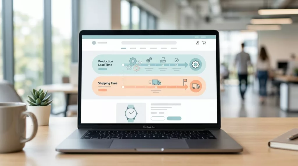
Good lead time messaging UX gives them two answers right away: how long production takes and how long shipping takes after that. The page should make both clear before the first click on Add to Cart.
When the message is honest and easy to scan, the page feels calmer. When it hides the timeline in a paragraph, it creates doubt.
Separate production lead time from shipping time
Shoppers often read any date as a delivery promise. That is where confusion starts, especially on custom and preorder pages.
Use two distinct labels whenever you can. One tells the shopper how long the item takes to make. The other tells them how long the carrier needs after it leaves your warehouse.
| Timeline piece | What it means | Clear UI copy |
|---|---|---|
| Production lead time | Time spent making the item | “Made in 7 to 10 business days” |
| Shipping time | Time spent in transit | “Ships in 2 to 4 business days” |
| Full delivery estimate | Production plus transit | “Arrives in 9 to 14 business days” |
If you can support a full delivery window, show it clearly. If not, keep the parts separate and let the shopper do the math later.
If the shopper has to guess whether a date means production or delivery, the page has already lost clarity.
A compact summary block helps here, especially on dense pages. Product specifications table UX offers a useful model for keeping detailed facts scannable on mobile.
Write copy that fits the product model
Different purchase types need different lead time language. A made-to-order chair does not need the same wording as a preorder drop.
If your team needs a starting point, product page copy templates can help you keep the phrasing tight and consistent.
Use copy that matches the promise shoppers are actually buying:
- Made-to-order uses a fixed production window. “Made after you order. Production takes 7 to 10 business days. Shipping is added at checkout.”
- Preorder uses a future release date. “Reserve now. Ships the week of June 17.”
- Personalized needs a short prep note. “Add your name or initials. Please allow 5 business days before shipment.”
- Custom needs a confirmation step. “Built to your selected specs. We confirm the ship date after payment.”
Keep the language plain. Words like “soon” or “shortly” create more work for the shopper. So do vague labels like “processing” when you really mean production.
If an option changes the timeline, update the message next to that option. A size selector, fabric picker, or monogram field should change the lead time in real time. That small detail prevents a lot of support mail.
Put the timeline near the CTA and product options
The shopper looks at the price, the options, and the Add to Cart button in one quick pass. The timeline belongs in that same area.
A page layout that keeps key facts close to the action follows the same logic as UX-centric product pages. The timing line should sit under the price, beside the variant selectors, or directly above the CTA.
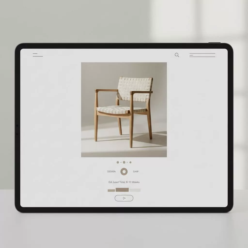
Place one short sentence where it can be seen fast, then add a smaller support line if needed. For example:
- “Made to order, ships in 8 to 10 business days.”
- “Estimated delivery shown at checkout.”
- “Personalized items take 3 extra business days.”
That spacing matters. A shopper should not need to hunt for the answer in the description, tabbed content, or footer note. The CTA area is where doubt peaks, so that is where the answer should live.
This also helps when product photos are strong and the page has little text. The image can sell the feeling, while the timeline line sells the decision.
Repeat the timeline in cart and checkout
The product page is only the first checkpoint. Many shoppers will still want confirmation once the item is in the cart.
That is a good place to repeat the lead time in a compact summary. Keep the same labels you used on the product page, so the wording feels familiar. If the product is made to order, the cart should still say “Production: 7 to 10 business days” and “Shipping: calculated at checkout” or a similar clear split.
A small summary card works well here, and product specifications table UX is a strong reference if you need a layout that stays readable on smaller screens.
Baymard’s checkout UX best practices also shows how delivery steps can create friction when the timing is unclear. If the shopper meets a new shipping cost and a new timeline at the same moment, the experience feels jumpy.
Use the cart to answer the last question before payment:
- What is being made?
- When does production finish?
- When does shipping begin?
- Does the delivery estimate change by address?
If the destination affects timing, say so before checkout when possible. If not, say it at the point where the shopper enters their zip code. The goal is not to give every detail early. The goal is to prevent a surprise late in the flow.
Keep trust after purchase with status updates
Lead time messaging does not stop at checkout. The order confirmation, account page, and shipping email all need to repeat the same story.
The first confirmation should tell the shopper that the item is in production, not lost in a generic “we received your order” message. A simple line works well:
“Your custom table is now in production. It should be ready to ship in 8 business days.”
The account page should show one clear status at a time, such as “In production”, “Ready to ship”, or “Shipped”. Avoid vague labels that blur the handoff between making and shipping.
When the order is ready, the shipping email should separate shipment from production. The shopper wants to know that the item left your hands, not that it is still being prepared.
NNGroup’s transactional notifications piece is a useful reminder that short, timely messages carry weight. These emails are not marketing. They are reassurance.
If the date slips, tell the shopper early. A short update with the new timeline beats a silent delay every time.
Test the message against real shopper questions
The best lead time copy answers the questions support teams hear every day. If customers keep asking, “When will it ship?” the page is not clear enough yet.
Start by checking three things on the product page:
- Can a shopper tell production time from shipping time in three seconds?
- Does the CTA area repeat the lead time without crowding the button?
- Do variant changes update the estimate right away?
Then check cart and post-purchase touchpoints. The same wording should appear in each place, or the shopper will assume the process changed.
Also watch mobile behavior. On a small screen, a helpful line can disappear fast if it sits too low on the page. If that happens, move it closer to the price or the CTA. A tiny placement change often does more than a larger rewrite.
The last test is simple. Read the page as a nervous first-time buyer, not as the brand team. If the wording feels calm, specific, and repeated at the right moments, the page is doing its job.
Conclusion
Made-to-order buying works best when the timeline feels honest from the first glance. That means separating production from shipping, using plain copy for each product type, and repeating the same message near the CTA, in the cart, and after purchase.
The strongest pages do not ask shoppers to decode the wait. They make the wait part of the product story, with clear wording and steady expectations.
When the timeline is easy to read, the purchase feels safer. That is what turns uncertainty into confidence.