Product documents can either remove doubt or create it. When a buyer needs a spec sheet, manual, or SDS file, every extra click feels expensive.
In B2B catalogs, those files are part of the product story. They answer technical questions, support compliance, and help teams move faster without calling sales or support.
Strong product document UX makes the right file easy to spot, easy to trust, and easy to download. The best patterns are simple, but they need to be intentional.
Why document downloads matter on B2B product pages
Specs help buyers compare fit, materials, performance, and compatibility. Manuals help installers, plant managers, and service teams confirm setup steps. SDS files answer safety, handling, and storage questions before a purchase reaches the dock.
If those files are buried, users start hunting. That hunt slows down procurement and creates doubt about whether the page is complete.
The problem gets worse in B2B catalogs because different people need different documents. A maintenance lead may want the latest manual, while a buyer needs the spec sheet and a safety team needs the SDS. The page has to serve all three without making them guess.
A document area also affects trust. When files look current and organized, the product feels maintained. When they look random, users wonder what else is missing.
For products with dense technical data, scannable product tables can handle the core specs before anyone opens a PDF. That gives buyers a fast path for simple decisions and a deeper path for technical review.
Separate specs, manuals, and SDS files clearly
A single “Downloads” bucket is too vague for technical products. Group files by purpose first, then by format.
| Document type | What users need | Better label | Good placement |
|---|---|---|---|
| Spec sheet | Dimensions, ratings, compatibility, finishes | Spec sheet (PDF) | Near key specs or the buy CTA |
| Manual | Install, setup, maintenance, troubleshooting | Installation manual | In a documents panel or support tab |
| SDS | Hazards, PPE, first aid, storage | Safety Data Sheet (SDS) | Visible in a safety or compliance row |
That layout works because it answers three different intentions. It also reduces mistakes, since a buyer can choose the right file without opening five PDFs.
If the label is vague, users assume the file is either old or unhelpful.
That matters most for SDS files, where revision date and version can change the answer a user needs. For manuals, the title should say what kind of manual it is, such as installation, operator, or service.
Design the download area so people scan it fast
A good layout keeps the file choice obvious. Users should see what the document is, why it matters, how large it is, and how to get it.
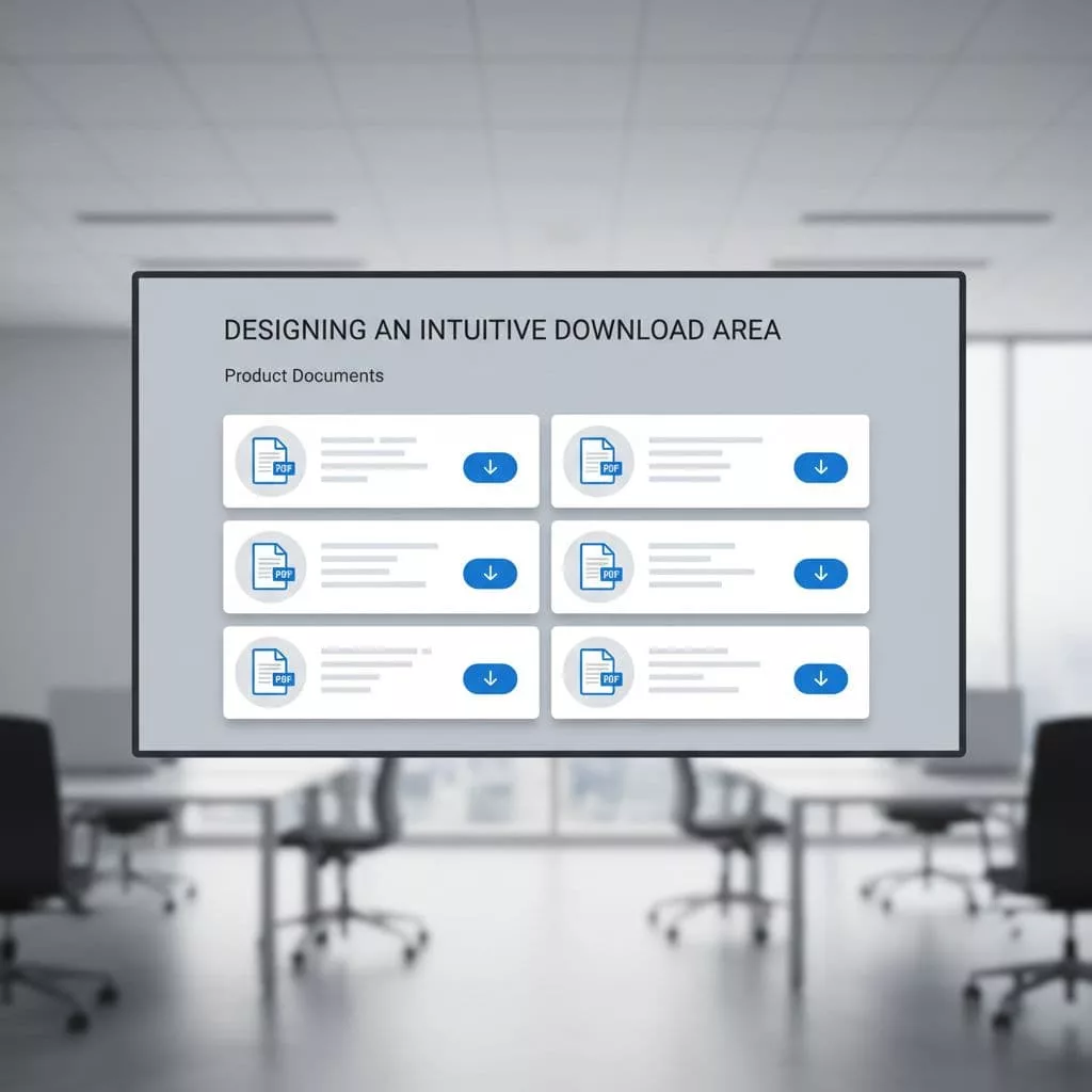
A compact card or table works well on desktop. On mobile, the same content can stack into clear rows with a full-width button.
The best placement is close to the main product facts, not hidden in a footer. Many teams use a right rail, a documents card under the summary, or a tab that opens beside specs and reviews. Each pattern can work if the document module stays visible.
Avoid a wall of icons. Icons help, but labels do the real work. A PDF badge alone does not tell the user if the file is a spec sheet, a service manual, or an SDS.
One direct download button for the most common file is enough in many cases. Secondary versions can sit behind an expand link or a small list. That keeps the main path short.
Labels and download patterns that prevent wrong clicks
Small wording changes make a big difference. Clear labels cut down on wrong downloads and support tickets.
- “Spec sheet, PDF, 2.4 MB, Rev. 03”
- “Installation manual, English, 18 pages”
- “Safety Data Sheet, 2026 revision”
- “Service guide, North America”
Those labels tell users what they are getting before they click. They also help search and filtering because the file names carry meaning.
Use one-click downloads for the common path. Use expandable sections for regional versions or older revisions. Use a preview step when files are large or when users often need only one section.
File details matter as much as the title. Date, version, language, and page count help people decide whether the document fits their job. For SDS files, the revision date should be hard to miss.
A good file row often follows this order, name first, document type second, then the practical details. That pattern reads fast and works well in long catalogs.
Keep large libraries easy to search and maintain
The best page design falls apart if the library behind it is messy. Product document UX depends on clean content management as much as front-end design.
Start with a single source of truth, whether that lives in a PIM, DAM, or document control system. Tie every file to one product ID, one file type, and one owner. Then retire old files instead of leaving them in plain sight.
Search should support part numbers, language, revision, and document type. If your catalog spans regions, add a market filter so users do not open the wrong compliance file. That matters on distributor sites, where one product may have several manuals or SDS versions.
A document library works when users can trust the file name before they trust the file.
When teams keep getting the same questions, the page needs support content too. Product page FAQ design patterns can answer version, compatibility, and access questions without forcing another download. For broader page structure work, the product design UX guide helps connect document access with the rest of the buying flow.
A strong maintenance process also protects the page over time. If a file changes, the label, date, and link should change with it. Broken or stale documents make the whole catalog feel dated.
Conclusion
Specs, manuals, and SDS files solve different jobs, so they should never look like one generic download pile. Clear labels, visible revision dates, and simple grouping save users from guesswork.
When the document area matches the task, the page feels easier to use and easier to trust. That is the core of product document UX.
Buyers do not want to hunt. They want the right file in one clean move.