Price Drop Alert UX That Brings Shoppers Back to Buy
A price cut can pull a shopper back faster than most campaigns. Still, the alert only works when it feels...

Order Cancellation UX That Cuts Chargebacks and Support Tickets
Bad cancellation UX turns a simple request into a trust problem. When people can’t tell if an order can still...

Contact Page UX That Gets Shoppers to the Right Help Fast
A contact page can save a sale or stall one. When every shopper lands on the same generic form, pre-purchase...
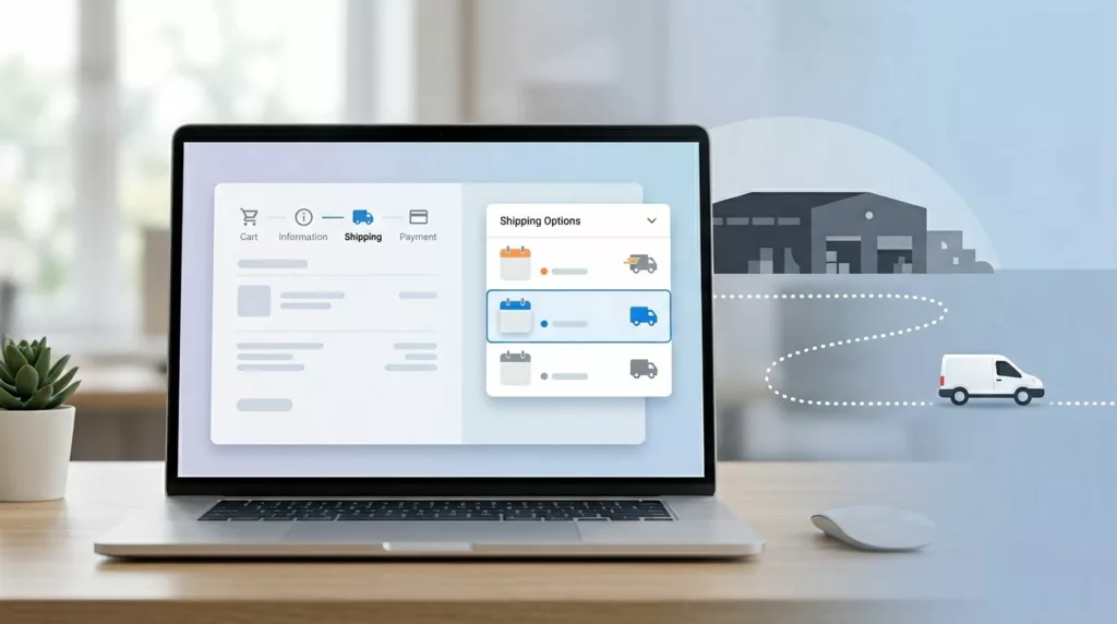
Shipping Option Selector UX That Prevents Delivery Mistakes
A shopper picks “Free Shipping” and expects it next week. Your warehouse treats that method as economy mail, the cutoff...

About Page UX That Builds Trust and Wins First Orders
A polished About page can still lose the sale in 10 seconds. When visitors land there, they’re often checking for...
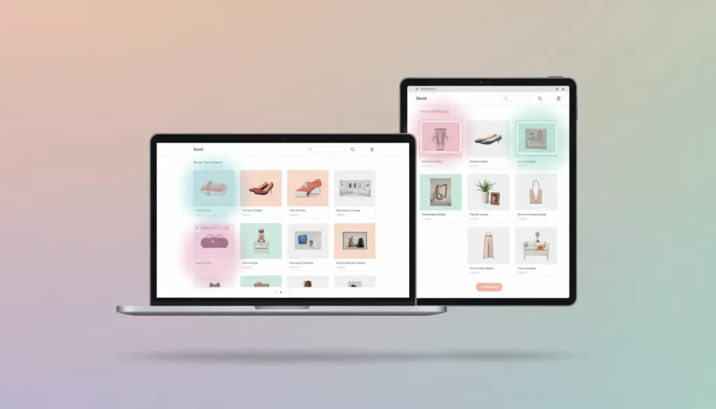
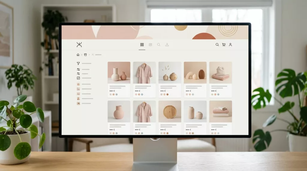
New Arrivals Page UX That Earns More Repeat Visits
A new arrivals page has one job: show change fast. If a returning shopper lands there and can’t tell what’s...

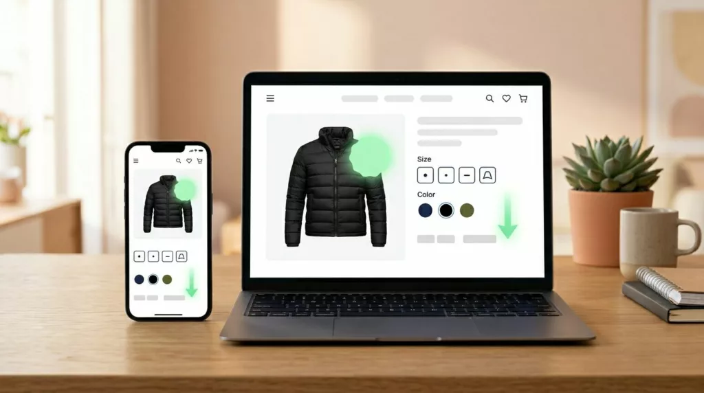
Mobile Quantity Selector UX That Stops Add-To-Cart Mistakes
A single stray tap can turn one item into four, and most shoppers won’t notice until the cart total jumps....

Live Chat Widget UX That Supports Sales, Not Drop-Offs
A live chat widget can save a sale or scare one away. The difference is usually live chat widget ux,...
Collection Banner UX That Sells Without Hiding Products
If shoppers land on a collection page and can’t see products, the banner already failed. Collection pages are for discovery...
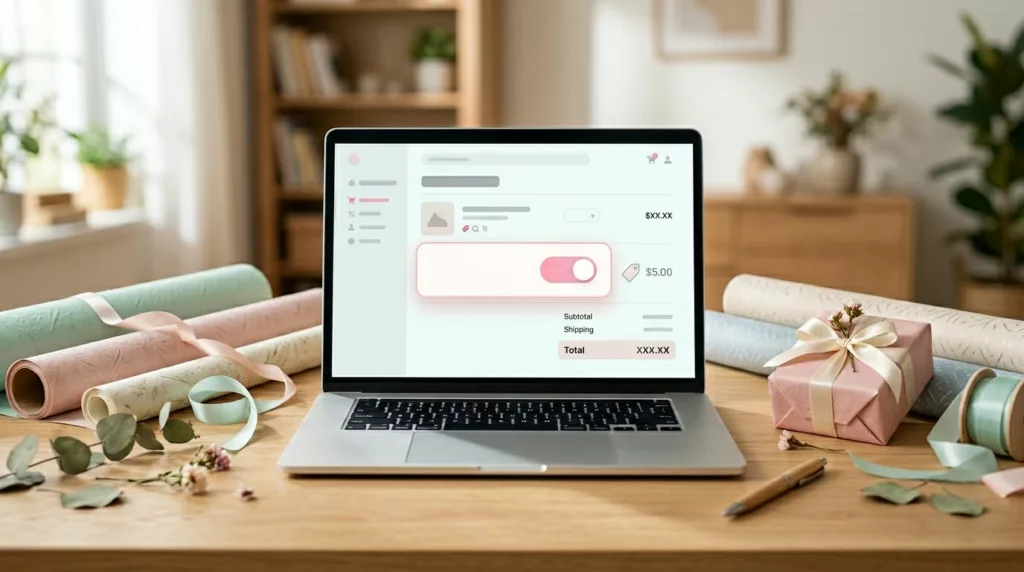
Gift Wrap UX Patterns That Raise Average Order Value
A small add-on can change order economics fast and boost average order value. Yet many stores still hide gift wrap...