

If shoppers land on a collection page and can’t see products, the banner already failed. Collection pages are for discovery first, and branding second. Collection banner ux works best when it sets the mood, sharpens category intent, and still leaves room for the grid.
That tension is real for most teams. Brand wants impact, merchandising wants context, and CRO wants products above the fold. The smart answer isn’t removing banners, it’s making them smaller and more useful.
Why oversized collection banners hurt product discovery
A homepage hero can sell a brand story. A collection page has a different job. It needs to help people scan, compare, filter, and move.
When the first viewport is mostly image, shoppers lose the scent. They don’t see assortment depth. They don’t see price range. On many stores, they also lose the sort control, filters, and breadcrumbs that help them orient fast.
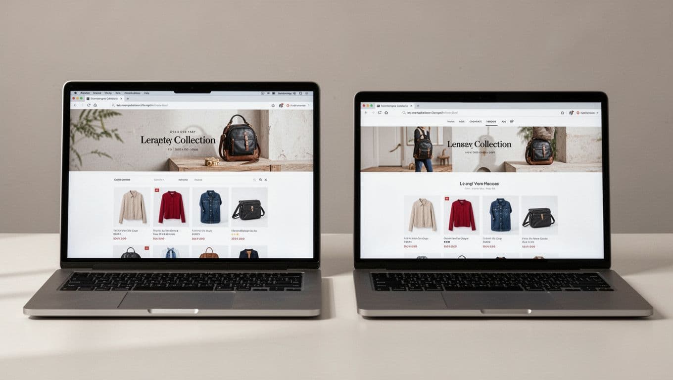
This is where collection banner ux often goes wrong. Teams copy the homepage pattern, then paste it onto categories. The result looks polished in review, but it slows the actual shopping task.
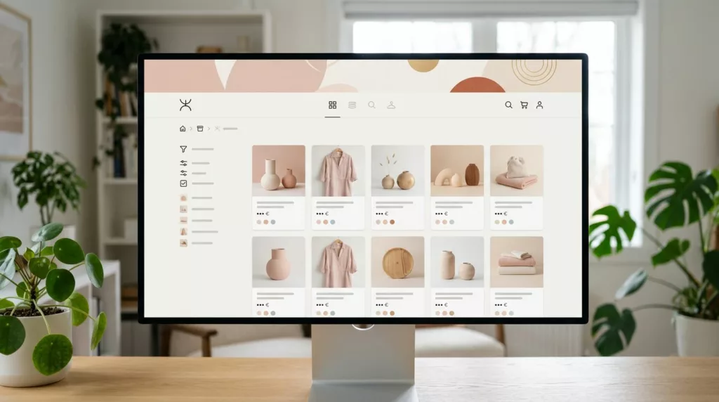
On a collection page, the product grid is the hero.
Big banners also carry hidden costs. They delay first product exposure, raise the scroll burden, and often drag down LCP with heavy imagery. On mobile, the problem gets worse because every extra block at the top steals a large share of the screen.
Above the fold, aim to show the category title, basic wayfinding, and at least part of the first product row. If shoppers can see products immediately, the page feels alive. If they have to scroll before browsing starts, the banner is taking more than it’s giving.
This also affects search performance. When banner copy lives inside an image, your key category context becomes harder for both crawlers and assistive tech to read. Keep titles and supporting text in HTML. Let the image support the message, not replace it.
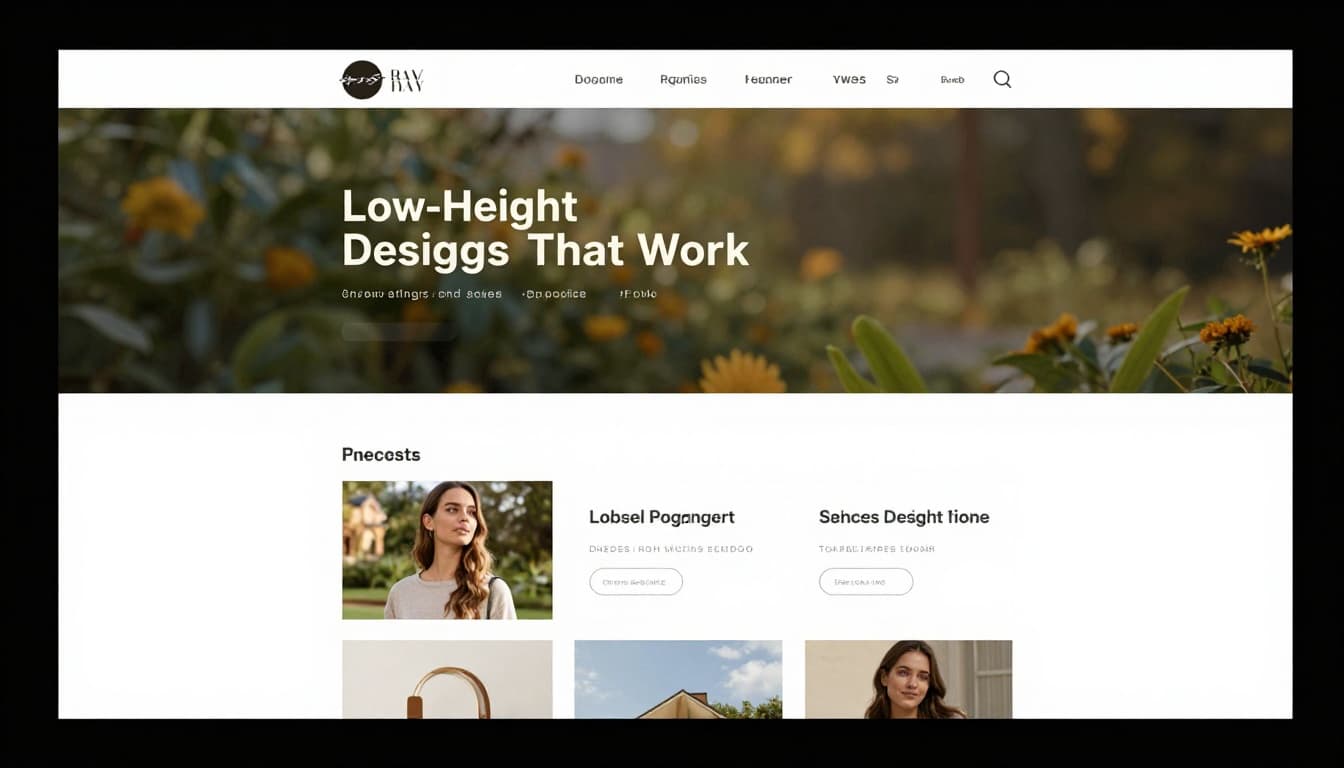
Low-height banner treatments that merchandise better
The best category banners behave like shelf signage in a store. They guide attention, but they don’t block the aisle.
On most desktop collection pages, a good working range is about 80 to 160 px tall. On mobile, think more like 56 to 96 px. That’s enough room for a mood image, a short line of merch copy, or a seasonal cue without burying the grid.
A few formats work especially well:
| Retail type | Low-height treatment | Why it works |
|---|---|---|
| Fashion | Cropped editorial image behind a slim title strip | Keeps trend context without turning the page into a lookbook |
| Home | Material texture or tight room vignette with one short line | Suggests style and quality without a full-room takeover |
| Multi-category | Color band, icon row, or promo chip style | Helps orientation when lifestyle imagery feels too broad |
The pattern is simple. Keep the banner to one message. One season, one value cue, one subcategory nudge. If you need to push more than that, move the rest into the grid.
That matters for merchandising. A fashion brand can place a slim campaign strip above the grid, then drop an editorial card into row one or two. A home retailer can use a restrained material shot up top, then surface a buying guide module below the first products. A broad retailer usually does better with a compact utility banner than with a dramatic lifestyle image that says little about the actual assortment.
Oversized carousels are rarely worth it here. Autoplay video is worse. Both steal attention from product discovery, and both tend to add weight with weak payoff.
If you want stronger visual selling, use richer assets where they help decisions most. In-grid cards, curated subcategory tiles, and supportive product imagery usually outperform a giant hero. That’s the same logic behind using visuals to boost e-commerce sales, where the image serves the buying task instead of hijacking it.
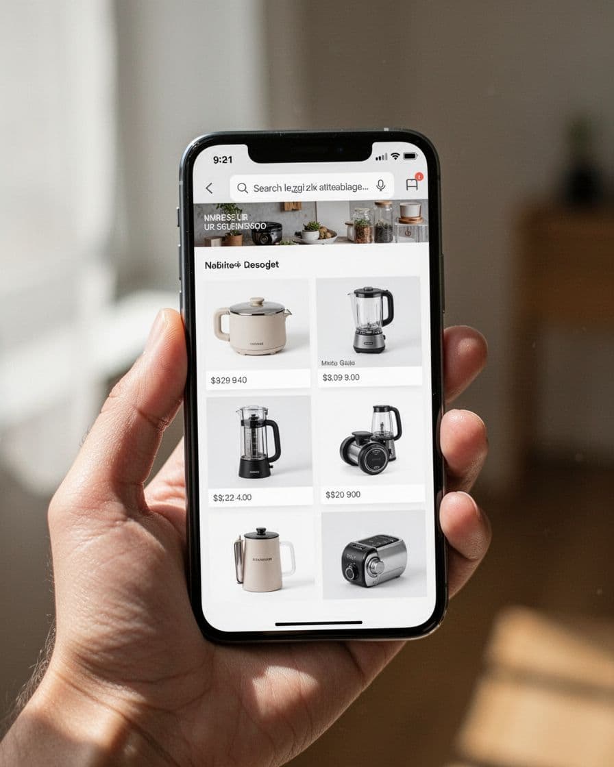
Mobile-first rules for collection banner UX
On mobile, a banner isn’t competing with empty space. It’s competing with product visibility.
That means the first viewport can’t become a stack of announcement bar, breadcrumb, campaign image, title, promo badge, filter button, and intro copy. That’s not merchandising. It’s traffic.
Keep mobile banners tight. Use a short title line, optional support text, and restrained imagery. Let filters, sorting, and the first products appear fast. Clear mobile-friendly breadcrumbs for categories also matter because they help shoppers understand where they are without adding bulk.
Accessibility needs the same restraint. Keep text live, not baked into an image. Maintain strong contrast. If the image is decorative, treat it as decorative. Motion should be off by default, because category pages are for choosing, not watching.
From a CRO angle, compact banners improve wayfinding. They keep the shopper close to filters, assortment, and price signals. That’s also why banner design should work with navigation mechanics. If your collection uses infinite scroll badly, the page can feel endless and disorienting. A compact top section pairs better with clear Shopify collection pagination vs infinite scroll decisions, because both choices shape how easily people browse and recover their place.
SEO also creeps in here. Banner links to filtered states can create clutter if they spray users into weak parameter pages. Keep campaign links clean, and be careful about managing faceted URLs on collections so merchandising doesn’t create crawl waste.
If the banner helps users choose a path faster, it belongs. If it delays the path, cut it down.
A collection page doesn’t need a billboard. It needs clear signals, visible products, and fast orientation.
The best collection banner ux feels almost modest. It frames the category, supports the brand, and then gets out of the way so shopping can start.