

A polished About page can still lose the sale in 10 seconds. When visitors land there, they’re often checking for risk, not reading for fun.
Good about page UX reduces doubt fast. It shows who runs the brand, why the product exists, and what kind of buying experience people can expect. When that page works, trust rises before the shopper reaches the cart.
The pages that help first purchases do one thing well. They move from story to proof to action without making people hunt for answers.
Why the About page matters before the cart
Most first-time shoppers don’t visit an About page because they’re curious. They visit because something still feels unproven.
Maybe the brand is new. Maybe the price feels high. Maybe the product promise sounds good, but the store hasn’t earned belief yet. That is where about page UX matters most.
A strong About page answers the basics in seconds. What do you sell? Who is behind it? Why should anyone trust the claim? If those answers sit under vague brand language, the shopper starts filling in the blanks alone, and that rarely helps conversion.
Good stores treat this page as part of the buying path, not as a side page. The same principles behind the UX design impact on conversion rates apply here. Friction, confusion, and weak signals can drain intent before someone even opens a product page.
Consistency also matters. Your tone, photography, product focus, and promises should match the rest of the store. If the About page feels like a different company, trust slips.
If you review Shopify’s 2026 About Us page examples or this guide to ecommerce About page structure and copy, the pattern is clear. The best pages explain the brand fast, then back it up with real evidence.
Your About page should answer “Can I trust you?” before it asks for another click.
Structure your story so shoppers find proof fast
Story helps, but a long autobiography hurts. Visitors want context, not a memoir.
Start with a short summary above the fold. Give people a plain-language line about what the brand makes and who it’s for. Then move into the founder or team story, but keep it concrete. Explain what problem started the brand, what changed along the way, and how that still shapes the product today.

Concrete details work better than slogans. A real founder photo, a short timeline, or a production image says more than broad statements about passion or purpose. If you mention small-batch production, show the workshop. If you say the brand began after a skin issue or sizing problem, tie that back to the product choices shoppers see today.
A simple layout keeps the reader moving:
| Page block | What the shopper wants to know | UX goal |
|---|---|---|
| Hero intro | “Am I in the right place?” | Explain the brand fast |
| Founder or team story | “Who is behind this?” | Make the business feel real |
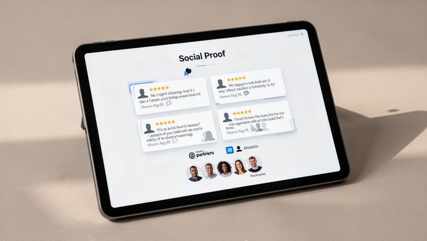
| Proof strip | “Why should I believe you?” | Add trust signals near claims |
| Next-step CTA | “What should I do now?” | Guide people toward a product path |
This structure works because it respects scanning behavior. Readers don’t move through the page in perfect order. Some skim for proof first, while others want the story first. Clear subheads, short paragraphs, and real images support both habits.
On mobile, dense copy feels like work. Keep sections tight, avoid huge photo stacks, and place the strongest trust cues before the endless scroll begins. For more layout ideas, ConvertCart’s guide to ecommerce About Us pages shows how story blocks and buying cues can sit together without crowding the page.
Add proof, then guide the first purchase
Once the story feels real, add proof near it. Don’t hide trust signals in a footer graveyard.
A short proof band can carry a lot of weight. Customer review averages, press mentions, founder credentials, store milestones, sourcing details, or third-party certifications all help, but only when they’re current and true. If you feature reviews on the About page, keep the experience aligned with your product review UX patterns that build trust. The tone and proof style should feel consistent across the store.
Proof alone won’t drive the first order, though. The page also needs a next step that fits the visitor’s mindset. Many About pages end with social icons or a generic “Learn more” link. That creates a dead end.
A stronger move is one clear CTA tied to buying intent. “Shop bestsellers” works well for broad catalogs. “Start with the sampler” helps when the brand has a common entry product. “See customer favorites” can work when social proof is your strongest advantage. Place that CTA after the story and again after proof, so it feels like a natural continuation instead of a hard sell.
Support that CTA with low-friction reassurance. Show shipping timing, guarantee language, or a short returns note near the button. When policy details matter, link to a fuller returns policy page design for trust instead of making people dig through the footer.
Many wider UX strategies for e-commerce trust point to the same rule. People buy when the site feels honest, easy, and consistent.
Trust grows when the page does real work
A good About page doesn’t ask visitors to admire the brand. It helps them decide whether buying feels safe.
When about page UX moves from clear story to visible proof to a focused next step, first purchases rise for a simple reason. The shopper no longer has to guess who you are, whether your claims hold up, or where to go next.