A shopper who cannot predict where a product lives often leaves before they compare it. Ecommerce card sorting helps teams uncover how real customers group products, describe them, and expect to browse a catalog.
It is especially useful when categories grew through merchandising requests, supplier feeds, and seasonal campaigns rather than a shared structure. The goal is not to let participants design your menu. It is to gather evidence that helps your team build a clearer one.
How Ecommerce Card Sorting Reveals Shopper Mental Models
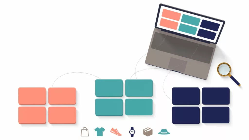
Card sorting asks participants to group product cards in ways that make sense to them. Depending on the study format, they can create their own groups, apply cards to proposed groups, or do both.
The activity reveals patterns in how shoppers classify a catalog. A customer may group trail shoes with hiking boots because both support outdoor activities. Your internal team may separate them by department. Neither view is automatically wrong, but the gap matters when people browse without a precise product name.

Use card sorting for grouping, not proof of usability
A card sort can show that people associate “rain shell” with “waterproof jackets.” It cannot prove that shoppers will complete a task quickly in a live navigation menu.
Menus introduce other variables, including hierarchy depth, label length, mobile interactions, search placement, filters, product imagery, and promotional modules. Nielsen Norman Group outlines the difference between card sorting and tree testing: sorting explores how people categorize information, while tree testing evaluates whether they can find it in a proposed structure.
Use the study to form a strong hypothesis, then test that hypothesis with other methods.
Choose the Card Sort Format That Fits the Decision
The format should match the uncertainty your team needs to reduce. Starting with the wrong format can produce clean-looking results that answer the wrong question.
Open sorting finds language and unexpected groupings
In an open card sort, participants create their own groups and name them. This works well when you are restructuring a large catalog, entering a new product area, or questioning inherited department labels.
For example, an outdoor retailer might learn that shoppers create groups named “Camping,” “Hiking,” and “Cold Weather.” That input can challenge a supplier-led navigation structure such as “Tents,” “Sleeping,” and “Insulation.”
Open sorts generate rich language, although the output needs more interpretation. Participants may create broad groups, narrow use-case clusters, or labels that overlap.
Closed sorting tests candidate categories
A closed card sort provides pre-defined groups. Participants place cards into those groups, often with an “I am not sure” option.
Use it when the primary menu is mostly settled but your team needs to check disputed placements. A beauty retailer, for instance, might test whether shoppers place cleansing balm under “Cleansers,” “Makeup Removers,” or both.
Closed sorting makes comparisons easier. However, it can hide a better organizing principle because people must work within your proposed structure.
Hybrid sorting works for mature catalogs
A hybrid study starts with a set of categories but lets participants add groups or flag poor fits. It is often practical for ecommerce teams because it preserves established business requirements while exposing weak category logic.
A high “not sure” rate is not a failure in the study. It identifies a label, product type, or hierarchy decision that needs more evidence.
Build a Product Card Set That Represents Real Browsing
Your card deck determines the quality of the discussion. A collection of obvious items will create artificial agreement, while a deck full of edge cases will frustrate participants.
Aim for cards that reflect the actual decisions shoppers face. Include familiar products, close substitutes, seasonal items, bundles, accessories, and products that could logically appear in more than one location.
Write short, neutral product-card labels
Each card needs enough context to identify the item without steering the grouping. Use a concise product name and one useful qualifier when needed.
Good card labels include:
- “Women’s waterproof hiking boot”
- “USB-C laptop docking station”
- “Portable induction cooktop”
- “Toddler convertible car seat”
- “Organic cotton duvet cover”
- “Replacement water-filter cartridge”
Avoid card labels such as “Best hiking boots for rainy trails.” The intended category is already embedded in the wording.
If a product name is technical, add the minimal context needed for a non-expert shopper. “SATA SSD” may be clear to enthusiasts but less useful for people shopping by device compatibility.
Include difficult products on purpose
Ambiguous products often produce the most useful findings. Consider a yoga mat, which could fit under Fitness, Yoga, Home Gym, or Wellness. A waterproof backpack may belong under Bags, Hiking, Travel, or Rain Gear.
Do not force every product into one permanent category just because the sort asks for a choice. A product can have a primary browse path and still appear in curated collections, search results, recommendations, and filtered listings.
For larger assortments, begin with a representative sample rather than hundreds of cards. A product taxonomy for large catalogs needs consistent rules beyond the study, including product data, internal linking, filters, and breadcrumbs.
Conduct Sessions Without Leading Participants
Card sorting can be moderated or unmoderated. Moderated sessions let researchers ask why a participant grouped two products together. Unmoderated studies can collect broader directional input when the instructions and card labels are clear.
Recruit people who resemble real customers, not only employees or product specialists. A hobbyist buying camera lenses may organize products differently than a first-time buyer seeking a simple upgrade.
Ask about intent when groups are unclear
A participant’s group name tells only part of the story. Ask plain follow-up questions such as:
- “What would you expect to find in this group?”
- “Which product made this group hard to name?”
- “Where would you look first if you needed this today?”
- “Would you expect this item to appear in more than one place?”
The answers expose whether people group by product type, use case, recipient, activity, problem, brand, or price point. That distinction affects how you build navigation later.
Keep the facilitator neutral. Saying “Would this go in Accessories?” can push a participant toward your preferred answer. Instead, ask where they would place it and what makes that location feel right.
Read the Patterns Without Treating Them as Votes
A card sort is not a referendum where the largest pile automatically wins. Look for repeated pairings, competing models, unclear labels, and participant comments that explain the pattern.
A strong grouping usually has a clear shared idea. “Running Shoes” and “Trail Running Shoes” may belong near each other because customers recognize the relationship. A weaker group may combine socks, water bottles, and headphones merely because all are small items.
Look at agreement and disagreement together
High agreement suggests a shared expectation, but low agreement can be equally useful. It may mean the card lacks context, shoppers use different vocabulary, or the catalog supports several valid paths.
Review the output with product experts, merchandisers, SEO specialists, and customer service teams. Search queries, return reasons, and support tickets often explain disagreements that a card sort alone cannot.
For example, shoppers may sort “air fryer accessories” with kitchen tools, while site search data shows many queries for a specific appliance brand. The final structure may need both a general accessories category and search synonyms for brand-led intent.
Turn raw groups into candidate hierarchy
Start with the categories that participants understood quickly. Then map their subgroups beneath those parents. Do not reproduce every participant-created label word for word.
Keep primary navigation shallow enough to scan, especially on mobile. A parent category should offer useful landing-page content and product access, not act as a dead-end folder. These ecommerce navigation patterns can help teams decide when mega menus, drill-down menus, or search should carry the browsing load.
Separate Categories, Attributes, and Filters
The most common ecommerce taxonomy problem is treating every product attribute as a category. That approach creates sprawling menus and inconsistent pathways.
Categories describe what a product is or the shopping mission it supports. Attributes describe properties that help shoppers narrow a result set. Filters expose selected attributes after a customer reaches a relevant category or search result.

Use this decision guide when a proposed group appears in the sort:
| If shoppers group by… | Usually treat it as… | Example |
|---|---|---|
| Product type or stable mission | Category | “Coffee makers” |
| A cross-category use case | Collection or secondary path | “Small-space living” |
| Product property | Filter or attribute | “Stainless steel” |
| Temporary promotion | Merchandising collection | “Back-to-school” |
| Brand | Filter, brand hub, or dedicated route | “Nike” |
The table is a starting point, not a hard rule. “Petite” might be a filter for a broad apparel retailer, yet a category for a brand built around petite clothing.
Keep filters for narrowing decisions
A filter should help someone reduce a product set based on a meaningful buying criterion. Apparel shoppers may need size, fit, color, material, and inseam. Electronics buyers may need compatibility, storage capacity, connector type, and voltage.
Do not turn “waterproof” into a top-level category if it applies across jackets, boots, backpacks, and phone cases. Shoppers should be able to browse the product type first, then filter for waterproof products.
Detailed faceted search UX guidance is helpful when a large catalog needs filters that stay understandable on desktop and mobile.
Account for Synonyms, Regions, and Audience Differences
One label rarely works equally well for every audience. Customers may search “trainers,” “sneakers,” or “running shoes” depending on region and intent. “Jumpers” can mean sweaters in the UK and something entirely different to many US shoppers.
Treat common terms as data, not arguments. Review site search logs, paid-search queries, customer-service language, reviews, and interview transcripts. Then decide which term belongs in navigation and which should work as a search synonym or on-page reference.
Match labels to shopper language
A category label should be short, familiar, and broad enough to contain what sits beneath it. “Loungewear” may work for a fashion-aware audience, while “Comfortable Clothes” may fit a different catalog and customer base.
Avoid internal terms such as “Consumables,” “Softlines,” or “Small Domestic Appliances” unless your buyers use them. They describe operational departments, not shopping intent.
Regional sites may need localized labels and different hierarchy choices. A grocery retailer in the UK might organize “Biscuits” and “Crisps” naturally, while a US version needs “Cookies” and “Chips.” Translate concepts, not just words.
Turn Findings Into an Ecommerce Navigation Proposal
After analysis, create a proposed hierarchy that makes each major decision visible. Document why each category exists, which products belong there, which attributes become filters, and which alternate pathways search or collections will support.
A practical proposal includes a primary menu, category-page structure, breadcrumbs, filter definitions, and synonym rules. It also identifies products that deserve multiple routes because customers shop for them through different intents.
Apply a clear decision checklist
Before approving a category, confirm that it meets these tests:
- Shoppers can predict the products it contains from the label alone.
- The category has enough stable inventory to remain useful after seasonal changes.
- Its products share a meaningful browsing intent, not merely a supplier relationship.
- A filter, collection, or search synonym would not solve the need more cleanly.
- The category works on a narrow mobile screen without a long, confusing drill-down.
- Breadcrumbs can show the category path without implying a false product relationship.
Document exceptions rather than hiding them. For example, a “Gifts” route can cut across the core taxonomy, but it should not replace product-type navigation. The same applies to seasonal collections and editorial landing pages.
Validate the Proposed Structure After the Study
Card sorting creates informed options. Validation tells you whether customers can use those options when they have a goal.
Run a tree test with the proposed menu labels and hierarchy. Give participants realistic findability tasks, such as locating a waterproof jacket for commuting or a replacement filter for a named appliance. Tree testing removes visual design from the equation, which makes it easier to identify unclear labels and dead-end branches. The Interaction Design Foundation’s tree testing guide explains how task paths expose where people lose their way.

Pair research with behavior data
Compare findings with internal search queries, zero-result searches, category exits, search refinements, product-list clicks, and conversion paths. Analytics cannot explain intent on its own, but it can reveal where the proposed structure needs closer review.
After launch, observe people using the actual menu, category pages, filters, and search. An ecommerce usability testing guide can help teams test product discovery without mixing it up with checkout tasks.
Monitor changes over time. New brands, seasonal inventory, and product-line expansion can weaken a structure that once worked well.
Set launch criteria before changing the menu
Agree on what evidence would support a rollout. Your criteria might include successful tree-test paths for priority tasks, fewer dead ends in usability sessions, reduced zero-result queries for known products, and stable or improved category engagement after release.
Roll out major changes carefully when possible. Preserve useful redirects, update breadcrumbs, map old category URLs, and brief customer support. A sudden taxonomy change can confuse returning customers even when the new structure is better.
Common Mistakes That Distort Card-Sort Results
Teams often get weak results because the study setup predetermines the answer. Avoid these problems before they reach the analysis stage.
First, do not use product images alone when variants look alike. A black running shoe and a black trail shoe may appear identical without a short label. Next, do not make participants sort based on information they would never see while shopping.
Avoid mixing products with category names, editorial pages, and promotional offers in the same deck. A “Holiday Gift Guide” card measures a different behavior than a “Leather Tote Bag” card.
Finally, do not treat an internal stakeholder’s preferred hierarchy as the only acceptable outcome. Customer language may challenge a legacy structure, and that friction is often where the work begins.
Conclusion
Clear category navigation starts with evidence about how customers organize products in their own minds. Ecommerce card sorting gives teams a practical way to gather that evidence, especially when labels, product placements, and filter rules have become inconsistent.
Use the findings to form a category hypothesis, then validate it through tree testing, search data, analytics, and usability sessions. A menu earns trust when shoppers can predict where a product belongs before they open it.