
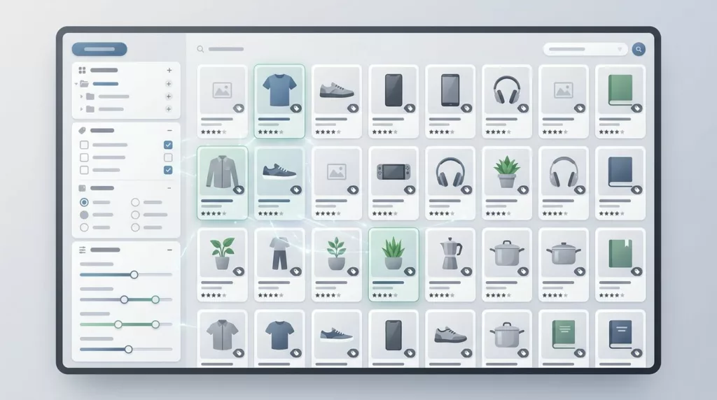

Large ecommerce catalogs punish weak filtering fast. When shoppers face hundreds or thousands of products, the filter panel becomes the shortest route to relevance or the fastest route to frustration.
Effective faceted search UX helps people narrow down choices without needing to learn your internal taxonomy. By streamlining product discovery, these systems ensure that shoppers on large eCommerce sites can quickly find exactly what they need. It also gives merchandisers cleaner signals about what shoppers actually want.
If your filters feel crowded, hidden, or slow, the fix is usually structural. The best place to start is how the catalog is organized, rather than how the panel looks.
Key Takeaways
- Prioritize for Speed: The goal of faceted search is to help shoppers narrow down choices quickly; move high-converting, relevant filters to the top and demote niche or unstable attributes.
- Search Within Facets: When lists become too long to scan comfortably, implement search-within-filter to prevent information overload, but ensure the search scope is limited to that specific facet.
- Maintain Stability: Ensure the filter UI is predictable, keeps track of user state across interactions, and remains fast to prevent users from feeling like they are fighting the interface.
- Separate SEO from UX: Do not make every filter combination indexable; establish a clear strategy to protect your site’s crawl budget while still providing shoppers with flexible navigation tools.
The reality of large catalogs
Large catalogs are not just more products. They usually include more brands, more variants, more material names, more compatibility rules, and more diverse user intent. Whether you are managing a beauty store, a parts catalog, or a fashion marketplace, each product catalog requires a tailored approach. The filter system has to answer complex shopper questions without forcing them to think like a merchandising team.
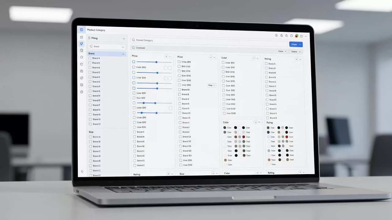
When values grow into the hundreds, the panel stops behaving like a tidy list. It becomes a sophisticated faceted navigation layer. Shoppers need to find a term fast, judge whether it will matter, and move back and forth without losing their place. This is very different from smaller eCommerce sites with six clean filter groups and a short list of values.
A smaller inventory can get away with visible lists and simple collapse rules. A large one requires careful prioritization, search within long lists, and stronger wording. The moment a shopper has to scan a wall of options, the search filters start asking for more effort than they provide in return. By optimizing how these options are presented, you improve overall product discovery and ensure the interface matches the scale of your inventory.
Facets work best when the broader navigation already makes sense. If your top navigation overlaps or uses labels shoppers do not understand, the filters inherit that confusion. Ecommerce navigation patterns help set a cleaner base.
In practice, filter UX is the last mile of information architecture. It cannot fix a broken map, but it can make a good map far easier to use.
How faceted search UX changes with catalog size
Designing a filter panel for 30 SKUs requires a different approach than building one for 30,000 SKUs. The first is about convenience, while the second is about control. That difference should shape every decision, from how many search filters you show at once to whether you add a search box inside the facet itself.
| Catalog size | What shoppers need | Best filter pattern | What usually fails |
|---|---|---|---|
| Small catalog | Quick scanning and simple choice | Visible lists with minimal collapse | Hiding useful facets behind extra clicks |
| Medium catalog | Faster narrowing without clutter | Collapsible groups and show more | Overusing default open panels |
| Large catalog | Recall, speed, and control | Search within long facets, pinned selections, and accurate result counts | Forcing endless scrolling |
| Marketplace or deep catalog | High specificity and trust | Facet prioritization plus intentional landing pages | Treating every facet value the same |
With a small set of values, a plain list is faster than typing. However, as your product catalog grows, the list becomes a wall of options, and the eye gets tired before the brain does. Integrating site search within facets helps when the user knows part of the answer, such as a brand name, model number, material, or compatibility term.
That is why you should not add facet search just because the component supports it. A tiny list with a search box feels heavier than a plain list, but a giant list without search feels broken.
The right threshold is not a fixed number, but the behavior is clear. If users can scan the facet in a few seconds, keep it simple. If they have to scroll to understand what is there, give them a search path and better ordering.
Choose the facets that deserve attention
Merchandising teams often ask for every attribute on the page. That makes the panel look complete, but completion is not the goal. The goal is speed. Every facet should earn its place by helping shoppers narrow the catalog in a way that feels useful.
Start with the product attributes that shoppers already use to compare items. Size, color, brand, fit, compatibility, capacity, and material usually outrank niche options. Then, look at which facets remove a meaningful number of products without feeling arbitrary. A facet that cuts the list in half is more valuable than one that trims it by five items.
A practical prioritization rule looks like this:
- Put the strongest converting search filters near the top, using behavior data, support logs, and search queries.
- Promote facets that reduce the result set fast and match how shoppers describe products.
- Incorporate dynamic facets to highlight context-aware options that adjust based on the current category or user intent.
- Keep rare or unstable product attributes lower in the stack so they do not dominate the page.
- Use shopper language, not internal metadata, so that labels reflect how customers actually think about their purchases.
A facet such as “Compatible with iPhone 16” often deserves more attention than a weak option like “Material” if it removes dead ends and gets the shopper closer to a purchase. In fashion or home goods, the reverse can be true. Material may matter more there because it changes the buying decision in a visible way. When applying thematic filters, group these by shopper interest to ensure that the navigation feels intuitive rather than purely technical.
For category pages that need filters, sort controls, and merchandising blocks together, filter UX for product categories shows how to keep the page readable without stripping out useful commerce actions.
Shoppers do not need to see every possible option at once. They need the facets that change the set the most and match the decision they are trying to make.
Search within facet values without hurting scanability
A search field inside a facet is not decoration. It is a rescue tool for long value lists designed to combat information overload.
If a facet needs a search box, the list has outgrown casual scanning.
Use search filters when the list is long enough that scrolling becomes work. A 12-option list does not need another input, but a 120-option brand list likely does. The point is to reduce effort, not to add a search box to every category simply because the pattern exists.
Effective facet search follows a few rules. First, it should query the current facet only, distinguishing it from your global site search that navigates the entire catalog. If a shopper is inside the brand filter, the input should index the available metadata to find brand values, not individual products. Second, the interface must support multi-selection by keeping selected values visible at the top, even after the list is filtered. Third, matching should support partial text and common spelling variants, because shoppers rarely type with perfect precision.
An empty state matters too. If nothing matches, tell the user what happened and let them clear the field without losing the rest of the facet state. Hidden failures feel like bad data, not a helpful interface.
The input belongs close to the values it controls. On desktop, that usually means placing it under the facet title. On mobile, it should sit inside the drawer near the top of the group. If the user has to hunt for the input before they can search, the feature loses most of its value.
Search order also matters. Alphabetical order works when users already know the term, while popularity order works when the audience is less certain. Many large catalogs need both, with the most used values pinned at the top and the rest alphabetized below.
This is critical in brand lists, parts catalogs, and compatibility filters. Those lists often become too long for scanning, yet too specific for broad browsing. Search within the facet turns a messy wall of values into a manageable set.
Make the filter panel easier to use on desktop and mobile
Layout shapes trust. A shopper can forgive a long list if the controls feel stable and predictable. They will not forgive a panel that jumps, hides state, or makes every tap feel expensive.
On desktop, a left rail works when the page has enough space and the search filters are reasonably stable. When it comes to mobile optimization, a full-screen drawer usually works better because it provides sufficient room for long labels, search inputs, and selected-state chips. Small accordions buried under product cards make the interaction feel cramped, especially on dense category pages.
Long lists should expand in place rather than sending shoppers to a separate page. A show more button is useful when it reveals the next set without resetting context. If a user opens a facet, scans a few values, and closes it again, the interface should remember that state.
Selected search filters should appear as chips above the results and inside the drawer. That gives shoppers a quick record of what they chose and a fast way to remove one filter without starting over. Counts help too, but only when they are current. Slow or stale counts do more harm than good because they break trust in the numbers.
The same page often has to balance filters, sort options, merchandising blocks, and quick actions. Refining your UI design is essential when that mix starts to feel crowded, as seen in this guide on Category page design for higher AOV.
Good panel behavior also means the basics stay visible. The user should always know where they are, what is applied, and how to get back to the full set. That sense of control matters more than visual polish.
Keep interaction state, performance, and accessibility honest
Filter systems fail when the interface forgets what the user did. If the URL does not reflect the selected search queries, people cannot share or return to the same view. If the back button breaks, trust drops fast. If the page refreshes and throws the shopper back to the top, the interface feels like it is working against them. Maintaining a stable state is essential because when shoppers can easily manage their choices, it directly protects your conversion rate.
Performance is a fundamental part of the UX. If a facet update feels sluggish, users blame the entire site search experience. Optimistic UI, which shows the selected state right away while results load, often feels better than waiting for a full refresh. Debounce typed facet search so every keystroke does not trigger a heavy query, but do not delay feedback so long that the panel feels unresponsive.
Accessibility needs the same care. Use clear labels for each facet. Make keyboard focus visible. Announce result changes for screen readers. Long filter panels should work seamlessly without a mouse, a touch gesture, or perfect vision.
When state is clear, filters feel helpful. When state disappears, they feel risky.
A simple test catches a lot of problems. Can a shopper apply, adjust, and remove three search filters without losing context? Can they do it on mobile? Can they do it again after a page update? If the answer is shaky, the panel is asking people to remember too much.
It also helps to keep the language plain. “Clear all” should mean clear all. “Apply” should signal that the page will update. “Show more” should reveal more values rather than a second layer of hidden controls. By using clear, intuitive language, you turn your interface into a tool for guided selling, ensuring that small clarity issues do not pile up and hinder your catalog depth.
SEO and crawl control for faceted pages
Large catalogs serve two distinct audiences: shoppers and the search engine. The same facet combinations that help a user navigate your site can inadvertently create thousands of crawl paths, leading to duplicate content and thin results pages. Because of this, your UX design and SEO strategy must work in tandem.
Establish separate rules for shopper utility and indexation. While you should let users combine filters freely to refine their search, you should only allow indexable pages where that specific combination has proven demand and a clear value proposition. A high-quality, indexable landing page should feature stable content, unique copy, and a purpose that extends beyond the filter itself.
Everything else should stay out of the index or consolidate to a primary URL using canonical tags. When parameters multiply without control, your core product pages may end up competing with their own filtered variants. This wastes your crawl budget and muddies your search signals. Implementing a robust strategy for faceted navigation is essential to prevent these technical issues from harming your organic performance.
For Shopify teams, faceted navigation indexing best practices lays out these crawl rules in more detail. This logic applies to any large-scale platform. You must decide which combinations deserve visibility, then keep the remaining filters focused solely on helping shoppers narrow the catalog.
A filter that helps shoppers but hinders crawlers requires a split strategy rather than a compromise. The goal is not to make every filter crawlable. The goal is to protect the pages that deserve to rank while ensuring that the rest of your faceted navigation remains a tool for users, not a drain on your site health.
Measure whether the experience is working
The clearest signal is time to product. If shoppers reach a useful set faster, the panel is doing real work. But do not stop there. A filter system can look busy and still fail to help people choose.
Track a mix of behavior and business metrics:
- Time to first product click, so you can see whether filtering reduces friction.
- Facet usage rate by category, because some pages need more guidance than others compared to your general site search behavior.
- Refinement depth, which shows whether shoppers keep narrowing their search queries after the first pass.
- Zero-result and dead-end rates, because they reveal bad facet combinations or weak data.
- Add-to-cart rate and conversion rate after filter use, which show whether the better path leads to action.
- Backtrack rate after applying a filter, which often exposes confusing labels or poor ordering.
A category can show lower filter usage and still improve if shoppers arrive at better results sooner. That is why you need both behavior metrics and commercial metrics. If time to product drops and conversion rises, the system is helping. If usage rises but conversion stays flat, the panel may be making people work harder without adding clarity.
Test one change at a time when you can. Facet order, default collapse state, search placement, and label wording all affect how the panel feels. You might even consider using machine learning to automate facet ordering or popularity ranking based on user intent. If you change all of these elements together, the lesson gets blurry and makes it harder for the search engine to index your preferred paths.
The best search filters are not the loudest ones. They are the ones that help people move from broad intent to the right product with less thinking.
Frequently Asked Questions
When should I add a search box to a filter facet?
Add a search box when the list of values is long enough that scanning becomes tedious or requires excessive scrolling. If a user cannot identify their desired option within a few seconds, a search input acts as a necessary shortcut.
How should I handle filter state on mobile versus desktop?
On desktop, a left-rail layout is standard, while mobile interfaces benefit from a full-screen drawer to provide ample space for long labels and multiple selections. Regardless of the device, the UI must keep selected filters visible as chips so users can track and remove choices easily.
Why does my filter system hurt my SEO performance?
Creating unique URLs for every possible combination of filters can generate thousands of duplicate or thin-content pages that waste your crawl budget. Use canonical tags or robots.txt rules to ensure only high-demand, high-quality filter combinations are indexed by search engines.
What good facet UX looks like at scale
Large catalogs reward restraint. The best filter systems show the right facets first, make long value lists searchable when needed, and keep the page fast enough that shoppers stay in control.
That balance matters because the same interface must serve both people and search engines without confusing either one. When the structure is clear and organized by relevant product attributes, faceted search UX stops feeling like a simple utility and starts acting like a powerful buying aid.
Effective UI design at this scale requires a deep understanding of user intent and how shoppers translate their needs into search queries. By streamlining faceted navigation, eCommerce sites can help customers narrow down massive catalogs without ever feeling overwhelmed by the interface. If shoppers can find exactly what they need without thinking about the system, the filters are doing exactly what they should.