
B2B VAT Number Field UX That Reduces Cross-Border Checkout Friction
A VAT (Value Added Tax) field can look small, but it changes the tax logic behind the order in B2B...
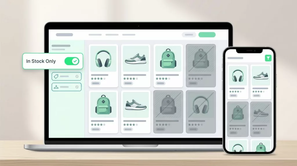
In-Stock Filter UX That Cuts Dead-End Product Browsing
Shoppers do not mind narrowing their options through sorting and filtering in filter UX. They mind wasting time on products...

Duties and Taxes Messaging That Builds Trust in Cross-Border Checkout
A single line about duties can decide whether international shoppers finish checkout. If the amount feels vague, they hesitate. If...
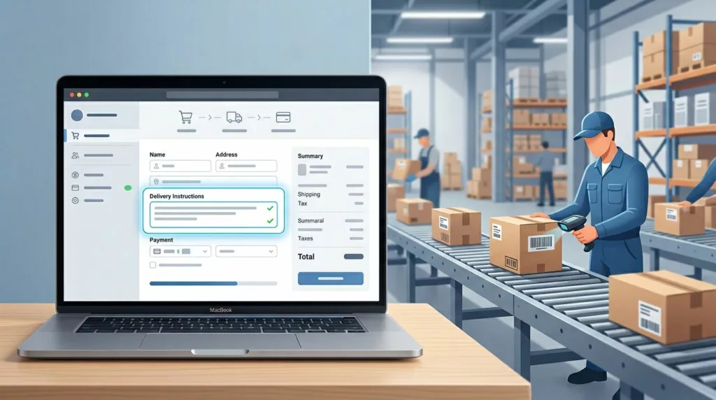
Delivery Instructions UX That Prevents Fulfillment Mistakes
One bad delivery note can send a package to the wrong door, the wrong gate, or the wrong person. That...

Warranty Page UX That Builds Trust on High-Ticket Stores
A warranty page can calm a nervous buyer or make them back out. On high-ticket products, that page often carries...

Post-Purchase Account Creation UX That Protects Conversion
The easiest way to lose a checkout is to ask for a new commitment before the order is done. Buyers...

Product Review Filters That Help Shoppers Find Relevant Feedback
A high rating can still hide the wrong review. Shoppers do not want every opinion, they want the few that...

Pickup Point Selector UX That Cuts Delivery Friction
Pickup point selection looks simple until shoppers have to use it. Then the clock starts, because every extra search, vague...

Product Q&A UX That Reduces Pre-Purchase Doubt
Product Q&A UX That Reduces Pre-Purchase Doubt Shoppers rarely leave a product page because they hate the item. They leave...

Ecommerce Image SEO Checklist for Product Pages in 2026
Product images now do more than show color and shape. They help shoppers decide, support search visibility, and shape how...