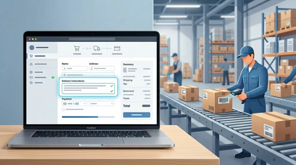

One bad delivery note can send a package to the wrong door, the wrong gate, or the wrong person. That usually starts with weak delivery instructions UX, not careless shoppers.
When the field is vague, buried, or hard to process in the checkout experience, customers improvise. Then the warehouse has to guess what “leave outside” means.
Good checkout design keeps the note easy to enter and easy to use, building customer trust through a professional handoff. The sections below show how to build that handoff so fewer orders go wrong.
Key Takeaways
- Place the delivery instructions field right after delivery method selection with progressive disclosure to match the user’s choice and reduce irrelevant entries.
- Use a hybrid input with structured fields for common details like gate codes, specific microcopy, character limits, and inline validation to guide shoppers and cut noise.
- Ensure the note travels cleanly to order admin, warehouse systems, and couriers via dedicated attributes, not generic comments, for reliable fulfillment.
- Avoid pitfalls like vague labels, poor mobile UX, or late placement by following the best-practices checklist in testing and prototypes.
Why delivery instructions fail in the first place
Most mistakes come from a mismatch revealed in the user journey map between what the shopper wants to say and what operations can actually use. Shoppers write natural language. Fulfillment teams need clear, predictable data.
A field that says “notes” invites anything and everything. That sounds flexible, but it creates noise. A driver note, a building access code, and a packaging request do not belong in the same bucket.
The problem gets worse when the field sits in the wrong place in the user flow. If it appears too early, the customer has not picked a delivery method yet. If it appears too late, they may never notice it.
If your checkout already handles addresses well, the checkout form UX patterns for addresses article is a useful reference for keeping extra fields out of the way, especially around shipping methods. Delivery instructions should follow the same rule, keep the form close to the decision that creates the need.
Put the field where the delivery decision happens
The best placement is near the delivery methods, not buried in a long address form. When the user chooses home delivery, pickup, or local courier, the instructions field should react to that choice.
That matters because the question changes by delivery method. A home delivery customer may need a gate code. A pickup customer may use an interactive map for locating units and need none at all. A local courier order may need safe drop-off locations.
For stores with multiple delivery methods, shipping option selector UX is part of the same problem. The field should follow the delivery path, not sit as a generic extra box.
A good rule is simple; apply progressive disclosure to show the field when it helps the order and hide it when it does not. That keeps the checkout shorter and cuts down on empty or irrelevant entries.
When the field does appear, pair it with address context. A shopper should know why they are seeing it. That is better than asking for “special instructions” with no clue about who will read them.
Design the input so people can answer fast
A delivery instructions field, built with standardized components from your design system, should not make people think. It should guide them toward the one or two details that matter.
If the shopper can write a note in two seconds, the warehouse can read it in two more.
Freeform, structured, or both?
The right format depends on the kinds of mistakes you see most often, as usability testing often reveals. A single textarea is easy to build, but it puts all the work on the customer. Structured fields take more setup, but they reduce guesswork.
Here is a simple way to compare the options using wireframes and prototypes:
| Pattern | Best use | Main risk |
|---|---|---|
| Freeform textarea | Rare or varied notes | Vague text, long notes, hard parsing |
| Structured fields | Gate code, buzzer, safe drop spot | Too many questions if overused |
| Hybrid form | Most ecommerce checkouts | Needs clear logic and fallback text |
Most stores do best with a hybrid setup. Ask only for the details that matter, then leave one short text field for anything else.
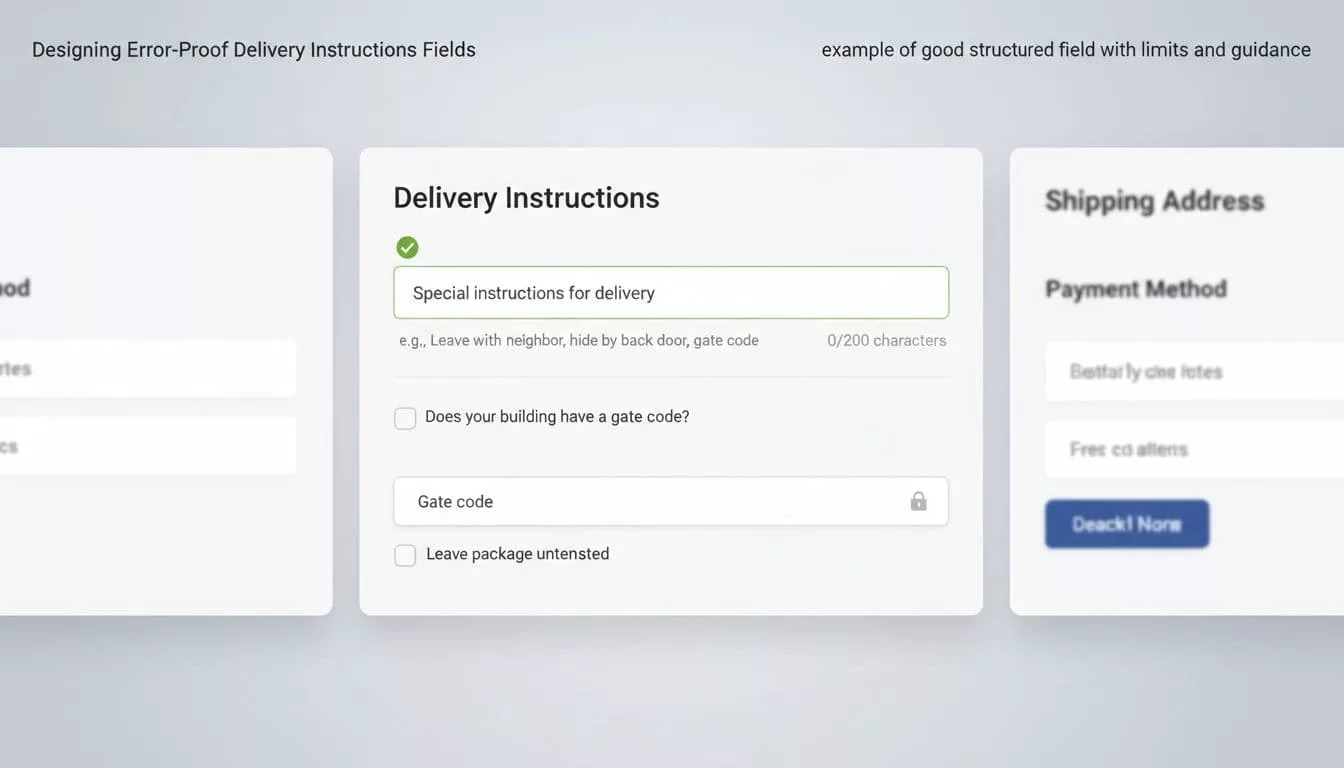
Microcopy and limits that keep notes usable
Microcopy should show the kind of detail you want. “Add gate code, buzzer, or safe drop spot” works better than “Add notes.” It tells people what belongs there.
Character limits help too, but only if they match the job. A 150 to 200 character cap is enough for most delivery notes. If people need more, the form is asking for the wrong information.
Shopify’s guidance on UX for delivery methods makes the same point for delivery methods; keep added content short and scannable. That advice matters here because delivery notes are part of the decision flow, not a freeform comment box.
Good example: “Delivery instructions, for driver only” Helper text: “Add gate codes, building access, or safe drop details.”
Bad example: “Notes” Placeholder: “Anything”
That second pattern invites noise and makes the field feel optional in the wrong way. Clear labels reduce bad data before it starts.
Use conditional logic and validation that match the order
Conditional logic keeps the form honest. If a shopper picks digital delivery, they do not need a drop-off note. If they pick courier delivery, they probably do.
This is where a lot of teams go too broad. They show the field to everyone, then ask ops to sort it out later. A better pattern is to use checkout UI extensions to reveal the field only when the chosen delivery method needs extra guidance.
Baymard’s fulfillment-selector research is useful here because its information architecture treats shipping, pickup, and pickup points as one flow. That same idea applies to instructions. The note should sit inside the flow that creates it.
Validation should happen as the shopper types or moves on, not after they place the order. If you wait until submit, the user has to hunt for the problem. Keep the message plain and fix-oriented.
Examples that work:
- “Add apartment or unit number.”
- “Gate code is too long.”
- “Use a shorter delivery note.”
Examples that fail:
- “Invalid input.”
- “Field error.”
- “Please check your data.”
The best validation also preserves focus and works with the navigation structure for keyboard and screen readers. That matters because the note field is often used on mobile, where errors are easier to miss.
Make the backend read the note correctly
A good front end means little if the note disappears after checkout. The field has to travel cleanly into the order admin, warehouse system, and courier handoff, ensuring last meter information reaches the driver.
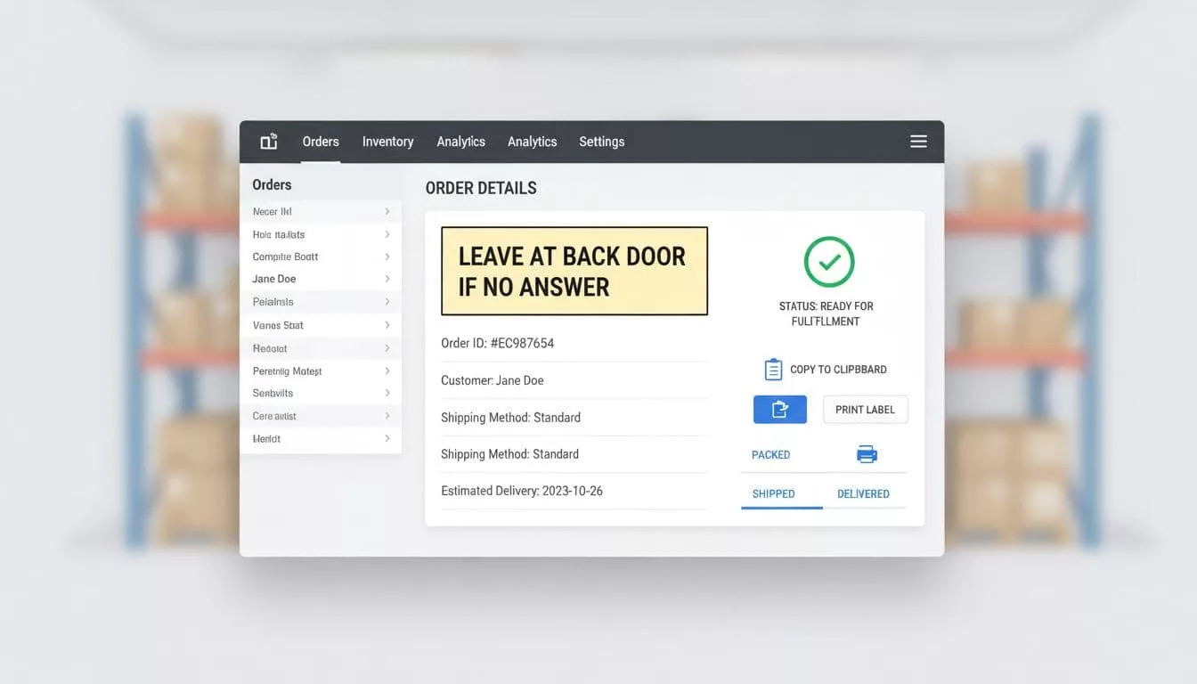
Map the field to a dedicated instruction attribute, not a generic comments blob. Warehouse staff should see it in the same place every time. If they need to open three tabs to find it, the design has already failed.
A delivery note that survives checkout but not the warehouse scan is a data-loss problem.
This is where backend visibility matters. Show the note in the order detail view, on pick tickets to support route planning and improve driver experience, and on packing slips when relevant. If a courier system receives structured delivery data, pass it along in a field it can read, not buried in a paragraph of mixed order notes.
If your ops team prints labels, test the printed output through stakeholder communication. Long notes can wrap badly or get cut off. That turns a good instruction into a useless one.
Common pitfalls that keep causing misses

The same visual design mistakes show up again and again. They are easy to spot once you know where to look.
- The field sits below payment, where shoppers never expect it.
- The label says “notes” or “comments” instead of “delivery instructions.”
- The placeholder does all the work while the label stays vague.
- The field accepts long paragraphs, but fulfillment only needs one short note.
- The backend stores the text in a place staff rarely check.
- Mobile users get a tiny textarea with no clear tap target.
Bad design often looks harmless during QA, but user research reveals these pitfalls. It breaks later, when different user personas such as a driver or warehouse picker miss a gate code or building note.
The fix is not more instructions. It is a tighter form, a clearer path, and a better data handoff.
Best-practices checklist for delivery instructions fields
Use this checklist as part of your UX deliverables for a quick review before release:
- Place the field after delivery method selection.
- Label it “Delivery instructions” or something equally clear.
- Keep helper text short and specific.
- Use structured inputs for repeatable details like gate codes or safe drop spots.
- Keep a short freeform area for unusual notes.
- Add a practical character limit and show it to the user.
- Validate inline with plain language.
- Pass the data into order, warehouse, and courier systems without retyping, following your service blueprint.
- Test the field on mobile, keyboard, and screen readers.
Incorporate these practices throughout your design process, including testing with high-fidelity prototypes before final release. If a checkbox or dropdown can capture the detail, use that first. Save free text for the part that needs judgment.
Frequently Asked Questions
Where should the delivery instructions field appear in checkout?
Place it near delivery method selection, like after choosing home delivery or pickup. Use progressive disclosure to show it only when relevant, pairing it with address context. This keeps the form short and ties instructions to the decision that creates the need.
Freeform textarea or structured fields—which works best?
Most stores need a hybrid: structured inputs for repeatable details like gate codes or safe drop spots, plus a short freeform area for extras. Freeform alone invites vague noise; structured reduces guesswork but avoid overkill. Test with usability to match your common mistakes.
How do you make delivery notes usable in fulfillment systems?
Map the field to a dedicated attribute, not a comments blob, so it shows consistently in order views, pick tickets, and courier handoffs. Test printed outputs and backend visibility with ops teams. A note that survives checkout but vanishes in the warehouse fails the handoff.
What microcopy and validation prevent bad data?
Use clear labels like “Delivery instructions, for driver only” with helpers like “Add gate codes, building access, or safe drop details.” Add 150-200 character limits and inline validation with plain fixes like “Gate code is too long.” Vague placeholders like “Anything” invite noise.
What are the top pitfalls in delivery instructions UX?
Common issues include burying the field below payment, vague “notes” labels, no mobile optimization, and poor backend routing. Long paragraphs overwhelm parsing, and showing it to everyone ignores delivery type. Fix with tighter forms, clear paths, and stakeholder testing.
Conclusion
Delivery instructions UX fails when the form treats it like an afterthought. It works when the checkout asks the right question, at the right time, in the right format.
The strongest delivery instructions UX keeps the field visible only when needed, guides the shopper with clear microcopy, and delivers that note into the systems that fulfill the order. When those pieces line up, the checkout feels lighter, the order is easier to ship, and clear notes support route optimization throughout the logistics chain.