A high rating can still hide the wrong review. Shoppers do not want every opinion, they want the few that match their situation.
That is where product review filters earn their place. When the filter set reflects real buying questions, it cuts friction, builds trust, and helps people decide faster. When it does not, the review section becomes another wall of noise.
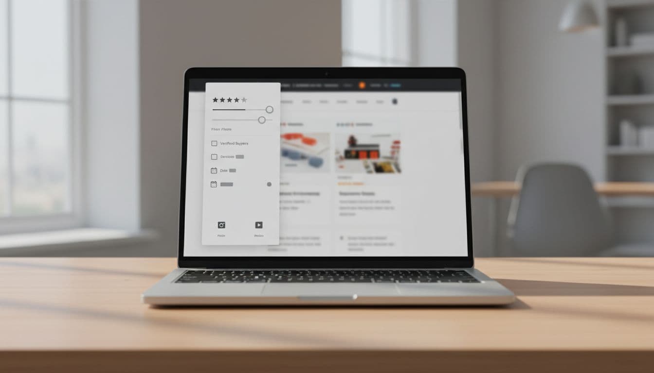
The best filter systems work like a sharp sales associate. They point shoppers to the comments that answer fit, quality, delivery, setup, and long-term use. Here is how to design them well.
Why review filters matter on product pages
Most shoppers do not read reviews from top to bottom. They skim for proof that feels relevant to them, then stop as soon as they find it. If your review module makes that search hard, people leave with doubt.
Good filters reduce that effort. A shopper looking for size feedback can jump straight to sizing comments. Another shopper can check verified buyers, recent reviews, or photo reviews before they commit. That saves time and lowers the chance of a mismatch after purchase.
Review filters also support trust. A long list of five-star ratings can look strong, but it still hides context. Filters help people see how the product performs for users like them, which is where confidence grows.
That is why review filtering works best as part of a larger review experience, not as a bolt-on feature. Pairing it with summary data, visible counts, and clear review snippets gives shoppers a faster path to a decision. See also product review UX patterns for the broader review module strategy.

If a shopper cannot find the review that matches their use case, the filter set is too vague.
Pick filter options by product category
A strong filter system does not look the same on every product page. What matters on an espresso machine is different from what matters on sneakers or a sofa. The trick is to match the filters to the decision.
Use the table below as a starting point.
| Product category | Best filter priorities | Why they matter |
|---|---|---|
| Apparel and footwear | Size, fit, body type, height, color, verified purchase | Shoppers want to know if the item runs small, true to size, or looks like the photos. |
| Electronics | Compatibility, setup, battery life, feature mentions, media type | Buyers need proof that the product works with their device and is easy to use. |
| Home and furniture | Assembly, dimensions, durability, delivery, room type | These filters reduce surprise around space, effort, and damage risk. |
| Beauty and personal care | Skin type, shade, scent, sensitivity, ingredient mentions | Relevance depends on personal fit, not just the star score. |
| Tools and hobby gear | Skill level, use case, long-term use, durability | Shoppers want context that matches how they plan to use the item. |
The takeaway is simple. Start with the filter that answers the biggest purchase risk, then add the next one only if it changes the decision. A page with three strong filters beats one with ten weak ones.
It also helps to keep the filter names plain. “Size” is better than “Fit attributes” when the shopper is in a hurry. “Photos” is clearer than “User-generated media”. Clear labels lower the mental load, which is the whole point.
Design the filter set around shopper intent
Review filters work best when they mirror how people think. Shoppers usually look for one of a few things: proof of fit, proof of quality, proof of ease, or proof that the product matches the claim. Your filter set should map to those jobs.
A useful way to sort the options is by intent:
- Match filters help people check size, compatibility, shade, or room fit.
- Proof filters help people find verified purchases, photos, or videos.
- Risk filters help people spot issues with setup, durability, shipping, or return pain.
- Recency filters help people weigh the latest feedback when products change over time.
Do not make people guess which category a filter belongs to. A label like “Most helpful” sounds nice, but it does not tell the shopper what they will find. A label like “With photos” gives immediate value.
The same logic applies to sorting. Sorting by newest or highest rating is useful, but it does not replace filters. Sorting changes the order of the reviews. Filtering changes the kind of evidence people see. Those are different jobs.
For the rest of the review module, keep the path to trust clear. If you already place review counts, ratings, and review snippets near the call to action, the filter area should support that story, not fight it. Placing reviews near CTAs helps shoppers compare the product, the proof, and the next step in one glance.
Make mobile filters easy to use and easy to read
On mobile, review filters need to feel light. A crowded sidebar that works on desktop can become a trap on a phone. Buttons get small, labels wrap, and the review list loses its flow.
A bottom sheet or compact filter drawer usually works better than a long panel. It gives shoppers a focused space to pick what they want, then returns them to the reviews fast. Keep the number of top-level options small, and hide the deeper ones under a clear “More filters” control.
Touch targets matter too. If a shopper has to tap twice or miss a checkbox, the filter has failed. Give each option enough space, and make the active state obvious. A selected filter chip should look selected at a glance.
Accessibility needs the same care. Every control needs a clear label, keyboard support, and readable contrast. Screen readers should announce both the filter name and its state. If a result count changes after a filter is applied, the update should be announced in a simple way.
Mobile review reading often happens in a hurry. People scroll, pause, and decide. That means the filter bar should help them act fast, not ask them to study the interface first. Good mobile UX lowers the effort, and that keeps the review section useful under real shopping pressure.
Handle low review volume without making the module feel empty
Low-review products need a lighter hand. When there are only a few dozen reviews, a huge filter panel can make the section look sparse and awkward. In that case, the goal is to guide, not to display every possible option.
Keep the core controls to the ones that still add value. “Verified buyer”, “with photos”, and a small set of category-specific attributes are usually enough. If there are not enough reviews to support a filter, leave it out for now. A dead filter creates more doubt than clarity.
This is also where default states matter. Show the most recent or most helpful review first if those views have enough data. If not, surface a short note that tells shoppers how many reviews they are seeing and what kind of feedback is available. Empty space without context feels like a missing feature.
You can also use the low-volume period to strengthen the review capture process. Ask for structured feedback after purchase, and prompt for the attributes that matter most in that category. That gives future shoppers better material to filter by.
A sparse review section needs guidance, not a spreadsheet. The best interface gives people just enough structure to move forward.
Conclusion
Shoppers do not need more reviews. They need better ways to find the ones that matter. That is why well-designed product review filters can change how a product page feels, especially when the page already carries ratings, snippets, and trust signals.
The strongest systems stay tied to shopper intent, fit the product category, work cleanly on mobile, and stay simple when review volume is low. When those pieces line up, the review section stops feeling like a pile of comments and starts acting like decision support.
If the filter set helps shoppers answer one real question faster, it is doing its job.