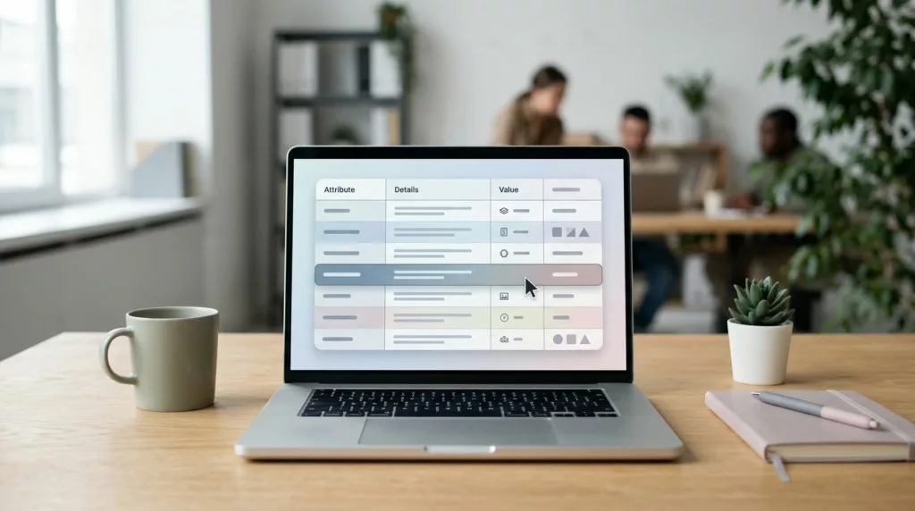
Product Specifications Table UX for Faster Buying Decisions
Shoppers don’t read product pages top to bottom. They scan, compare, and look for the one detail that removes doubt....

Compatibility Checker UX That Prevents Wrong Part Orders
A wrong part order is rarely a data problem alone. More often, it starts with a poor user experience on...

Request a Quote UX Patterns for B2B Product Pages
When a B2B eCommerce product needs a quote, the page has one job, move a buyer from interest to a...
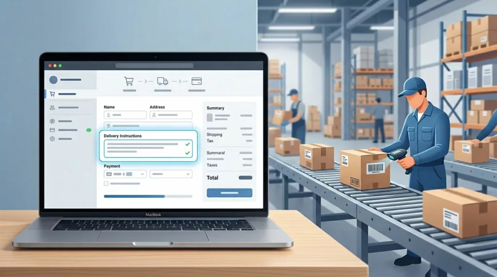
Delivery Instructions UX That Prevents Fulfillment Mistakes
One bad delivery note can send a package to the wrong door, the wrong gate, or the wrong person. That...
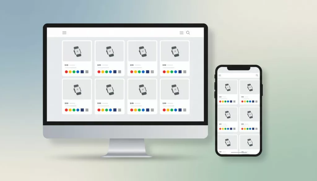
Product Card Swatch UX That Helps Shoppers Compare Variants
Shoppers compare variants in seconds. If your product cards hide the difference, they slow down or guess. Strong product swatch...
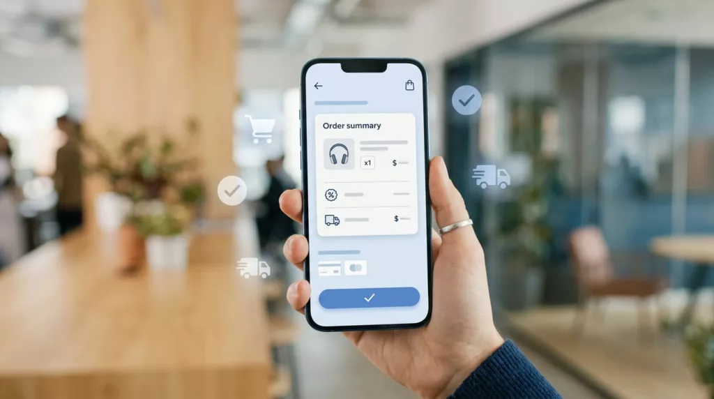
Mobile Checkout UX: Order Summaries That Stop Late Drop-Off
Most late-stage mobile drop-off starts with doubt, not lack of intent. A shopper reaches payment, then pauses because shipping changed,...

Order Cancellation UX That Cuts Chargebacks and Support Tickets
Bad cancellation UX turns a simple request into a trust problem. When people can’t tell if an order can still...
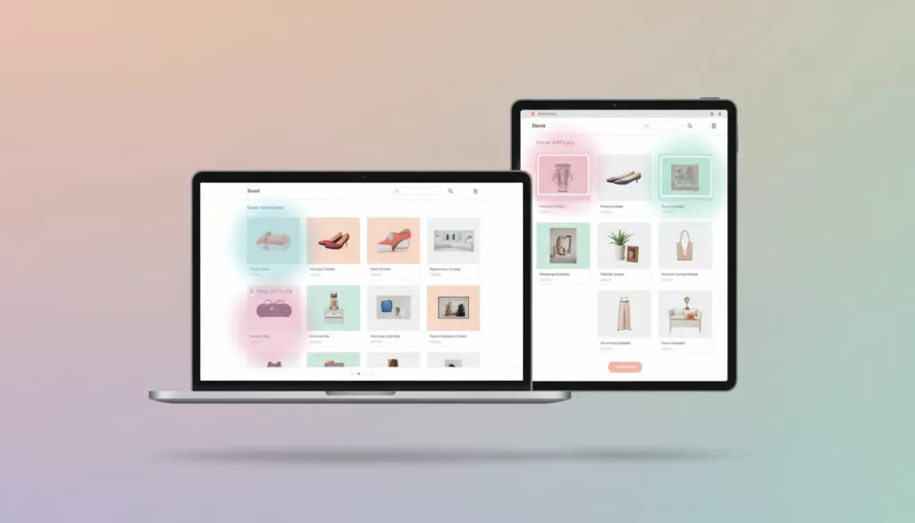
New Arrivals Page UX That Earns More Repeat Visits
A new arrivals page has one job: show change fast. If a returning shopper lands there and can’t tell what’s...
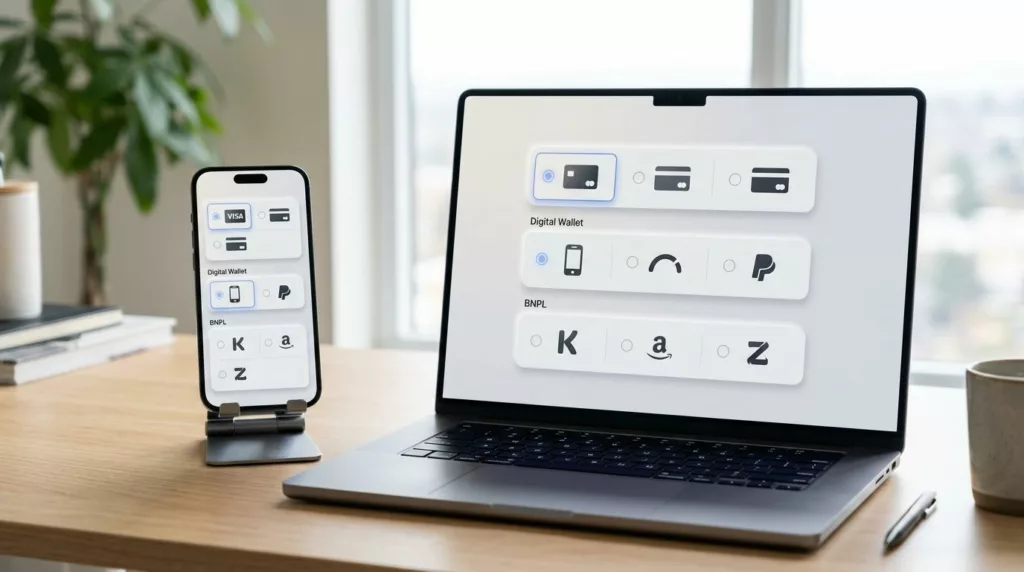
Payment Method Selector UX That Reduces Checkout Hesitation
A shopper can tolerate one more field. They usually won’t tolerate one more decision. That’s why the payment method selector...
Product Badge UX: Highlight Value Without Visual Clutter
A badge can save a click or sabotage a product card. When every item says New, Sale, Trending, Limited, and...