

A wrong part order is rarely a data problem alone. More often, it starts with a poor user experience on a screen that leaves too much room for guesswork.
When a shopper cannot tell whether a part fits, they hesitate, click anyway, or contact support. A strong compatibility checker UX removes that doubt before it reaches the cart, which protects conversion, cuts returns, and saves your team from avoidable tickets.
The best software applications do more than collect a year, make, or model. They guide the customer to a clear answer, then back it up with plain language and next steps.
Key Takeaways
- A strong compatibility checker UX prevents wrong part orders by providing visible vehicle selection, plain-language fit confirmation, and reason codes for mismatches right near the decision point.
- On mobile and search, keep the selected vehicle persistent, use large touch targets, and filter results to match, reducing friction across devices.
- When no fit is found, explain why in simple terms, suggest alternatives, and offer clear paths to support or related parts to maintain confidence.
- Test the flow against real buying moments—entry, selection, result, recovery, and mobile—with metrics like support tickets and return reasons to ensure it protects conversion.
Why wrong-part orders happen at the user experience layer
Fitment data matters, but the user interface decides whether shoppers trust it. If the selector is buried, resets on every page, or gives vague results, the customer starts filling in the gaps themselves.
That is where wrong-part orders begin. A buyer sees a product, assumes it might work, and clicks add to cart because the site never gave a strong enough yes or no.
Good UX cuts off that chain early. It shows the right vehicle or product context first, keeps the selection visible, and explains the fit in words a buyer understands.
For automotive and aftermarket stores, that means the checker needs to act like a gatekeeper and a guide that aligns with established design principles. It should filter incompatible parts out of sight when possible, and it should explain exceptions when it cannot. For a useful reference on how fitment data and front-end choices affect returns, see accurate fitment data for automotive ecommerce.
If a shopper has to guess, the UX has already failed.
The same logic applies to product-page questions. The checker ensures system functionality supports the buyer’s needs, and a strong product page FAQ UX for compatibility checks answers the last doubts that the selector cannot cover on its own.
What a good compatibility checker shows first
The first screen should answer one question fast, “Does this fit my vehicle or setup?” Anything slower creates friction.
A strong checker usually includes these critical UI components:
- Visible vehicle selection keeps the customer in context. Year, make, model, trim, and engine should be easy to find, not buried in a tab.
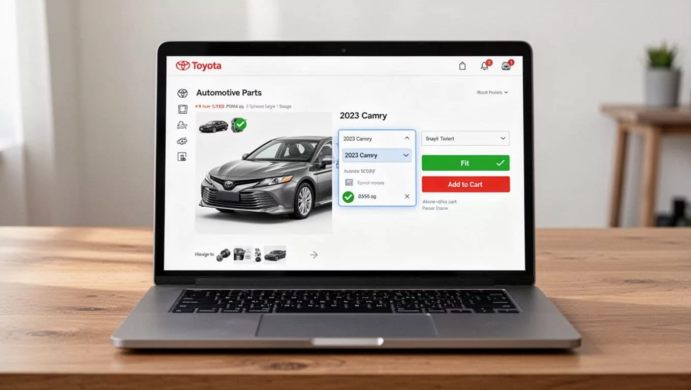
- Plain-language fit confirmation removes ambiguity. “Fits your 2023 Toyota Camry” is easier to trust than a vague compatibility status.
- Reason codes for mismatches help users recover. If a part does not fit, tell them why, such as trim, engine, or submodel conflict.
- Editable choices without loss prevent frustration. A buyer should be able to change the vehicle without losing the part or the page state.
Clear fit messaging works best when it sits near the decision point. A shopper should not hunt for it in specs or read it after the add-to-cart click. Automotive conversion guidance from how to improve conversion on automotive Shopify stores makes the same point, the selector should be obvious and the fit message should live close to the action.
A good checker also respects visual accessibility. Labels must be compatible with assistive technology, contrast must hold up in bright light with proper color contrast and contrast ratio of text, and color cannot be the only signal. Graphical objects like a green badge are helpful, but they should provide secondary cues and never be the whole story.
The best pattern is simple, show the selected vehicle, show the result, then show the next move. If the part fits, the path to cart stays short. If it does not, the user gets a reason and a way forward.
Mobile screens and search need the same rules
Traffic from mobile devices changes the stakes. Small screens make vague fitment flows feel even riskier, because every tap costs more effort.
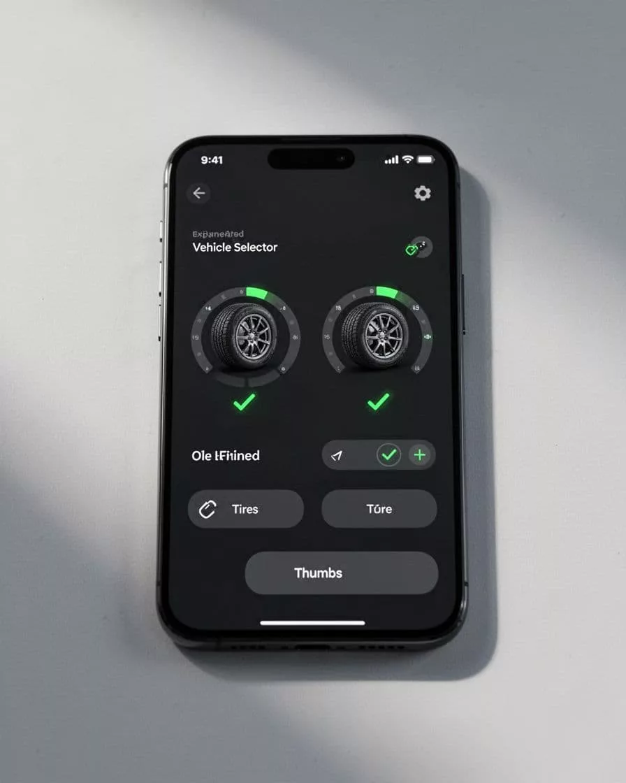
A mobile compatibility checker with responsive design should keep three things steady. First, the current vehicle must stay visible. Second, the selection control needs large touch targets. Third, the fit result should appear without a page reload that breaks the flow, and the checker must perform well across different screen resolutions.
Search needs the same discipline for cross-platform compatibility. Once someone selects a vehicle, search results should respect that choice. If the shopper enters “brake pads,” the store should not show every brake pad in the catalog. It should show the ones that match the selected vehicle, or at least rank them that way, with the logic remaining consistent across all device types.
This is where multi-platform persistence pays off. Saved vehicles, remembered sessions, and a visible “My Garage” style profile reduce repeat work. They also make it easier for a returning shopper to pick up where they left off.
Review content can support this flow too. Shoppers often look for proof that another buyer with the same vehicle had success. A focused product review filters for fitment proof pattern helps them surface reviews tied to compatibility, setup, and use case.
If you want a platform-level example of vehicle-aware filtering, Shopify fitment app details show how persistent selection and mobile-friendly controls can support the experience. The UX still matters most, because the best data model fails if the screen is hard to use.
Reduce uncertainty before support gets involved
Not every visitor will find the answer inside the checker. Some need a second confirmation before they spend money. That is where your support paths matter.
A strong fitment experience gives users clear exits when confidence drops. It does not trap them in a dead end.
A few practical moves help here:
- Add a short explanation when no fit is found.
- Offer a related part or a universal option if one exists.
- Show the reason for the mismatch in plain language.
- Give the customer a direct path to support, chat, or FAQ.
That last point matters more than many teams expect. A compatibility question that reaches chat is still a sale opportunity if the handoff is clean. The right live chat UX for compatibility questions keeps help available without blocking the product page, leading to higher user satisfaction.
This is also where a strong FAQ page earns its place. Questions like “Does this fit my trim?” or “What if I have an aftermarket setup?” belong near the product, not in a support article that nobody reads. Good answers that prioritize web accessibility and adhere to WCAG compliance reduce both anxiety and ticket volume, enabling successful task completion.
For a deeper look at the structure behind fitment-heavy stores, vehicle fitment store architecture is a useful reference. It shows why confidence badges, saved vehicles, and compatibility layers matter together, not in isolation.
The point is simple. When the checker cannot say yes, it should still help the customer move forward with confidence.
A simple framework for testing the flow
The fastest way to improve compatibility checker UX is to test it against real buying moments, not abstract opinions. Start with the same questions your customers ask.
The table below gives a practical review framework.
| Step | What to check | Why it matters |
|---|---|---|
| Entry | During usability testing, can shoppers find the selector within one scroll? | Hidden selectors create guesswork and lost conversion. |
| Selection | In functional testing, does the flow keep vehicle data visible and editable? | Users need confidence without losing progress. |
| Result | Is the fit message clear, plain, and near the add-to-cart button? | Vague status labels increase wrong orders. |
| Recovery | Do mismatch states explain the problem and suggest the next move? | Good recovery paths reduce support tickets. |
| Mobile | Can the whole flow work cleanly on a phone with one thumb (include accessibility testing)? | Most friction shows up on smaller screens first. |
The takeaway is simple. Test the flow where money is on the line, not just where the data looks clean.
You can use this as a launch checklist:
- Confirm the selector is visible on product, category, and search pages.
- Check that fit status uses plain language, not internal jargon.
- Make sure incompatible items are hidden or clearly flagged.
- Test what happens when a shopper changes vehicle data mid-session.
- Review the no-results path on mobile and desktop.
- Perform cross-browser testing using browser emulators on different operating systems.
- Measure support tickets tied to fitment before and after changes.
- Compare return reasons tied to wrong parts, not just total returns.
- Verify total testing coverage and generate a feedback report before going live.
If you want a stronger baseline, compare your current state against real cart behavior, not a design mockup. A checker that looks good but fails on mobile still creates wrong orders. A checker that answers fast, explains clearly, and recovers well tends to improve conversion and lower service cost at the same time.

Frequently Asked Questions
Why do wrong part orders happen despite good fitment data?
Wrong orders stem from poor UX that leaves room for guesswork, like buried selectors or vague results. Shoppers assume fit and add to cart when the interface fails to give a clear yes or no. Strong UX acts as a gatekeeper, filtering incompatibles and explaining exceptions upfront.
What UI elements make a compatibility checker effective?
Key components include visible year-make-model-trim-engine selection, plain fit messaging like “Fits your 2023 Toyota Camry,” reason codes for no-fit, and editable choices without state loss. Place these near the add-to-cart button for trust. They work best with accessibility cues beyond color alone.
How should mobile compatibility checkers handle small screens?
Keep the vehicle selection visible, use large touch targets, and show results without page reloads. Search must respect the selection, filtering or ranking compatible parts first. Persistent “My Garage” saves reduce repeat entry across sessions.
What is the best way to test a compatibility checker UX?
Use the framework: check entry visibility, selection persistence, clear results near action, mismatch recovery, and mobile thumb-friendly flow. Measure pre/post changes in fitment tickets and wrong-part returns. Test on real carts, not mockups, across browsers and devices.
How does a good checker reduce support tickets?
It cuts uncertainty with explanations, alternatives, and direct support links when fit fails. Product-page FAQs handle common doubts like trims or aftermarket setups. Clean handoffs to chat turn questions into sales without blocking the path.
Conclusion
Wrong part orders usually come from weak signals, not weak intent. The shopper wanted the right item, but the user interface made the choice harder than it needed to be.
A better compatibility checker gives them clarity early, keeps the selected vehicle in view, explains mismatches in plain language, and offers a clean next step when doubt remains. That is how you protect conversion while reducing returns and support load.
A high-quality compatibility checker UX is a cornerstone of good user experience. Every user interface should make fitment feel calm and obvious to prevent wrong orders.