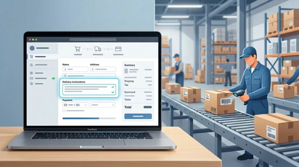
Delivery Instructions UX That Prevents Fulfillment Mistakes
One bad delivery note can send a package to the wrong door, the wrong gate, or the wrong person. That...

Post-Purchase Account Creation UX That Protects Conversion
The easiest way to lose a checkout is to ask for a new commitment before the order is done. Buyers...

Pickup Point Selector UX That Cuts Delivery Friction
Pickup point selection looks simple until shoppers have to use it. Then the clock starts, because every extra search, vague...

Phone Number Field UX for Ecommerce Checkout in 2026
The phone number field can make checkout feel smooth or stubborn in one screen. On mobile, that choice often shows...
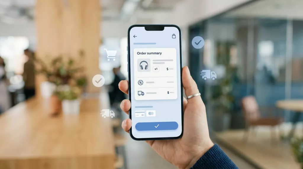
Mobile Checkout UX: Order Summaries That Stop Late Drop-Off
Most late-stage mobile drop-off starts with doubt, not lack of intent. A shopper reaches payment, then pauses because shipping changed,...
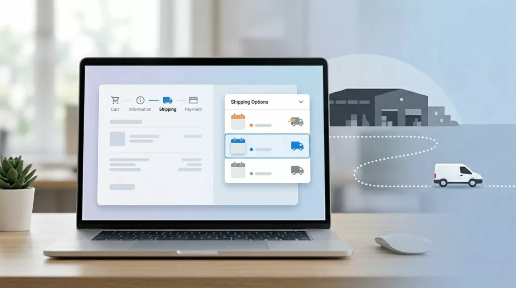
Shipping Option Selector UX That Prevents Delivery Mistakes
A shopper picks “Free Shipping” and expects it next week. Your warehouse treats that method as economy mail, the cutoff...

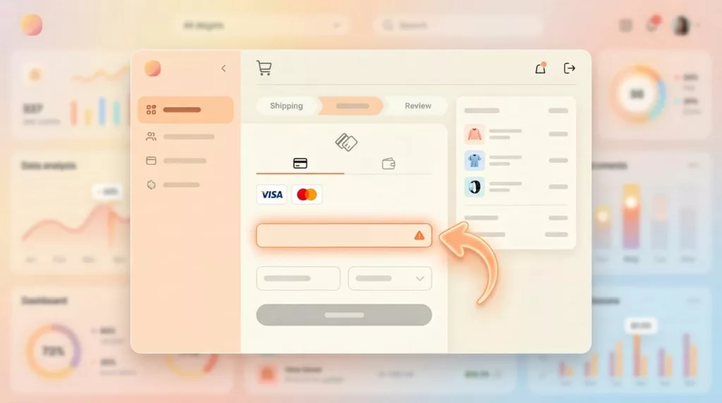
Credit Card Form UX Patterns That Cut Payment Errors
A checkout can lose a sale because of one mistyped digit. That is why credit card form UX still matters,...
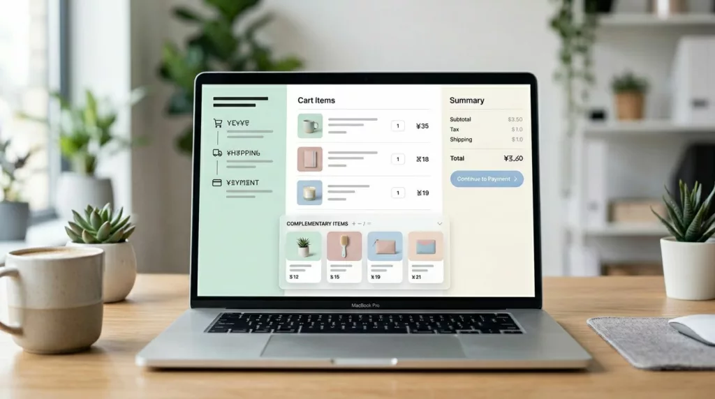
Cart Upsell UX That Lifts Average Order Value (AOV) Without Taking Over Checkout
The fastest way to lose an extra sale is to make the cart feel like a trap. Cart upsell UX...
Payment Failure Recovery UX That Saves More Checkouts
A failed payment doesn’t always mean a lost sale. More often, it means a poor customer experience where the checkout...

Address Autocomplete UX That Turns Long Forms Into Faster Checkouts
A shopper can forgive one extra tap. They rarely forgive a long, error-prone address form in the e-commerce checkout. For...