
B2B buyers rarely log in to admire a dashboard. They log in because they need an invoice, a PO match, or a payment record before the meeting starts. If that file takes more than a few clicks, the portal already feels costly to use.
Strong invoice download UX gives finance teams a fast path to the documents they need and keeps support out of the loop. When you design a modern SaaS invoicing platform, the user interface should prioritize clarity so admins can manage multiple users, tax details, and billing contacts across one account without unnecessary complexity.
The goal is simple: make invoice access obvious, trustworthy, and hard to break. The best portals do that without crowding the screen or exposing sensitive data.
Key Takeaways
- Prioritize visibility: Place billing and invoice links in the primary navigation rather than burying them within general account settings.
- Optimize for billing tasks: Build your invoice list to act as a functional workspace, including essential data like invoice numbers, dates, status, and PO references to minimize manual matching.
- Ensure friction-less downloads: Make the download action direct and predictable; avoid hidden menus or complex previews that confuse users and drive unnecessary support requests.
- Design for self-service: Use role-based access and intuitive filtering to empower finance teams to resolve their own needs without contacting support for documents or historical records.
- Monitor usability metrics: Track search-to-download times and invoice-related support volume to identify and resolve hidden bottlenecks in the user experience.
Make invoice history easy to spot
Invoice access should sit where people expect to find billing work. In many portals, providing an intuitive user experience means placing a clear Billing area with an Invoices tab in the primary navigation, rather than burying the link deep under account settings.
A small summary card helps anchor the page too. By focusing on clean dashboard design, you can display the current balance, the latest invoice, and the active company or entity before users start clicking. That level of clarity matters in B2B, where one admin may manage several brands, subsidiaries, or regions. A skilled UI/UX designer plays a critical role here, ensuring that the entity management structure feels logical and reduces cognitive load.
If your team is still shaping the wider account structure, improving billing portal user experience is a useful way to think about what belongs on the page and what should stay out of the way.
The invoice area itself should feel calm and predictable. Search, filters, and sorting belong near the top, because finance users scan for dates, amounts, and invoice numbers first. If the list can stretch across many months, let people narrow it by status, date range, specific billing methods, and billing entity.
A portal can look clean and still hide the wrong details. The trick is to show enough context for quick decisions without turning the page into a spreadsheet graveyard.
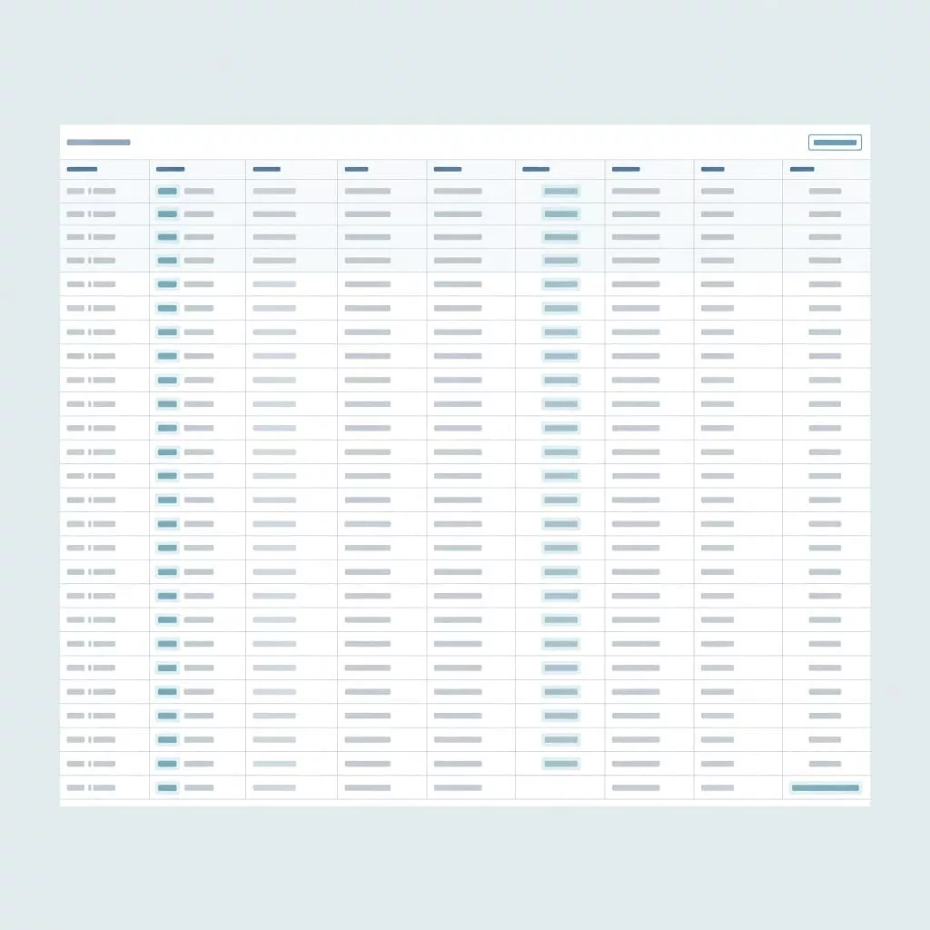
Build the invoice list around real billing tasks
A good invoice list is not a document dump. It is a working surface for AP teams, procurement leads, and account owners who need to match records quickly.
These fields cover most billing tasks without adding clutter or complexity.
| Field | Why it matters | Good default |
|---|---|---|
| Invoice number | Fast reference for internal systems | Prominent and searchable |
| Date | Helps with month-end close | Sortable, newest first |
| Amount | Supports quick scan | Right-aligned, currency shown |
| Status | Separates paid, open, overdue, credited | Plain language |
| Payment terms | Helps teams prioritize urgent payments | Clear due date countdown |
| PO number | Matches procurement records | Visible when present |
| Download action | Makes the next step obvious | Button for PDF invoices |
Those columns handle most of the work. Add more only when the account has a clear need, such as tax region, billing entity, or customizable line items.
When PO values matter, keep them tied to invoice records and search. The article on managing PO data in portals is a good reference point for that flow. If a buyer can find the invoice but cannot match the PO, the portal still creates manual work. Providing additional context, such as milestone-based billing, also helps AP teams match records against contracts more effectively.
Labels matter as much as layout. “Invoice 10492” is useful, but “Invoice 10492, paid, $3,400, due June 12” is better. It gives users enough detail to choose the right file without opening multiple documents first.
Make the download action feel instant
The download action should never feel like a scavenger hunt. Put it at the row level, keep the label plain, and make the result predictable.
If a user has to ask support for a past invoice, the portal has already failed.
A simple click should start the download of PDF invoices or open a preview with a clear path back. If a preview appears first, the download control must be obvious. Tiny icons, hidden menus, and unlabeled buttons create avoidable confusion that often forces users to resort to requesting an email attachment from your support team.
The structure of invoice filenames matters more than many teams expect. A file called “Invoice.pdf” forces users to rename it and search for it later. A better pattern uses the invoice number, company name, and date in a consistent order.
Bulk download also helps when teams close books at the end of a month. Some users need one file, while others need a batch export they can file or share internally. Give both groups a path that feels intentional.
If invoice generation takes time, show a clear loading state and keep the user in the loop. Silent failures are worse than slow files, because they make people doubt the reliability of the entire billing area.
Set access rules without adding friction
Invoice data is sensitive, but it should not feel locked down to the point of uselessness. Role-based access works well when it matches real account roles, such as owner, finance admin, and read-only viewer. Effective client management relies on these roles to ensure the right people see the right documents without creating administrative bottlenecks.
The key is to limit access by role, not by unnecessary process. A finance user should not need a support ticket to see last quarter’s invoices or verify specific payment terms. At the same time, a sales rep with account access may not need the full billing archive.
For teams still mapping portal structure, how to build a customer portal on your business website offers a useful baseline for thinking about permissions and page hierarchy.
Use time-limited links for emailed invoices, and prefer signed URLs for downloads that contain sensitive details. That reduces the chance of stale links floating around inboxes for months. Audit logs help too, because finance teams often need to know who accessed what and when.
SSO can fit into this flow without extra drama. It is the responsibility of a skilled UI/UX designer to ensure that security measures like SSO do not interfere with the overall user experience. If a user is already authenticated in the portal, invoice access should stay inside that session unless the file is especially sensitive. Extra password prompts on every download create more friction than protection.
Mobile access deserves the same care. People do check billing records on phones, even if they prefer desktop for the real work. If the mobile app design fails to scale, the invoice table may collapse poorly or buttons may shrink past tap-friendly sizes, causing the entire interface to break down.
Common invoice portal mistakes that drive support tickets
Even the best account portals often suffer from common usability issues that lead to unnecessary support volume. These flaws are easy to overlook during initial reviews, but they inevitably drive up ticket costs. Investing in quality design services early in the process helps identify these pitfalls before they frustrate your customers.
- Hiding historical invoices behind a generic documents page or requiring a manual request flow.
- Resetting search filters every time the user navigates away from the list.
- Displaying invoice numbers in tiny text while obscuring essential billing details.
- Neglecting mobile app design, which results in broken layouts that force users to pinch and zoom just to locate a file.
- Stripping away PO numbers, billing references, or tax details during the export process.
- Opening a file preview that lacks a clear download button or fails to display a clean, professional invoice template.
Each of these problems pushes users to seek help through email, chat, or phone. That is a poor trade for a routine task that should take only seconds to complete.
A portal can also fail in smaller, subtle ways. For example, an empty state that simply says “No invoices found” without explaining the current filter settings leaves users stuck. A better approach is to display a message that highlights the active date range or status filter, allowing the user to recover on their own without needing to contact your team.
Measure whether the portal is doing its job
The best invoice experience is visible in the support queue as much as in the UI. If the portal works, invoice-related tickets should drop and repeat visits should get shorter. When assessing performance at an enterprise scale, it is vital to remember that the portal is a critical piece of your software ecosystem; its integration capabilities with internal accounting systems often determine how smoothly data flows for your clients.
For a broader view of enterprise expectations, modern B2B portal UX best practices for enterprise growth is a helpful comparison point.
| Metric | What it tells you | What to watch for |
|---|---|---|
| Invoice download completion rate | Whether users can get the file | Many starts, few finishes means friction |
| Search-to-download time | Whether lookup works well | Slow times point to weak filters or labels |
| Invoice-related support tickets | Hidden usability costs | Repeated requests mean the portal is unclear |
| Bulk export usage | Whether AP teams need batch work | Low use may mean the feature is buried |
| Failed download events | Technical or auth problems | Recurring failures need a fix fast |
Read the numbers together. A high completion rate looks good, but not if users need five searches to get there. A low ticket count also helps, although it can hide a portal that people avoid using altogether. Every UI/UX designer should monitor these metrics to identify where the interface fails to meet user needs.
Watch how users arrive at invoices. If most people go straight to billing, the navigation works. If they land on the home page and wander, the entry point needs work. If they search by PO or invoice number every time, those fields deserve stronger placement and better indexing. You should also consider that many users cross-reference these documents with their own project management tools or specific internal records. Furthermore, if your company offers diverse pricing models or tracks billable hours, finance teams will rely on these portal insights to reconcile their books. Finally, be sure to audit your search filters against common billing methods, as clear labeling here ensures that users find the specific transaction types they need without unnecessary effort.
Frequently Asked Questions
Where should I place invoice access within my portal navigation?
Invoices should be located in a dedicated Billing area directly accessible from your primary navigation menu. Users expect to find billing documents in a predictable spot, so placing them under account settings or deep menus will only increase frustration and search time.
What metadata is essential for an invoice list?
To support efficient work for finance teams, your list should display invoice numbers, dates, amounts, status, payment terms, and PO numbers. This level of detail allows users to scan for the correct document and verify records without needing to open multiple individual files.
How can I reduce support tickets related to invoicing?
Most invoice-related support tickets stem from users being unable to find documents, broken search filters, or confusing download actions. By making the download path immediate, ensuring filters are easy to use, and providing clear, descriptive filenames, you can resolve the primary pain points that drive users to contact your support team.
Is it necessary to require re-authentication for invoice downloads?
While security is important, extra password prompts for every download create significant friction and often feel unnecessary if the user is already authenticated in their session. Use secure, time-limited links or signed URLs to protect sensitive documents without interrupting the user’s workflow.
Conclusion
Invoice access sounds small until someone cannot close the books because a PDF is missing. That is when portal design stops being cosmetic and starts affecting daily work.
The strongest billing experiences make the path obvious, the file easy to trust, and the download quick enough to feel routine. When people can find the right invoice, match the right PO, and export it without help, the user interface is clearly doing its job.
Refining the invoice download UX in B2B account portals requires a strategic approach. Whether you are leveraging professional design services or working with a dedicated UI/UX designer, the goal remains the same. When you make the task boring, fast, and dependable, the entire billing experience becomes a seamless part of your customer relationship.