

Industrial buyers do not browse product catalogs like casual shoppers. They scan for exact sizes, load ratings, materials, and standards, then dismiss anything that feels vague. When filters hide those details, every search takes longer than it should.
A strong dimensional filter UX makes technical specifications easy to compare without forcing buyers to open every product page. It also helps engineers, procurement teams, and distributors stay aligned on the same part. The best systems turn a dense catalog into a clear path from requirement to shortlist.
Why precise filters matter in industrial buying
A catalog with thousands of SKUs can still fail if the filters are too broad. The issue is rarely the number of options. It is the gap between how the business stores data and how buyers think.
Industrial users usually begin with a hard requirement. Will the part fit the envelope? Will it handle 250 psi? Is it 24 VDC or 120 VAC? Does it meet ISO, UL, or NEMA requirements? If the filter set does not answer those questions fast, buyers start opening product pages one by one.
That creates drag across the whole purchase path. It also increases spec mistakes, because people begin to guess when the interface stays vague. A filter for “material” is useful, but a filter for “316 stainless steel” is better. A filter for “compatibility” is useful, but a filter that names the actual series, mounting pattern, or mating system is far better.
If a buyer has to guess the right facet, the catalog is already costing them time.
The goal is not to show every possible attribute at once. The goal is to show the attributes that decide whether a part belongs in the shortlist.
Build the filter order around buyer questions
The best filter groups follow the questions buyers ask first. Most industrial buyers move through a simple order, fit, function, compliance, then finish details. Your interface should mirror that order.
A clear sidebar gives the buyer a map before the first click.
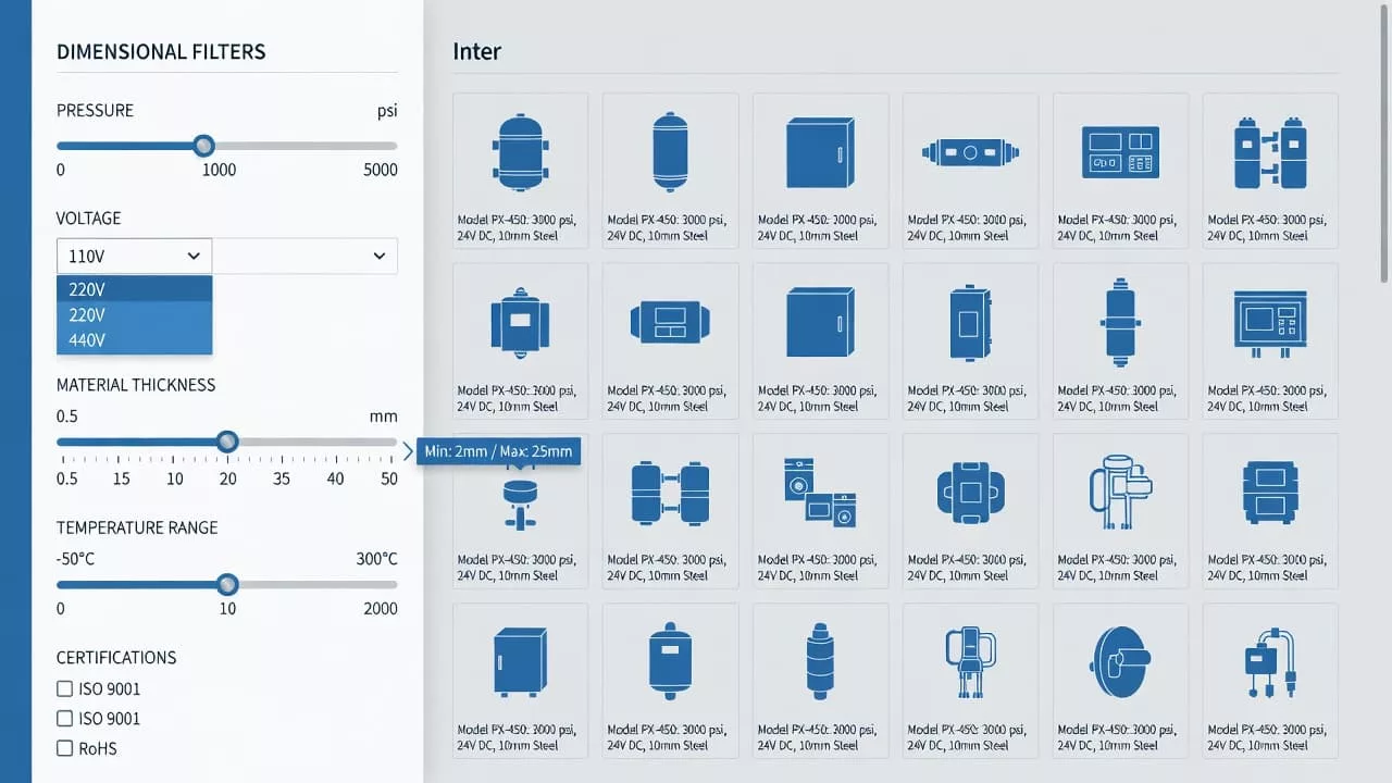
Size, voltage, pressure, and compatibility belong near the top because they remove the wrong products fast. Group dependent specs together, too. A pressure rating means little without the related material, temperature, or media context. Meanwhile, obscure details such as coating type or finish grade can sit lower in the stack.
That order matters on mobile as well. Space is tight, so the first visible facets need to work hard. If the filter list reads like an internal database export, buyers will miss the items that matter most.
A useful rule is simple. Put the attributes that decide fit and safety first, then move into attributes that refine the choice. The sidebar should feel like a guided path, not a warehouse shelf.
Organize spec facets so they feel familiar
Industrial buyers trust catalogs that speak the language of the spec sheet. They do not want clever labels. They want units, ranges, and terms that match what they already use in work orders and drawings.
The table below shows how common filter types should behave in a technical catalog.
| Filter type | What the buyer checks | Good UX pattern | Common mistake |
|---|---|---|---|
| Size | Will it fit? | Show units clearly and support exact values and ranges | Mixing mm and inches without clear context |
| Voltage | Will it power correctly? | Display AC or DC, nominal values, and common variants | Hiding the unit or burying phase details |
| Pressure | Will it hold under load? | Present min and max values in a clean numeric order | Using a slider for a sparse set of ratings |
| Material | Will it resist wear or chemicals? | Use specific grades and common aliases | Collapsing everything into “metal” |
| Compatibility | Will it work with the current system? | Tie values to series, brands, or standards | Using vague yes or no labels |
| Tolerances | Is the precision acceptable? | Show plus or minus values and acceptable bands | Treating tolerance like a note field |
| Standards | Does it meet required compliance? | Let buyers filter by named standard and status | Hiding compliance in PDFs only |
This kind of structure reduces mental work. It also cuts down on repeat clicks, because buyers can rule parts in or out faster. The interface should not make someone relearn the same dimension in three different places.
Normalization matters, too. If one product lists 24 VDC and another says 24 volt DC, the catalog should treat them as the same value. The same goes for 1/4 in and 6.35 mm, or pressure listed in psi and bar. Buyers care about the part, not the storage format behind it.
Handle ranges, dependencies, and dead ends
Industrial catalogs rarely fail because of a lack of data. They fail when the data behaves badly in the interface. Empty states, conflicting filters, and hidden dependencies can turn a serious buyer away fast.
Use sliders only when the data is dense and continuous. Pressure, temperature, and size can work well with ranges. Standards, materials, and compatibility usually work better as discrete choices. A slider for a sparse set of values feels imprecise and slow.
Keep the selected values visible as chips or tags. Buyers need to know what is active without reopening the filter panel. They should also be able to clear one condition without losing the rest. That is especially important when a spec chain gets long.
A few interface rules help a lot:
- Show disabled values with counts when possible, so buyers can see nearby options.
- Explain why a value is unavailable if the system can do it cleanly.
- Preserve filters across pagination and back navigation.
- Let users edit a range without resetting the full filter set.
Zero results need a recovery path, not a dead end. If “Size 12 mm + 316 stainless + NEMA 4X” returns nothing, the page should suggest the nearest valid change. That might mean widening the size range, swapping a material grade, or removing one compliance constraint.
Tolerance handling needs care as well. Buyers often compare parts that are almost, but not quite, interchangeable. Show the actual numbers, not just “close match” labels. Precision is the point.
Connect filters with search and comparison
Search and filters should not act like separate tools. Many industrial buyers begin with a part number, a spec string, or a standards term, then use filters to confirm the match. When the query and facets line up, the catalog feels trustworthy.
That is why search results page UX design matters when buyers move from a query to a shortlist. The results page should keep key specs visible, sort by relevance and stock, and avoid burying the filter panel behind extra clicks.
Comparison matters just as much. Industrial buyers often need two or three near matches side by side. A results page that shows voltage, pressure, material, tolerance, and compliance in a compact view saves time and reduces confusion.
The same logic applies to part-number searches. When someone types a precise code, the system should protect that intent instead of replacing it with broad merchandising logic. Search autocomplete can help here, but only if the suggestions stay disciplined and relevant. If the buyer already knows the spec, the interface should meet them there.
A strong results page also supports handoff between teams. Engineers may care most about fit and tolerance. Procurement may care about stock, lead time, and approved standards. Good filtering lets both groups work from the same shortlist without rebuilding it from scratch.
Conclusion
Industrial buyers do not need more noise. They need clear paths to the right part. When filters match the way people read spec sheets, the catalog becomes faster, calmer, and easier to trust.
Strong dimensional filter UX makes size, voltage, pressure, material, compatibility, tolerances, and standards easy to scan and compare. It also keeps the buyer moving when the first choice does not fit.
In a complex catalog, clarity is not a nice extra. It is the feature that turns technical detail into a purchase decision.