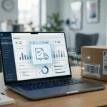

Customers do not open account portals for decoration. They open them when a shipment needs proof, a finance team needs a record, or a support rep needs to close a case.
If the proof of delivery download path is hidden, slow, or unclear, the portal feels broken even when the document exists. In B2B, that one file can affect billing, disputes, and the next order.
Strong proof of delivery UX gives users a clear path from order to file, without forcing a support ticket into the middle. The best portals make that path obvious, fast, and safe.
Why POD access matters after the order ships
B2B buyers treat proof of delivery as an operational record, not a nice extra. It confirms receipt, helps match invoices, and settles claims when something goes wrong.
When the file is hard to find, support gets the question. When it arrives late, finance waits. When the format is unclear, customers download the wrong version and start over.
That is why portal guidance from B2B customer portal best practices puts self-service and clear navigation at the center of the experience. It also lines up with B2B ecommerce design basics, where simple paths matter more than extra features.
The account area should make the next action obvious. If your home screen still feels like a filing cabinet, customer account page UX shows how to surface the right task without crowding the page.
Make the document path easy to spot
The main rule is simple, customers should not hunt for PODs.
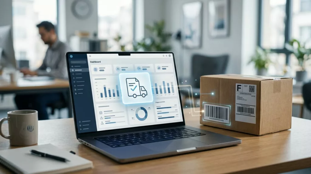
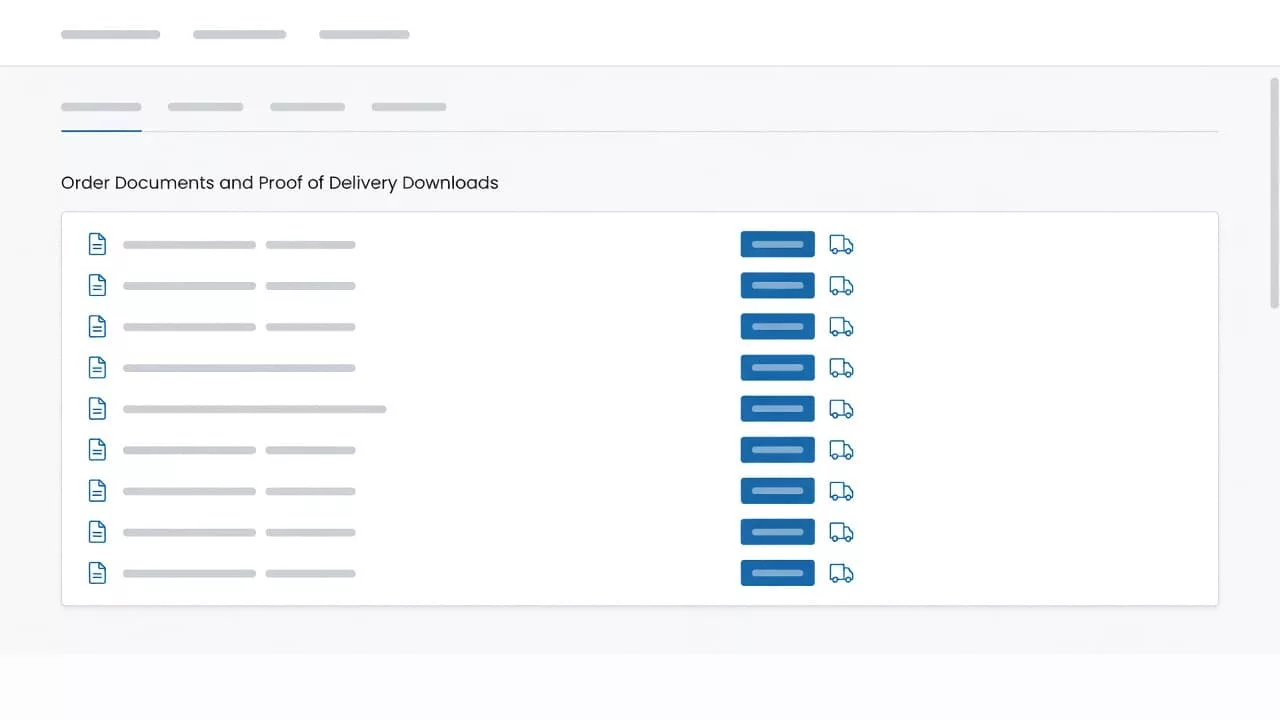
Place the download entry inside the order detail view, close to shipment status and tracking. If the portal uses a dashboard, show the document area in the same place every time. Users learn patterns fast, and they trust them even faster.
Use labels that match the buyer’s language. “Proof of delivery,” “Signed POD,” and “Delivery receipt” are clear. Internal terms like “carrier confirmation” or “doc package” force users to guess.
A good workflow is short and predictable:
- The user opens recent orders.
- The user filters by order number, date, or ship-to location.
- The order detail page shows delivery status, document type, and access state.
- The user downloads a PDF or previews the file before saving it.
That path keeps the document attached to the order, which is where users expect it. It also lowers the chance that they need help just to find the right record.
Build trust with clear status, formats, and audit trails
A POD file should never look the same in every state. Ready, pending, missing, and restricted all need different treatment.
Show a status badge right next to the action. A user should know at a glance whether the file is ready, still syncing from the carrier, or waiting on a signature. That small detail saves a lot of guesswork.
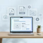
File format matters too. A PDF is right for printing and archiving. A JPG or PNG may work better for quick checks on a tablet. Large files should show size before download starts, so users know what to expect.
Audit details turn a simple download into a trusted record. Timestamp, source system, document version, and last sync time give support and finance one place to verify the file. If a claim comes back weeks later, that history matters.
The best portals also make preview easy. People often want to confirm the signature before they save the document. A quick preview cuts dead clicks and keeps the user in control.
Role-based access keeps the right hands on the right file
Not every user should see every delivery record. A national account can have AP staff, branch managers, support agents, and admin users in the same portal. Each one needs a different level of access.
A simple permissions model keeps the experience clean. It also reduces accidental sharing and prevents users from seeing data they don’t need.
Here is a practical way to map access:
| Role | What they need | UX cue |
|---|---|---|
| Accounts payable | Match invoices to received goods | PDF download, date, PO number |
| Branch manager | Check local deliveries fast | Ship-to filter, route search |
| Support agent | Resolve claims without back-and-forth | Audit trail, version history |
| Customer admin | Control visibility across teams | Role permissions, export logs |
When each role sees the right controls, the portal feels easier to use. It also cuts down on manual exports and copy-paste work inside the account team.
The same principle works across account design. Keep the first screen focused on the most common task, then let permissions open the right doors behind it.
How better POD UX lowers support volume
Support volume drops when the portal answers the question before the ticket exists. A missing POD often starts with a quick search, then turns into an email chain, then becomes a phone call.
Good UX shortens that path. If users can search, filter, preview, and download on their own, fewer requests reach the support queue. That means faster response times for the cases that do need a person.
It also helps operations. Warehouse teams get fewer “send it again” requests. Finance teams close invoice checks faster. Account managers spend less time chasing file requests and more time on larger accounts.
The retention effect is real too. Customers remember a portal that helped them solve a problem without friction. That pattern builds confidence in the relationship, which is part of what B2B customer portal loyalty is about.
Track a few signals to see whether the experience is working:
- Search success rate for POD files
- Time to first download
- File-related ticket volume
- Repeat use of self-service after a claim
- Percentage of downloads with preview first
If the right POD takes less than a minute to find, the portal starts to earn its place in the account workflow.
A good proof of delivery flow also lowers hidden costs. Fewer manual lookups mean fewer interruptions for warehouse staff and fewer exceptions for support managers.
Good workflow design feels boring in the best way
The strongest portal workflows are calm and direct. They do not force users to think about where the file lives or how it should open.
A strong flow often looks like this:
- Recent orders appear first.
- Delivery status sits beside the order number.
- A document card shows the POD state.
- Download, preview, and share actions sit together.
- Access rules stay visible before the user clicks.
That structure sounds plain, and that is the point. In B2B portals, plain often beats clever.
Clarity also helps during edge cases. If a POD is missing, the portal should say why. If a file is still processing, the user should see that status. If access is limited by role, the message should explain what the user can do next.
The more the portal explains itself, the less people need to ask.
Conclusion
Proof of delivery seems small until it sits between a shipment, an invoice, and a support case. Then it becomes a test of whether the portal helps people do real work.
The best proof of delivery UX makes the file easy to find, easy to trust, and easy to share. It also protects operations time, trims support volume, and gives customers one more reason to rely on self-service.
When the status is clear, the format makes sense, and access matches the user role, the portal does its job without getting in the way.