
A billing address toggle can save more checkout sessions and improve the checkout experience more than a long list of form tweaks. When shoppers see the right default, they move faster and make fewer mistakes.
The problem is simple. Many checkouts require shipping details and then ask for billing information even when the billing address and shipping address are the same, or they hide that choice so well that people miss it. That creates extra typing, validation errors, and doubt at the exact moment when trust matters most.
A better toggle reduces friction without hiding important information. The best versions feel obvious, clear, and easy to reverse.
Key Takeaways
- A pre-selected “Same as shipping address” checkbox defaults to the most common case, cutting duplicate typing, validation errors, and checkout abandonment.
- Use clear labels, immediate field reveals, and visible controls to make the toggle predictable, building shopper trust and control.
- Prioritize mobile-first design with large touch targets, accessibility features like ARIA announcements, and proper autocomplete attributes to reduce friction on small screens.
- Test with metrics like toggle changes, form errors, completion rates, and support tickets to confirm the pattern boosts orders without adding hesitation.
- Pair the toggle with broader checkout fixes to ensure billing data accuracy for payments, taxes, and order fulfillment.
Why the billing address toggle matters
In an ecommerce store, checkout is where small design choices turn into lost orders and hurt conversion rates. If a shopper has to enter the shipping address and then the billing address again, one more field can become one more reason to quit.
The billing address toggle works because it respects the most common case. Many buyers want the billing address to match the shipping address, so the form should start there. Google’s payment and address form best practices recommend making that the default when it fits the flow, and using proper autocomplete values so users don’t type the same data twice.
That matters for more than speed. Clear defaults reduce second-guessing. When shoppers understand what will happen if they keep moving, they feel more in control. That sense of control supports trust, and trust supports completion.
A weak pattern does the opposite. It makes the shopper pause, scan, and wonder if they missed something. That pause is where errors creep in. It can also trigger mismatches between the billing address and shipping address or delivery address, failed card checks, and support tickets after the order.
For broader checkout work, pair this pattern with checkout UX fixes that reduce cart abandonment. The toggle is small, but it has a real effect on the flow around it.
What a strong billing address toggle looks like
A good toggle does three things well. It sets a sensible default, explains the choice in plain language, and only expands the form when the shopper needs it.
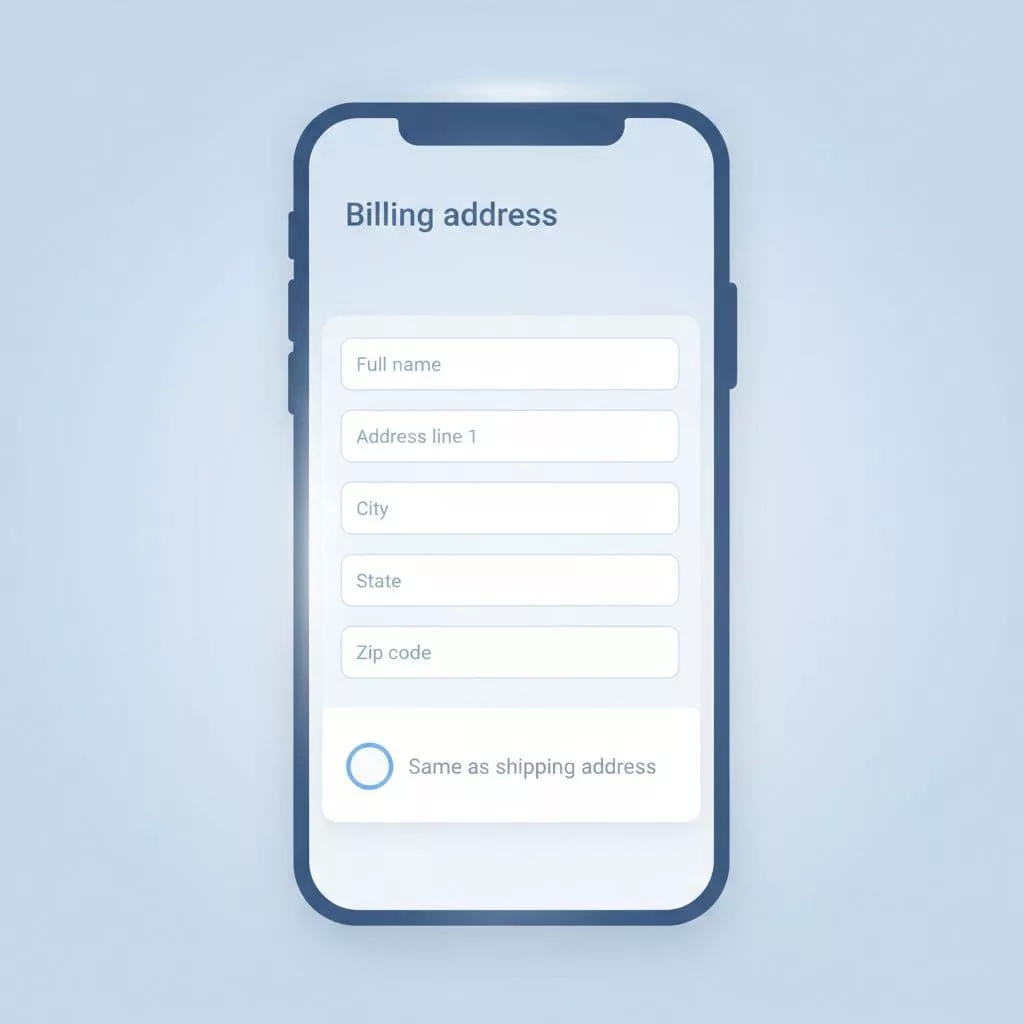
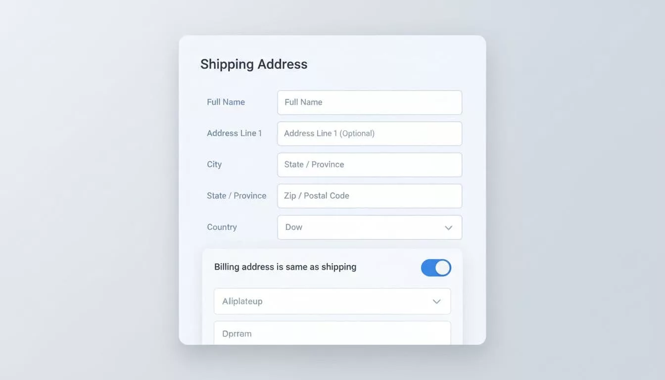
The best pattern is often a pre-selected checkbox labeled “Same as shipping address” near the shipping address summary. If billing matches shipping, the shopper leaves it alone. If it doesn’t, the separate billing address fields reveal right away. That keeps the checkout layout short and makes the next action obvious.
Baymard’s billing address design examples show how often checkouts get this wrong. Sites run into trouble when they ask for billing details too early, label the control in a vague way, or force shoppers to hunt for the edit path.
A useful test is simple. Read the label out loud. If it sounds like something a cashier would say to a customer, it probably works. If it sounds like an internal form note, it probably fails.
| Pattern | Poor version | Better version | Why it matters |
|---|---|---|---|
| Default state | Billing fields shown by default | Pre-selected checkbox: “Same as shipping address” | Cuts typing and lowers error risk |
| Label | “Use different address” | “Same as shipping address” | Makes the outcome clear |
| Reveal behavior | Extra fields appear late | Separate billing address fields appear right after the toggle changes | Keeps the form predictable |
| Edit path | Hidden link in small text | Visible, nearby control | Helps shoppers recover fast |
The goal is not to make the form clever. The goal is to make the right choice feel effortless.
The toggle also needs to respect payment rules. If the payment method requires a billing address, say that before the shopper reaches the field, especially for payment details validation. Surprises at the end of checkout often feel like bugs, even when they are not.
Mobile-first and accessible patterns
Mobile checkout pages expose weak delivery address logic fast. Small screens leave less room for confusion, and thumbs are less patient than desktop cursors.
Start with touch targets. The toggle should be easy to tap without zooming or precision. Keep enough spacing around it so a nearby tap does not flip the wrong control. On a narrow screen, that small failure feels much bigger.
Next, keep the field labels and state visible together. A shopper should know what the toggle does without reading a help paragraph. If the form expands, do it immediately and in place. Do not force a page jump or a hidden accordion path that loses context.
Accessibility matters here as well. The control needs a clear accessible name, a logical focus order, and a state that screen readers can announce. If those fields appear, move focus to the first relevant field or announce the change in a live region. That helps keyboard users and screen reader users understand what just happened.
Autofill also matters. Use appropriate autocomplete attributes for both shipping address and billing address fields. That reduces typing and makes browser suggestions more reliable. It also helps users with saved addresses fill forms faster, which can lower form errors before they start.
A good mobile pattern feels calm. A poor one feels crowded, hidden, and easy to break. If the control is hard to use on a phone, it is too hard.
Mistakes that create checkout errors
Most billing address problems come from bad defaults or unclear labels, hurting order accuracy and leading to failed transactions. The form looks simple, but the interaction can still fail in subtle ways.
One common mistake is showing both billing and shipping forms at once. That makes the page longer and creates duplicate work, even for shoppers who do not need separate addresses. Another mistake is using a toggle without saying what happens next. If the label only says “Different billing address” the shopper has to infer the result.
Some teams also hide the edit state after the form expands. That can make the shopper worry they cannot change it later. The fix is easy, keep the control visible and give it a clear relationship to the fields below it.
Another weak pattern is assuming the billing address never matters once the toggle is set. Payment validation can still fail if the billing data does not match the card issuer’s record, especially when it comes to PCI standards for data security. For that reason, error messages should point to the exact field and explain the mismatch in plain terms.
Here are the most common issues to watch for:
- The default state is wrong for most shoppers.
- The label is vague or uses internal language.
- The expanded fields appear with no clear reason.
- The form hides the change after the shopper taps it.
- Validation messages blame the user instead of the data.
If you want to reduce that kind of friction across the full flow and improve the checkout experience, compare this pattern with reducing ecommerce checkout friction. The billing address toggle works best when the rest of checkout is equally direct.
How to measure whether it helps
A billing address toggle should be tested like any other checkout change. Guessing is expensive, and the wrong default can hide in plain sight.
Start with field-level metrics. Track how often shoppers change the toggle, how many form errors happen after the toggle, and how long it takes to complete the step. If the new pattern lowers time to complete and reduces correction loops, it is doing real work.
Then compare completion rates by device. Mobile users often benefit most from fewer fields, but they also suffer most from unclear controls. If the mobile version drops errors while desktop stays flat, that still counts as a win.
Support tickets can help too. Look for notes about address mismatch, missing address fields, or confusion around the checkbox. Those comments point to wording problems that analytics alone may miss.
Using your store builder’s checkout settings to customize checkout and enable billing address variations, the cleanest test usually covers these points:
- Default to “same as shipping address” when most orders use the same address.
- Show the toggle near the shipping summary, not far below it.
- Keep the label short and plain, with intuitive form options.
- Reveal additional fields immediately when the shopper changes the choice.
- Measure errors, completion rate, and time to pay.
If a variation gets more completed orders and fewer field corrections, keep it. If it adds hesitation, simplify it again.
Frequently Asked Questions
What is a billing address toggle and why does it matter?
A billing address toggle is a pre-selected checkbox like “Same as shipping address” that defaults to matching addresses, revealing separate fields only when needed. It matters because it respects the common case where addresses match, reducing typing, errors, and doubt during checkout when trust is critical. This small change can lower cart abandonment and improve conversion rates more than many form tweaks.
What makes a strong billing address toggle design?
The best toggles use plain language like “Same as shipping address,” place the control near the shipping summary, and expand fields immediately upon change. They keep the control visible for easy reversal and pair with autocomplete for speed. Avoid vague labels or hidden edits that cause confusion or failed payments.
How should the toggle work on mobile devices?
On mobile, ensure large touch targets, visible labels with the toggle, and in-place field expansion without page jumps. Add accessibility like clear ARIA names and focus management for screen readers. This prevents thumb mis-taps and keeps the cramped screen calm and predictable.
What are common mistakes to avoid?
Don’t show billing fields by default, use vague labels like “Use different address,” or hide the toggle after expansion. These create duplicate work, uncertainty, and errors leading to failed transactions. Always explain outcomes clearly and validate billing against payment rules upfront.
How do you measure if the toggle improves checkout?
Track toggle interaction rates, post-toggle form errors, step completion time, and overall conversion by device. Monitor support tickets for address confusion. If it reduces corrections and boosts mobile completions without added hesitation, it’s working.
Conclusion
A well-designed billing address toggle removes work where shoppers feel it most. It reduces duplicate typing, lowers form errors, and ensures correct billing data flows to order confirmation emails, the order details page in the customer account, tax calculations, packing slips, and customer data integrity. This makes checkout feel more predictable.
The strongest version is clear on mobile, accessible to all users, and honest about what happens next. Refine it further with text customization and custom fields. When the default matches real behavior, shoppers move through checkout with less friction and more trust in their billing address toggle and billing address.