
PDF SEO for Ecommerce Manuals and Spec Sheets in 2026
A PDF can still help a shopper, but it should not be the only place your product details live. In...
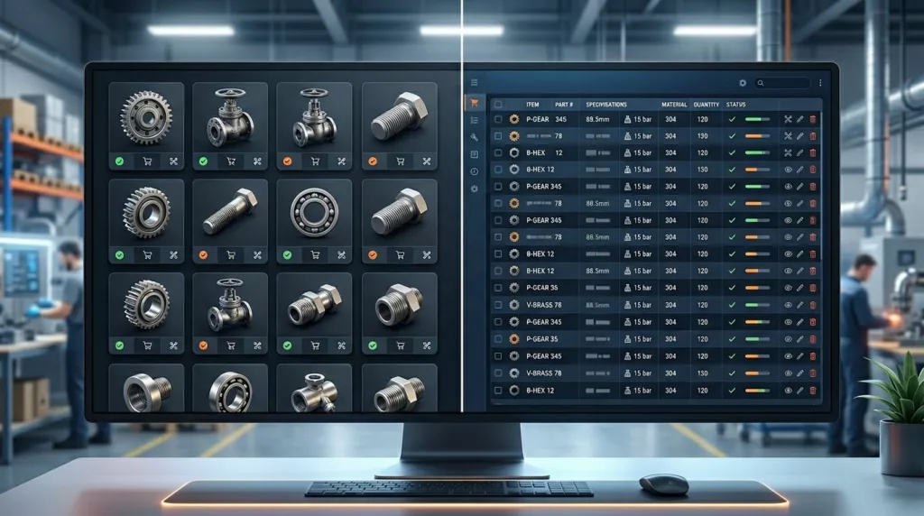
Grid vs Table View for Industrial Category Pages
Industrial buyers do not browse a catalog the way a consumer shopper does. They compare part numbers, specs, availability, and...

Job Name Field UX in Contractor Checkout
A blank job name field can cause trouble long after the order is placed. In contractor ecommerce, that small text...

Proof of Delivery UX for B2B Account Portals
Customers do not open account portals for decoration. They open them when a shipment needs proof, a finance team needs...
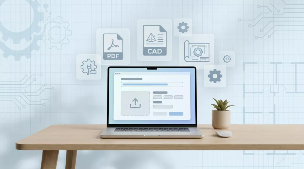
Drawing Upload UX for Manufacturing Quote Requests
Technical buyers do not mind uploading drawings. They mind guesswork, failed uploads, and waiting for a reply that never comes....
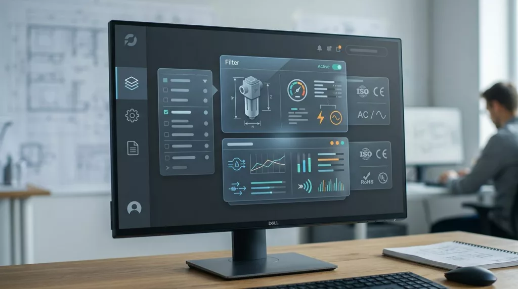
Dimensional Filter UX for Industrial Catalogs
Industrial buyers do not browse product catalogs like casual shoppers. They scan for exact sizes, load ratings, materials, and standards,...
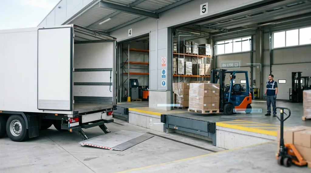
Liftgate and Loading Dock UX for Freight Checkout
The smallest freight form field can trigger the biggest shipping mistake. If a buyer picks the wrong delivery setup, the...

Certificate of Analysis Download UX for Chemical Product Pages
A COA download looks small on a product page, but it often decides whether a buyer keeps moving or leaves...

Open Orders Dashboard UX for B2B Account Portals
B2B buyers don’t open an account portal to browse. They open it because they need an answer fast. When the...
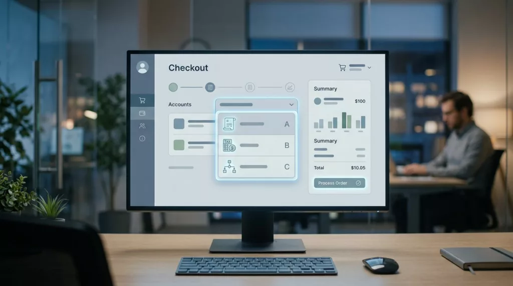
Bill-To Account Selector UX for B2B Checkout
A wrong bill-to account can send an order to the wrong tax profile, the wrong invoice queue, and the wrong...