
Industrial buyers do not browse a catalog the way a consumer shopper does. They compare part numbers, specs, availability, and price in the same session, often with engineering or procurement in mind.
That makes the grid vs table view decision more than a visual preference. The wrong layout slows down shortlists, hides critical data, and pushes buyers toward extra clicks.
The right layout helps people spot the exact SKU faster. It also fits the way they scan, compare, and narrow options on a category page.
Why industrial category pages need different logic
Industrial catalogs ask more from a category page than lifestyle or general retail pages do. Buyers are not choosing a color or a style, they are checking whether a part fits a system, meets a spec, or ships on time.
That means the page has to show enough information to support a decision without turning into a wall of text. A strong e-commerce optimization strategy treats layout as part of that job, because the layout shapes what buyers notice first and what they postpone.
Grid view helps when shoppers are still orienting themselves. Table view helps when they already know the criteria and want to compare options side by side. The best category pages respect both phases.
For spec-heavy assortments, that distinction matters even more. Baymard’s research on product tables for desktop listings aligns with what many industrial teams see in practice, dense comparison layouts work when technical attributes drive the shortlist.
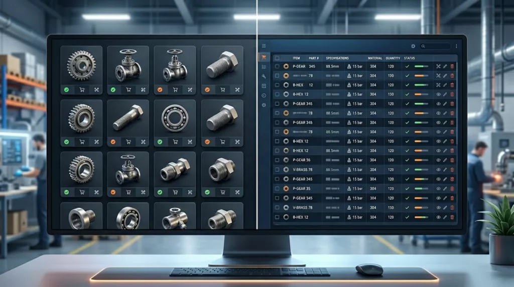
Grid view vs table view at a glance
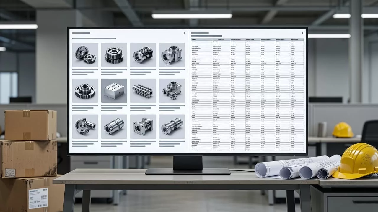
The simplest way to compare the two is by the job each layout does best.
| Buying task | Grid view | Table view | Better fit |
|---|---|---|---|
| First-pass browsing | Strong, because images and short labels help scanning | Weaker, because dense rows slow visual scanning | Grid |
| Spec comparison | Limited unless cards expose enough metadata | Strong, because buyers can compare attributes without opening each SKU | Table |
| Mobile browsing | Usually better, because cards stack cleanly | Harder, unless the table collapses well | Grid |
| High-SKU assortments | Good for merchandising and discovery | Good only when the table stays readable | Depends on density |
| Purchase confirmation | Moderate, if badges and price are visible | Strong, if inventory, lead time, and compliance are clear | Table |
For industrial buyers, grid opens the door and table closes the deal. The best category pages often let both views do the work they do best.
When grid view earns the default spot
Grid view works well when visual differences matter early in the decision. That includes categories with tools, PPE, enclosures, kits, replacement parts, and other products where the image helps confirm the type before the buyer reads the spec sheet.
It also fits broad browsing sessions. If a distributor carries hundreds of similar items, a card layout can keep the page from feeling heavy. A buyer can scan names, images, prices, stock badges, and one or two key spec chips without losing momentum.
That said, a grid needs discipline. A product card should answer one question fast, “Is this worth opening?” If the card only shows a polished image and a title, it adds friction instead of removing it. The layout starts to work when it surfaces enough information to qualify the SKU quickly.
Grid also makes sense on mobile. Cards stack cleanly, tap targets stay usable, and the page keeps a familiar rhythm. For teams balancing presentation with performance, strategic ecommerce UX/UI design helps shape that balance without turning the page into a poster.
Where table view wins for industrial buying
Table view earns its place when buyers are comparing hard specs. Dimensions, thread type, voltage, material, pressure rating, compliance marks, MOQ, stock status, and lead time all fit better in rows than in isolated product cards.
That format reduces the number of page hops. Instead of opening five product pages to compare one detail, the buyer can scan across columns and eliminate weak matches in seconds. On desktop, that is a major advantage. On the other hand, a table can feel cramped if the category has too many fields or the typography is too small.
Nielsen Norman Group’s ecommerce product page guidelines reinforce a related point, buyers need the right information close to the decision, not buried behind extra steps. Industrial category pages follow the same logic. The user should not have to work hard to separate the similar from the suitable.
A table also supports procurement tasks better than a grid does. When the buyer needs a final check on price breaks, availability, or compliance, the row structure makes the decision feel orderly. That matters when the purchase has operational risk attached to it.
The case for a toggle, and what it should remember
For many industrial catalogs, the safest choice is a view toggle. One layout handles discovery, the other handles comparison. That is the right answer when the assortment contains both browse-friendly products and spec-heavy products.
A toggle works best when the page remembers the user’s choice. If someone switches to table view, then filters, compares, and comes back later, the site should keep that preference. Resetting the layout creates extra work for repeat visitors, and repeat visitors are common in B2B ecommerce.
If buyers switch layouts once, remember the choice. Friction starts when the page resets.
The toggle should also preserve filters, sort order, and scroll position. When those pieces disappear, the user feels like the page forgot the task. A compare tray helps too, because it lets shoppers move selected SKUs into a controlled shortlist instead of juggling browser tabs.
On mobile, a full table often needs a different treatment. Some teams use a grid default on small screens, then expose a compare action or a stacked spec view after filtering. Others keep the table but collapse less important columns. Either approach can work if the most important data stays visible.
How to choose the default for your catalog
The default should match the first job most visitors need to finish. If search traffic lands on categories with one clear spec-driven intent, table view often makes more sense. If visitors browse a broad family of related products, grid view gives them a faster first pass.
Traffic mix matters too. Desktop-heavy catalogs with engineers and procurement teams often benefit from table-first layouts. Mobile-heavy traffic usually needs grid-first, because long tables force too much horizontal work and too many micro-decisions.
A few signals make the choice clearer. If buyers keep opening item pages just to find one missing spec, the category layout is doing too little. If they bounce because the page looks crowded before they can recognize a product, the layout is doing too much.
Watch these behaviors in analytics
Look at task completion, filter use, compare clicks, and product-page exits. Those patterns tell you more than a preference vote ever will. If table users compare more and convert faster, the layout is doing its job. If grid users open fewer product pages but abandon sooner, the cards may need richer metadata.
Layout decisions also sit inside best practices for ecommerce web design, because filters, card density, and comparison tools affect one another. Changing one element without the others often produces mixed results.
Conclusion
Industrial category pages work best when the layout matches the buying task. Grid view helps people browse, recognize, and orient themselves. Table view helps them compare exact specifications and move toward a shortlist.
Most B2B catalogs need both, with a clear default and a view switch that remembers user preference. When comparison is the job, let the table carry the load. When browsing is the job, let the grid do the work.