

A product grid in an ecommerce online store is like a shelf in a busy store. Shoppers glance, decide, and move on fast. If your product listing card design can’t communicate value in a second, your CTR drops and “Add to cart” never happens.
The good news: you don’t need a total redesign. High-quality website templates often prioritize minimal, modern, clean, and elegant patterns to drive sales. Small, testable card patterns with a minimal, modern, and clean approach often lift both clicks and adds because they reduce effort at the exact moment people compare options.
Below are proven patterns, when they work best, and what to test (with clear metrics and guardrails).
Build a “one-second” scan with clear hierarchy (image, price, proof, action)
Hierarchy is the quiet workhorse of high-performing product cards. When the image, title, price, and proof signals fight for attention, the product card becomes “readable” only after a pause. That pause is where users bounce or keep scrolling.
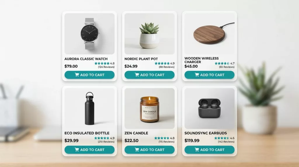
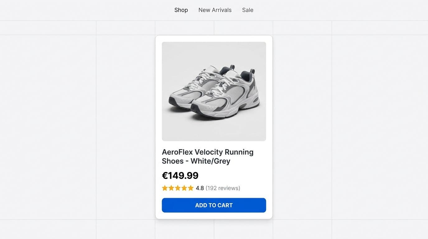
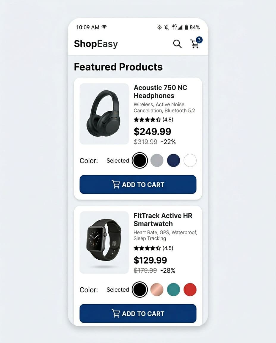
Start by making the product photo dominant and consistent in clean, minimal product cards. Use a fixed aspect ratio across the grid in modern responsive templates so the user’s eyes don’t re-learn layout every card. Next, treat price like the anchor, not an afterthought. Make it easy to spot with high contrast and visually stable (avoid tiny cents, low-contrast gray, or shifting line wraps).
Social proof, including customer ratings and promotional badges, should be compact and credible. Stars alone are weak. Stars plus rating count reduces doubt because it signals sample size. If you support review content elsewhere, Baymard-style usability work often reinforces that shoppers rely on clarity and consistency across page designs, not just on PDPs (see these research-backed e-commerce UI patterns for broader layout principles).
One more rule: make the entire product card clickable for browsing, but keep one clear primary action like “view details”. Don’t hide the primary CTA behind hover only, because it punishes touch devices and keyboard users.
Here’s a practical test framing for hierarchy changes as an e-commerce designer audits fashion product cards:
| Card element | Why it increases clicks or adds | Test hypothesis | Primary metric |
|---|---|---|---|
| Larger, consistent, clean image | Faster recognition, fewer misclicks | Increasing image prominence in minimal, modern layouts lifts CTR on the product card | Product CTR |
| Price contrast and elegant placement | Reduces search time, lowers cognitive load | Clearer price hierarchy in clean designs increases adds from PLP | Add-to-cart rate from PLP |
| Customer ratings + count | Builds confidence during scanning | Showing count increases CTR on high-rated items | CTR, ATC rate |
| Prominent CTA | Makes intent easy to act on | A visible CTA in elegant, modern product cards increases ATC without harming CTR | ATC rate, CTR |
Takeaway: prioritize scan speed first, then persuasion in clean, minimal page designs. For more product-card-focused guidance, this write-up on optimizing product cards on listing pages is a useful reference when you’re auditing card components.
Add quick-add and variants without turning the card into a control panel
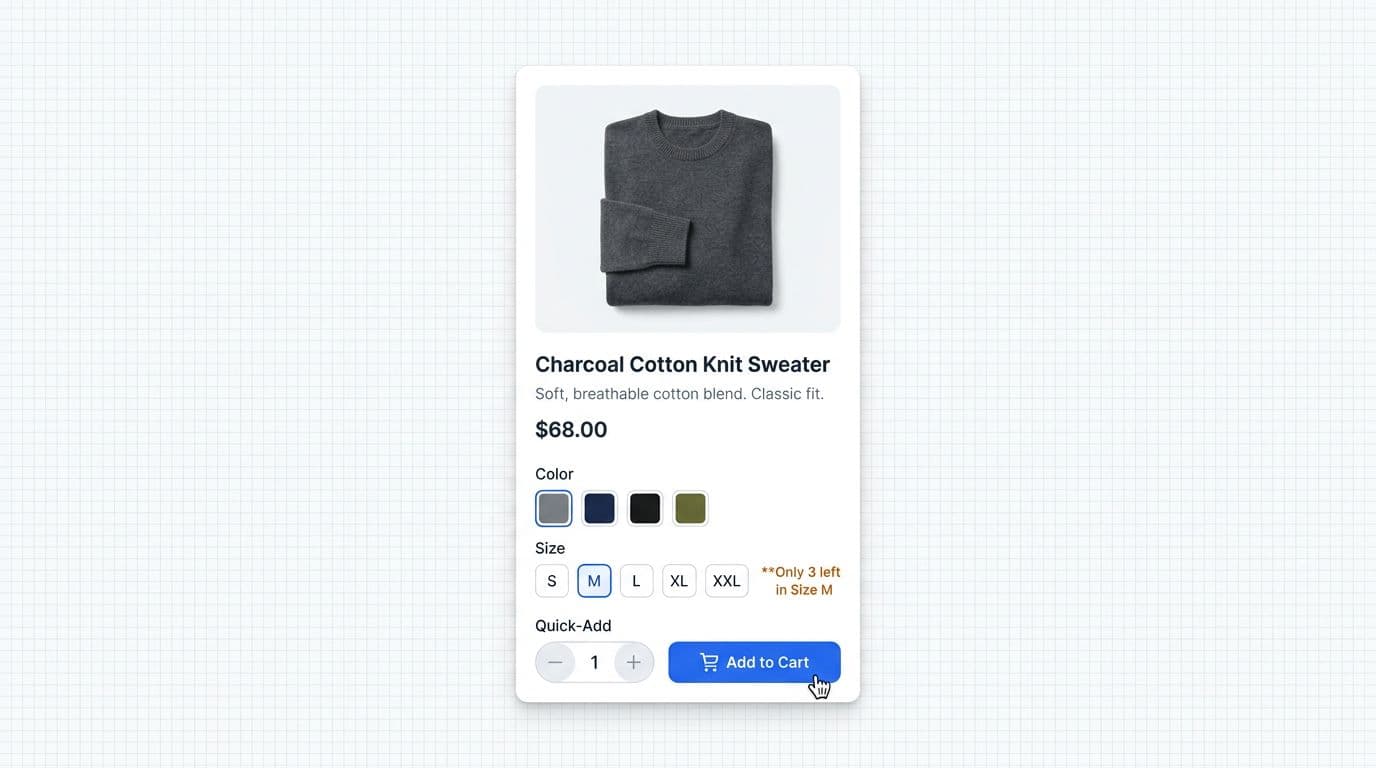
Quick-add can raise add-to-cart rate because it removes a step. It can also backfire if it creates mistakes (wrong size, wrong variant) and drives returns. The pattern works best when the product has low “evaluation cost” (replenishment items, familiar brands, or shoppers with strong intent coming from search).
Use progressive disclosure for quick view elements. On desktop, reveal quick-add on hover or focus. On mobile, use a compact expand row or bottom-sheet triggered by the CTA. Avoid showing every control by default, because clutter lowers CTR. These customizable cards adapt well across product categories.
Variants need extra care. If size or color is required, don’t let “Add” behave like a trap. Instead, change the CTA label to “Choose size” (or “view details”) until a selection exists, then confirm the chosen variant in the button feedback. Pair it with secondary actions like “view details” for deeper exploration.
Gotcha: quick-add increases ATC, but it can also increase downstream cancellations if variant selection is ambiguous. Treat cancellation rate and return rate as first-class guardrails.
Clean stock and urgency cues can help, but only when they’re specific and honest. “Only 3 left” can reduce procrastination, while vague hype tends to blend into the noise. Keep urgency near the action, not as a loud badge competing with price. Elegant, minimal badges maintain a modern look.
If mobile is a major share of traffic, prioritize thumb reach and tap reliability. Use at least 44 × 44 CSS px touch targets, leave spacing between wishlist and add buttons, and keep the CTA away from OS safe areas. For deeper mobile CTA guidance, these mobile add-to-cart button design patterns map well to listing-card quick-add behaviors, especially around feedback states and tap confidence. Clean implementations shine in retail websites and Webflow templates.
These minimal, modern patterns are ideal for customizable Webflow templates on retail websites, delivering elegant hover states without clutter.
What to test for quick-add:
- Hypothesis: Showing quick-add on intent (hover or expand) increases PLP ATC rate without lowering CTR.
- Primary metrics: ATC rate from PLP, revenue per session.
- Guardrails: return rate, cancellation rate, “remove from cart” rate, bounce rate from PLP.
Add trust and value cues that answer “Is this worth it?” right on the card
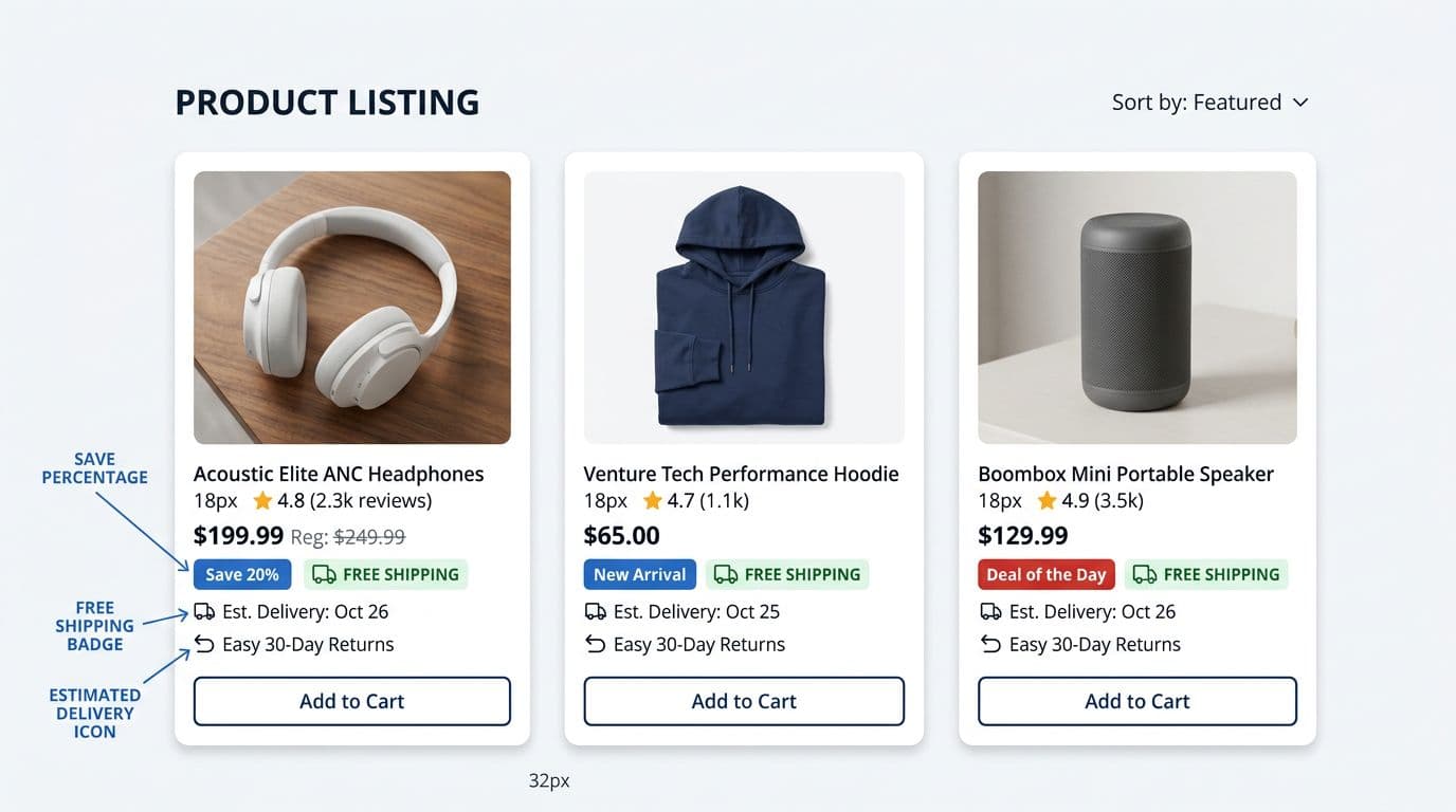
Shoppers hesitate when they can’t estimate the “total pain” of buying: delivery time, shipping cost, and return effort. Listing cards that surface those answers can win the click, and sometimes win the add, because they remove a reason to open five tabs for comparison.
High-performing trust cues tend to be factual, compact, and aligned with corporate professional brand standards:
- Delivery date or delivery range (“Arrives Thu”, or “2 to 4 days”).
- Free shipping threshold (if it’s easy to qualify).
- Returns window (“Free returns 30 days”).
- Price integrity cues (strike-through pricing only when it’s real, plus a clear savings label).
Place these cues below the price or near it, not above the image, for a minimal, modern layout. The image is for recognition. The price area is where the decision tightens.
A useful constraint is “two lines of reassurance.” If you add three badges plus two promos plus three icons, your card becomes a poster. Test minimal sets and let data pick the winners. If you’re improving the broader experience around trust and clarity, these user experience e-commerce tips can help align card cues with PDP and checkout expectations in your multi-page website templates.
Trust cues are also where accessibility issues hide. Ensure badge contrast meets WCAG expectations and quality guidelines, including dark mode accessibility, keep type sizes readable on mobile, and don’t rely on color alone for meaning (for example, “Sale” should have a text label, not just a red pill).
What to test for trust and value cues:
- Hypothesis: Adding delivery-date messaging or social sharing buttons increases CTR on items with fast shipping.
- Primary metrics: CTR, ATC rate, conversion rate.
- Guardrails: customer support contacts about shipping, refund rate, return rate.
For measurement planning, Amplitude’s perspective on ecommerce outcomes is a helpful reminder that small experience changes can shift downstream value across multi-page website templates (see ways to increase shopping cart values). Ensure dark mode accessibility for elegant, clean badge designs in modern e-commerce setups.
Mobile-first checks for listing cards (because most “adds” happen on phones)
Mobile cards fail in predictable ways: tiny tap targets, cramped price text, and quick-add controls that open the wrong thing. Designers auditing responsive templates for a startup website should prioritize one primary action with elegant, minimal touch targets, support it with fast feedback (“Added” state), and make the hit area forgiving and clean. Support dark mode too for better power-saving and readability on mobile devices.
Also, remember that “tap the card” and “tap Add” are different intents. If both actions trigger the same behavior, you’ll see rage taps and accidental navigations. A simple fix is separate zones: image and title open view details, button adds.
Pair these with dynamic filtering for enhanced navigation. For more product-list UX context, this guide on product list UX and conversions pairs well with card-level testing.
Conclusion
Clicks and adds don’t come from louder cards, they come from clearer ones. Treat product listing card design as a system: scan speed, low-friction actions, and trust cues that answer doubts early. Run focused tests with CTR and PLP add-to-cart rate as primary metrics, and keep return rate and cancellations as guardrails. Pick one pattern for your product cards, ship it behind an experiment, and learn fast from real shoppers. These product cards belong in comprehensive multi-page website templates that prioritize minimal, modern, clean ecommerce design, with elegant dark mode support and a second layer of minimal modern clean multi-page layouts. Follow brand quality guidelines for long-term success.