
Cross-Reference Table UX That Helps Buyers Find Replacement Parts
Buyers who need replacement parts usually do not start with a perfect product name. They start with a worn label,...
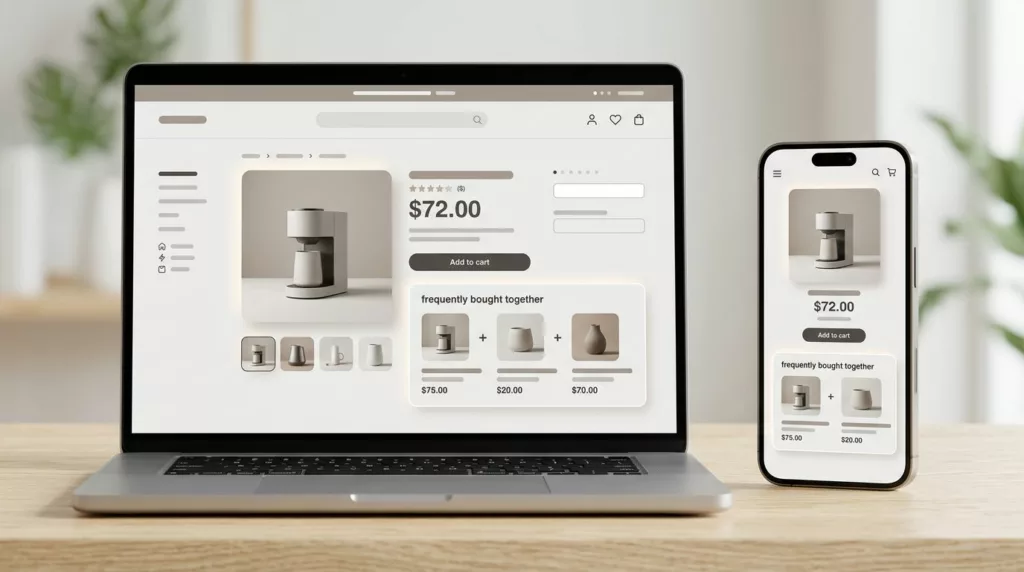
Frequently Bought Together UX That Increases Bundle Attach Rate
A bundle widget can sit on a product page and still do nothing. The difference is often not the offer...
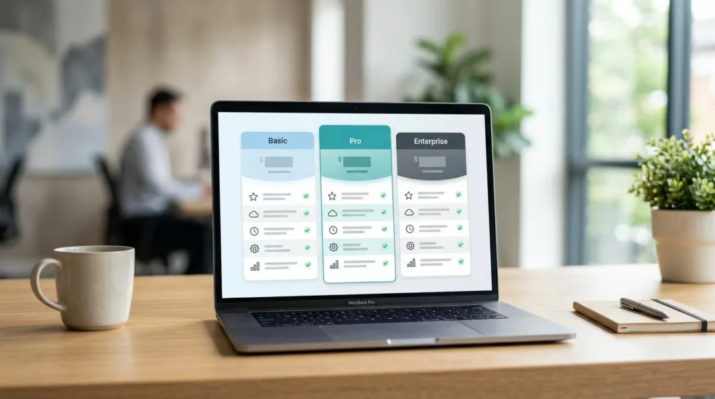
Tiered Pricing Table UX That Speeds B2B Buying Decisions
Buyers rarely leave a pricing page because the price is too high. They leave because poor pricing page design hurts...
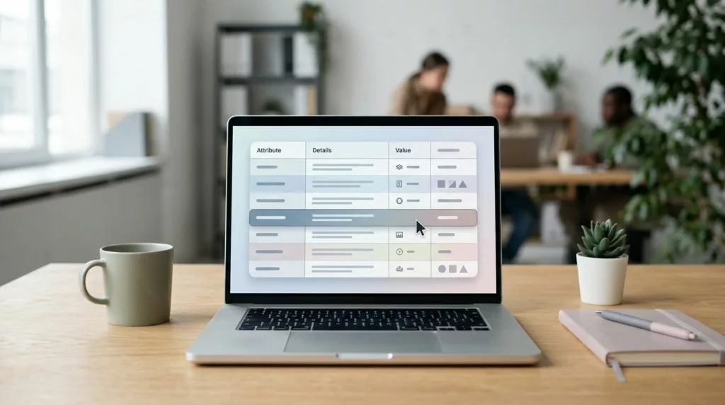
Product Specifications Table UX for Faster Buying Decisions
Shoppers don’t read product pages top to bottom. They scan, compare, and look for the one detail that removes doubt....
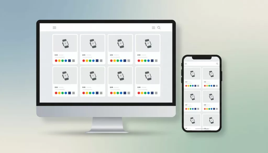
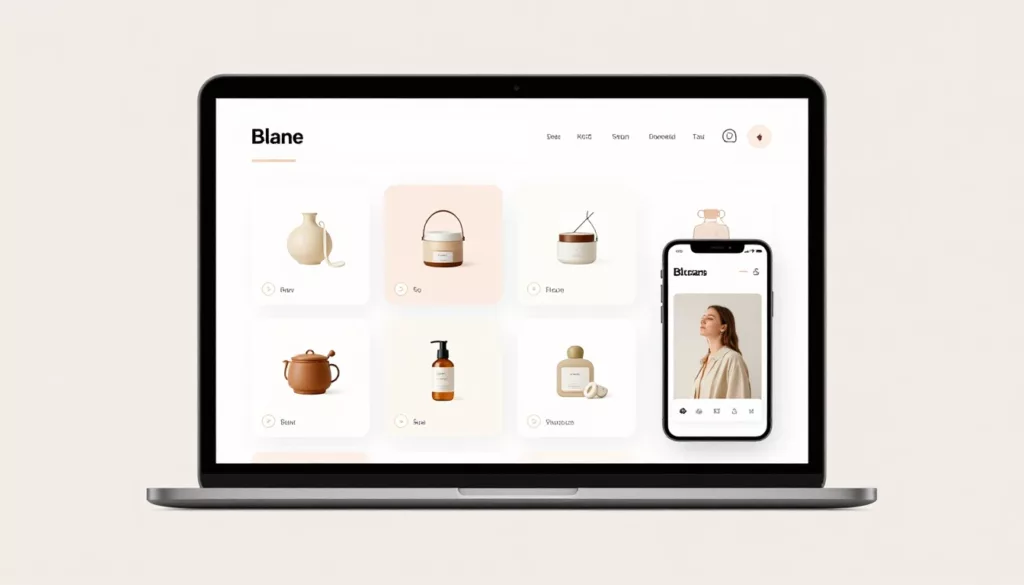
Product Card Swatch UX That Helps Shoppers Compare Variants
Shoppers compare variants in seconds. If your product cards hide the difference, they slow down or guess. Strong product swatch...
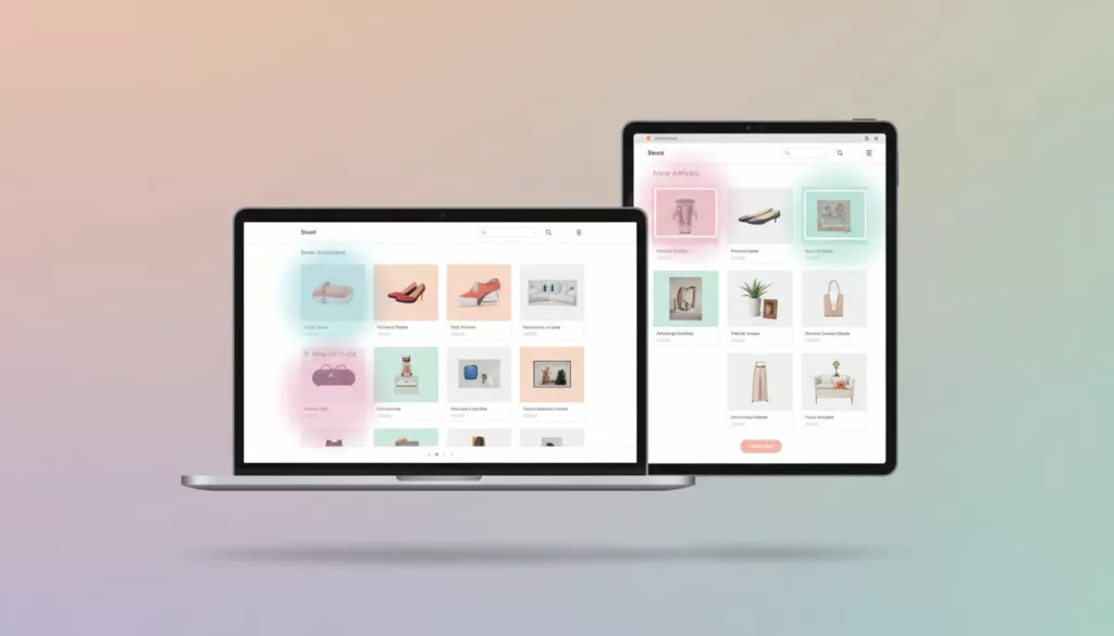
New Arrivals Page UX That Earns More Repeat Visits
A new arrivals page has one job: show change fast. If a returning shopper lands there and can’t tell what’s...
Product Badge UX: Highlight Value Without Visual Clutter
A badge can save a click or sabotage a product card. When every item says New, Sale, Trending, Limited, and...

BNPL UX That Increases Conversion Without Trust Gaps
The fastest way to lose a BNPL sale is to make it feel slippery. Shoppers use buy now, pay later...
Shopify Collection Sorting UX That Improves Product Discovery
Bad sort order hides good products in plain sight. On a Shopify collection page, the first screen shapes clicks, filter...
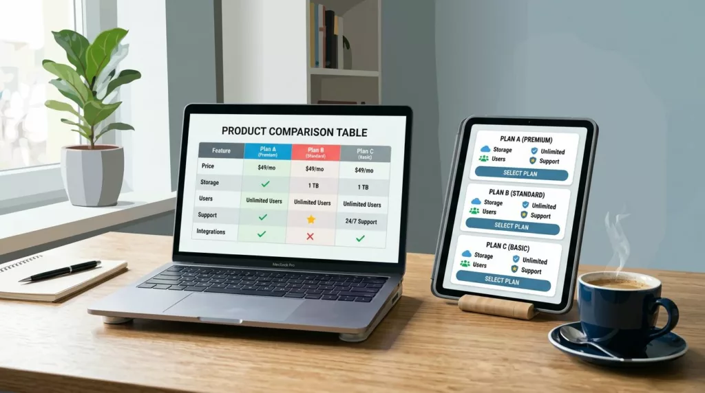
Product Comparison UX: How to Design “Compare” Tables People Actually Use
A comparison table should feel like a helpful salesperson aiding decision making, not a math test. Yet many “compare” tables...