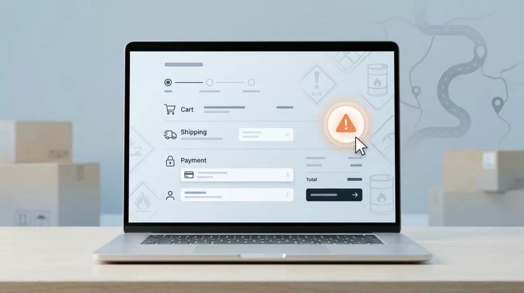

Checkout flows for hazardous materials often fail when regulatory requirements appear only after the shopper has already committed to a purchase. A customer can add an item to their cart, begin the shipping process, and suddenly hit a wall with little context. This creates doubt and abandonment instantly.
Effective hazmat shipping UX puts the warning in the right place, uses plain words, and keeps the next step visible for the user. It protects compliance with Department of Transportation regulations without turning the checkout process into a dead end. The real work involves deciding when to speak, how much information to provide, and what the interface should do next to ensure a smooth transition.
Key Takeaways
- Surface restrictions early: Avoid checkout abandonment by disclosing hazmat shipping limitations on the product page or in the cart rather than at the final payment step.
- Use plain, direct language: Translate complex regulatory requirements into simple, human-readable instructions that clearly explain what the rule is and how the customer can proceed.
- Sync interface logic with policy: Ensure the checkout UI proactively removes or hides incompatible shipping methods, such as air freight for ground-only goods, to prevent invalid selections.
- Maintain consistency across channels: Align messaging across product pages, cart views, and support documentation so customers receive uniform information regardless of where they interact with the brand.
Why hazmat surprises happen at the worst moment
Hazmat products and other dangerous goods create a special kind of checkout friction. Batteries, aerosols, solvents, and similar items often carry strict destination or carrier limits. If that limit is only disclosed at the shipping step, the shopper has already invested time and effort into the purchase process.
This timing issue is difficult because it intersects with regulatory compliance. Logistics teams must adhere to federal regulations that dictate how these items are transported, yet store platforms often fail to communicate these rules until the final stage. That timing matters because checkout is where trust feels fragile. A late notice looks like a system error, even when the restriction is valid. It can also make the store seem careless, since the product page never warned the shopper about the underlying requirements.
The biggest failure is silence. A page shows price and photos, but the restriction is hidden until the cart or payment step. At that point, the user is not reading policy. They are trying to finish an order.
A restriction shown late feels like a checkout failure, even when the rule is correct.
When the message appears earlier, the shopper can decide whether the item fits their address and needs. That single shift lowers confusion and support load at the same time.
Surface restrictions before the cart feels committed
The most useful pattern is simple. Tell the shopper what matters before they choose a shipping method. Then repeat it where the decision gets real.
On the product page, the note should set expectations by identifying the hazard class of the item. In the cart, the notification should stay visible near the item, ensuring the proper shipping name is clear and accurate. At address entry, the interface should validate if the destination can accommodate the specific UN identification number associated with the goods. That same logic appears in shipping calculator UX patterns, where costs change early, and in shipping option selector UX patterns, where methods stay readable beside the tradeoffs.
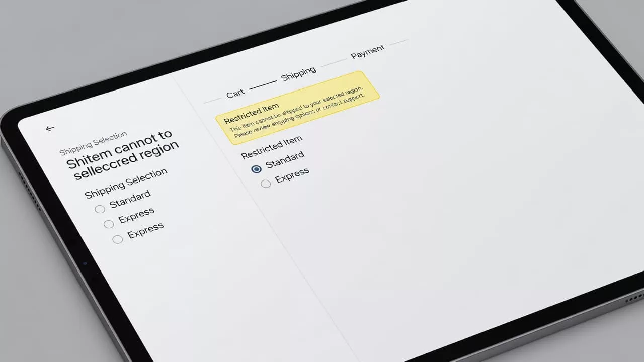
A small alert can do the job without taking over the page. The shopper should notice it, read it, and keep moving. The warning should feel like part of the purchase flow, not a pop-up from nowhere.
| Place in checkout | Message goal | Good UI behavior |
|---|---|---|
| Product page | Set expectations early | Show a short restriction note near add to cart |
| Cart | Reconfirm before commitment | Keep the note visible beside the item |
| Address field | Check eligibility | Validate location before shipping methods load |
| Shipping step | Explain the final options | Hide unsupported methods due to strict labeling requirements |
The pattern is plain, but it works. Early visibility gives people time to adjust before the checkout feels personal.
Write hazmat copy that sounds clear, not alarmist
Use language a shopper would use out loud. “Ground only” works better than policy code. “We can’t ship to PO boxes” works better than a paragraph about carrier service levels. Short copy feels more honest.
Helpful messages answer three questions fast: what the rule is, what triggers it, and what to do next.
- This item ships by ground only.
- We can’t deliver this item to PO boxes.
- Enter a street address to see available delivery methods.
- Some locations can’t receive this product.
While your internal systems rely on the proper shipping name and the specific hazard class to stay compliant, your interface should translate these technical details into plain language for the customer. If you are shipping hazardous materials, make sure the restriction is clear. A shopper should not have to guess whether the issue is the product, the location, or the carrier.
If the rule depends on location, say so. If it depends on the item, mention that too. For certain high-risk products, you may need to collect an emergency contact number at checkout. If this is required, explain exactly why you need it to build trust rather than frustration.
Tone matters just as much as wording. Avoid all caps, legal jargon, and blame. A message like “Delivery requires a street address” is calm and direct. A message like “Invalid address” leaves people wondering what to fix.
Small support cues help as well. Pair the message with text first, then use an icon only as a backup. Color alone is risky. Many users miss it, and assistive tech may not announce it clearly.
If there is a fix, put it in the same sentence. “Add a street address to see available methods” gives the shopper a clear next step. That is far better than a warning that stops at the problem.
Connect the message to checkout behavior
The copy is only half the job. The interface must react in a way that aligns with your shipping warnings. By ensuring the UI logic adheres to 49 CFR and Department of Transportation mandates, you protect both the customer experience and your regulatory compliance.
If an item is restricted to ground transport, do not let the shopper select an air service only to fail later. Because items with a specific packing group may trigger unique carrier requirements, your interface should ideally collect enough data early on to facilitate the eventual creation of accurate shipping papers. If a ZIP code or international destination rules out the item, display that limitation before payment. If the cart total changes due to these restrictions, keep the old amount visible long enough for the shopper to notice the update. This feels much steadier than a sudden, blank refresh.
If the UI changes the cart, it should also explain the change.
| Situation | Better message | Checkout response |
|---|---|---|
| Ground-only item | “This item ships by ground only.” | Hide air methods before selection |
| Address not allowed | “We can’t deliver this item to your location.” | Stop early and point to a valid address or different product |
| Missing street address | “Add a street address to see delivery options.” | Keep focus in the form and mark the field |
| Rate recalculation | “Delivery options updated.” | Keep prior details visible while the new rates load |
When options change, keep the focus in place and announce the update for screen reader users. That keeps the page usable and reduces the sense of churn. It also avoids the frustrating feeling that the checkout is jumping around.
A good rule is simple. Do not let the shopper select an invalid method and then back them out. Remove bad choices early, or explain them before they can be chosen. That is cleaner for the user, safer for the business, and ensures that you remain fully compliant with complex logistics standards.
Measure whether the UX stops confusion
Compliance teams often track whether a rule exists, but checkout teams need to track whether the rule confuses people. Your data should bridge the gap between user behavior and the underlying regulatory requirements, such as the data found in a Safety Data Sheet.
Start with the basics: notice views, exits after the notice, support tickets about shipping limits, and the number of shoppers who return to the product page after seeing a restriction. Compare metrics for restricted items against unrestricted items to highlight where your messaging breaks down for hazardous materials.
Session replays provide additional insight. Watch for shoppers who hunt for a hidden method, refresh the page, or reopen the cart after a warning. These behaviors often point to wording that is too vague or placement that is too late.
Keep the test narrow by changing the wording, placement, or update behavior rather than testing away the rule itself. The goal is to make the restriction easier to understand, not easier to miss. This is where a single message library becomes vital. Product, checkout, support, and compliance teams should use identical phrasing. If your checkout logic relies on a hazardous materials table, your messaging should reflect that reality with precision.
Consistent communication requires that internal teams receive proper hazmat training. This ensures that every department understands why the ISHP sequence must remain uniform across the entire site. Without this alignment, one page might say restricted, another might specify ground only, and a third might say nothing at all. Consistency keeps the store believable and keeps your compliance documentation in sync with the customer experience.
Frequently Asked Questions
Why should I display hazmat warnings on the product page?
Displaying warnings early sets accurate customer expectations before they commit to the checkout process. This transparency prevents the frustration of being denied at the final step and helps customers decide if the item meets their shipping needs.
How should I phrase shipping restrictions for hazardous items?
Use simple, plain language that focuses on the constraint rather than legal jargon or internal policy codes. Phrases like “This item ships by ground only” are much clearer to a shopper than technical references to Department of Transportation hazard classes.
What is the best way to handle address-based shipping restrictions?
Validate the user’s location as soon as possible and provide clear guidance on why a shipping method may be unavailable. If a street address is required, prompt the user clearly within the form rather than simply displaying an “Invalid address” error message.
Should I use color or icons to denote hazmat items?
While icons and color can draw attention, they should never be the sole indicator of a restriction. Always pair visual cues with clear text to ensure the information is accessible to all users and remains understandable for those using assistive technology.
Conclusion
Checkout surprises are avoidable when rules regarding hazardous materials appear early and read like plain human speech. The shopper should see the limit, understand the reason, and know what happens next before they feel committed to the purchase.
That is the heart of hazmat shipping UX. By prioritizing clear timing, direct copy, and honest interface behavior, you turn a jarring warning into useful guidance. When your interface successfully manages hazmat shipping, it builds the trust necessary for the more technical aspects of compliance. This sets your customers up for success as they move toward the final stages of the process, including accurate shipper’s certification, proper marking and labeling, and the inclusion of detailed emergency response information for all hazardous materials.