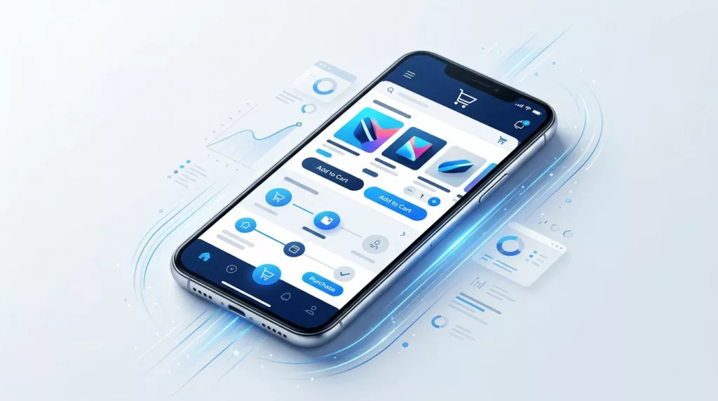
Mobile Optimization Checklist for E-commerce Sites
A slow or awkward mobile store can lose a sale before a shopper sees the product. In 2026, mobile accounts...
Saved Cart UX for B2B Buyers in 2026
B2B buyers do not forget carts anymore, they abandon context. In today’s landscape, a saved cart serves as external memory...
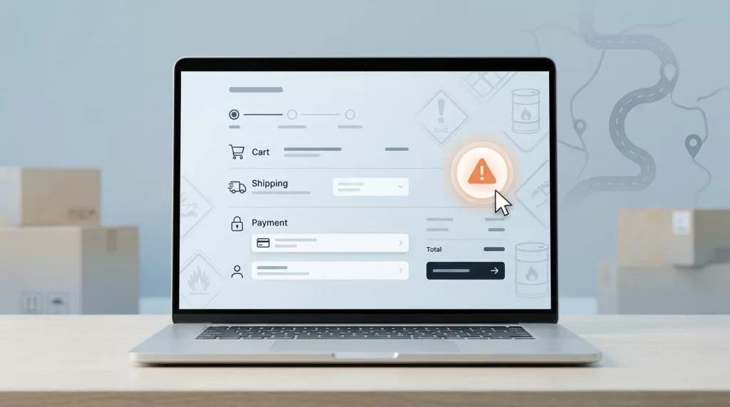
Hazmat Shipping Messaging UX That Prevents Checkout Surprises
Checkout flows for hazardous materials often fail when regulatory requirements appear only after the shopper has already committed to a...

Credit Limit Messaging UX That Prevents B2B Checkout Failures
A B2B buyer rarely abandons checkout because they changed their mind. More often, the order stops because the account has...
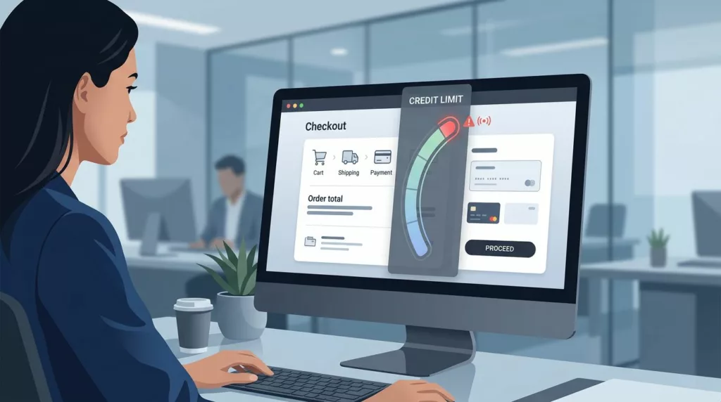
Credit Limit Messaging UX That Prevents B2B Checkout Failures
A B2B buyer rarely abandons checkout because they changed their mind. More often, the order stops because the account has...

Quote Expiration Messaging UX That Keeps B2B Orders Moving
A quote that expires without clear guidance often dies in the inbox, not in the system. Buyers get busy, sales...
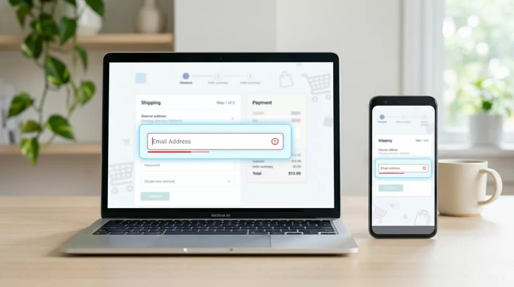
Email Field UX That Cuts Checkout Typos
A single mistyped email address can wreck an otherwise smooth checkout. The order may go through, but the receipt, shipping...
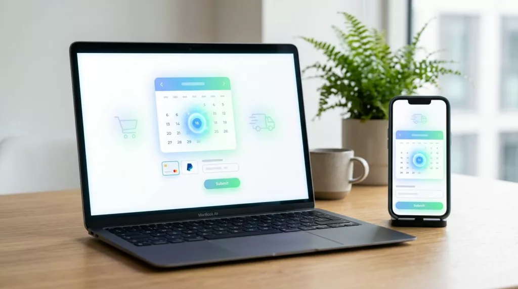
Delivery Date Picker UX for Ecommerce Checkout in 2026
A delivery date picker can do more than set expectations. It can decide whether a shopper feels confident enough to...
Minimum Order Quantity UX That Prevents Cart Friction
A shopper who learns about a minimum only after adding items to the cart is already annoyed. They now have...

PO Number Field UX for B2B Checkout in 2026
A PO field can save a sale or slow one down. In B2B checkout, the difference often comes down to...