

A shopper who sees that all sales are final only after clicking the purchase button often feels trapped. That frustration quickly escalates into return requests, chargebacks, and unnecessary support tickets.
The fix is not to make your policy text louder or more aggressive. Instead, focus on better timing, clearer language, and ensuring your refund policy is easily accessible at the moments when shoppers are making their decisions.
When final sale messaging appears early and stays consistent throughout the journey, you cut confusion before it becomes a complaint. You also protect your conversion rate because shoppers can self-select before they commit to the buy.
Key Takeaways
- Prioritize Early Placement: Avoid hiding final sale policies in footers; display them prominently on product pages, variant selectors, and carts so shoppers are aware before they reach the payment step.
- Maintain Consistent Messaging: Use identical, clear, and calm language across all customer touchpoints—from product descriptions to confirmation emails—to prevent confusion and build trust.
- Balance Clarity and Tone: Use short, specific language that explains the policy without sounding punitive or aggressive to ensure customers feel informed rather than threatened.
- Address Exceptions Clearly: If your policy includes exceptions for defective or damaged goods, state them explicitly alongside the final sale notice to manage expectations and minimize support inquiries.
- Test and Monitor: Regularly evaluate the placement and visibility of your messaging across different devices and use support ticket data to identify whether your policy needs further clarification.
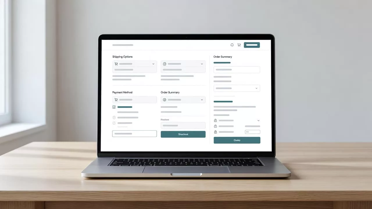
Put the policy where the decision happens
The biggest mistake is hiding your final sale policy in a footer or a policy page. By the time a shopper finds these rules, the purchase is already in motion.
The requirements need to appear in the product path, not only in legal copy. A strong returns and shipping policy page layout supports that, but it cannot carry the whole load by itself. Product pages, variant selectors, carts, checkout, and confirmation emails all need the same message.
A simple structure works well:
| Placement | Sample copy | What it prevents |
|---|---|---|
| Product title area | “Final sale, no returns or exchanges” | Surprises before the shopper reads the details |
| Variant selector | “This color is a clearance item” | Hidden risk on one specific selection |
| Below add-to-cart | “Please confirm size and fit for this inventory clearance” | Fit-related regret |
| Cart summary | “Final sale item in cart” | Last-minute doubt before payment |
The best labels are short and plain. They do not need legal language to feel firm. They need enough detail to answer the first question a shopper asks: can I change my mind later?
If your policy has exceptions, say so in the same line. “Final sale, except for defects on arrival” is clearer than a long paragraph about exclusions. These rules are particularly important for discontinued products and seasonal merchandise where restocking is not an option.
Write labels that sound calm and specific
A final sale badge should feel clear, not punitive. If it sounds like a threat, shoppers get defensive. If it sounds vague, they miss it.
Use language that names the rule and the scope. These examples work well:
- “Final sale, no returns or exchanges”
- “This item is not returnable; no refund”
- “Final sale on this colorway”
- “Final sale unless the item arrives defective or damaged”
The most useful copy often sits near the source of risk. For apparel, that might be beside the size selector. For beauty items, it might sit under the shade picker. For clearance home goods, it might appear under the price. These clear labels are especially essential for personalized products and custom orders, as those items cannot be resold. While you want to be firm, always reassure the customer that their rights are protected if they receive faulty goods.
A small badge, a helper line, or a short note is usually enough. A giant warning block can make a page feel broken. A tiny footnote can disappear. The right answer sits in the middle, where people can scan it in one glance.
If the shopper notices the rule after clicking buy, the message arrived too late.
That is why tone matters as much as placement. Calm language builds trust. Overheated language makes the policy feel worse than it is.
Use cart and checkout reminders to catch late decisions
Shopping carts are where browsing turns into a transaction, but they are also the place where checkout hesitation often sets in. A shopper may like the product, but they still need a final, reassuring reminder before committing to the purchase.
This is the ideal place for a repeat notice because the shopper has shifted their mindset toward buying. Keep the copy short and place it near the payment path. A simple line of text below the subtotal often does the job effectively.
Good examples include:
- All sales are final, no returns or exchanges
- Please review size, color, and fit before checkout
- This purchase is final sale and cannot be returned for a refund or store credit
- Final sale applies to this item only
The copy should sit near the order summary, payment button, or shipping method. On mobile, that placement matters even more because a note buried below the fold is easy to miss.
The tone should remain steady throughout the journey. Do not switch from a soft product page note to a harsh or alarming checkout warning, as that shift can feel like a bait and switch and damage customer trust. Instead, repeat the same language in a slightly tighter form to maintain consistency.
Here is the kind of checkout reminder that works:
All sales are final. No returns or exchanges. Please confirm all details before placing your order.
That sentence is direct, clear, and hard to miss. It also gives the shopper one last chance to pause if they are unsure about the product.
Copy like this helps conversion too. Shoppers who do not want to adhere to final sale rules can leave before paying, while shoppers who stay are more likely to accept the policy and complete the purchase with confidence.
Match confirmation copy with the policy page
Post-purchase confusion is expensive. It drives support tickets, chargebacks, and angry email threads that never needed to happen. To maintain effective ecommerce compliance, your order confirmation page and transactional emails must repeat your return policy in plain language.
Use the exact same terminology found on your product pages and your official terms of service. If one page says final sale and another says no exchanges, customers may assume there is a meaningful difference. Aligning this language is a critical component of a transparent and trustworthy refund policy.
A useful confirmation message might read:
“Thanks for your order. This item is final sale, so it cannot be returned or exchanged. If your order arrives damaged, contact support within 48 hours with photos.”
That copy serves three purposes. It confirms the policy, defines narrow exceptions, and provides clear instructions for the customer. These details prevent unnecessary back-and-forth communication.
Furthermore, you should include a link to your return portal within the confirmation email. Even for non-returnable items, the portal acts as a central hub where customers can verify their order status or review your stated policies. This same messaging should appear in the customer account portal, on the packing slip, and in any follow-up emails your team sends. In this context, repetition is not a waste; it is a vital form of friction removal that protects both the shopper and your business.
Test placement, timing, and device behavior
Final sale copy should be treated as a placement problem, not only a wording problem. A clean sentence in the wrong spot can still fail to register with the customer.
Start with one baseline. Then change one thing at a time. A product page badge, a cart reminder, and a checkout note can each have different effects on shopper behavior.
A simple test plan looks like this:
- Test the first visible placement on the product page.
- Test a repeat reminder in the cart or checkout.
- Check mobile and desktop performance separately.
- Watch support tickets and returns, not only the conversion rate.
- Include offline conversion tracking to correlate online engagement with actual return behaviors.
- Verify that your messaging remains compliant with local consumer protection laws and accounts for any mandatory cooling-off period required in specific regions.
Pay close attention to where shoppers hesitate. Session replays, heatmaps, and checkout drop-off data can show whether the message gets seen or ignored. If people keep asking, “Was this final sale?” the placement still needs work.
Measure more than just purchases. Track return requests tied to final sale items, pre-purchase chat volume, and overall chargeback frequency. If those numbers drop while conversion remains steady, the messaging strategy is working effectively.
One final check matters: compare every surface. The product page, checkout, confirmation email, and help content should tell the same story about your refund policy. If they do not, shoppers will naturally trust the most lenient version, even if it is the incorrect one. Consistency across these touchpoints is the best way to prevent friction and ensure customers understand the terms of their purchase.
Frequently Asked Questions
Where should I place final sale messaging for the best results?
Place your messaging as close to the decision-making point as possible, such as near the add-to-cart button or the variant selector. Repeating this information in the cart summary and at the checkout screen ensures the shopper has multiple opportunities to see the policy before completing the purchase.
Should I use legal jargon to make the policy more binding?
No, keeping your language simple and plain is more effective at preventing surprises. Legalistic language can feel cold or intimidating, whereas clear, direct sentences explain the terms effectively without creating unnecessary friction or defensiveness in the shopper.
How can I handle final sale items that arrive damaged?
Always include a short, reassuring clause about damaged or defective items within your final sale notice. This protects the customer’s rights, clarifies that the final sale policy only applies to functional items, and reduces the likelihood of angry support requests.
Does mentioning final sale reduce conversion rates?
Surprisingly, being upfront about your policy can help by allowing shoppers to self-select before they commit. Shoppers who are aware of the terms are less likely to experience post-purchase regret, which helps build long-term trust and reduces expensive return and chargeback overhead.
Conclusion
Shoppers do not mind a final sale policy as much as they mind discovering the terms too late in the checkout process. When the message appears early, repeats at key decision points, and uses consistent wording across your site, it builds genuine customer trust.
That kind of clarity protects both the shopper and the store. It effectively cuts surprise returns, lowers your support workload, and reduces the likelihood of payment disputes. The strongest messaging is the one nobody has to hunt for, leaving no doubt that all sales are final.