

B2B buyers do not mind complex pricing. They mind unclear pricing.
When contract pricing visibility is handled well, the product page feels useful instead of vague. When it fails, buyers guess, bounce, or open another tab to ask sales.
The tricky part is balance. You need transparency for trust, personalization for account terms, and enough structure for sales-assisted buying. The best product pages make those goals work together.
Why pricing visibility changes the buying experience
Price is rarely just a number in B2B ecommerce. It signals account status, order flow, contract terms, and sometimes channel rules.
A buyer who sees no price may still convert, but only if the page explains why. A buyer who sees the wrong price may lose trust fast. That can happen with dealer pricing, volume tiers, freight rules, or negotiated discounts.
This is why pricing visibility is a UX decision, not only a commerce setting. The page has to answer three questions fast. What is the price? Why do I see this price? What should I do next?
If the answer is buried, users stall. They may click away to a competitor, call a rep, or start a quote request they did not want. That friction costs more than a clean price display ever will.
For a useful reference point, B2B ecommerce best practices always circle back to clarity, speed, and trust. Pricing works the same way.
The main pricing visibility models B2B teams use
Different catalogs need different rules. A spare-parts store, a distributor portal, and a custom manufacturing site should not show price in the same way.
The most common patterns are easy to compare:
| Model | Best fit | Buyer sees | Main risk |
|---|---|---|---|
| Login-gated pricing | Account-specific catalogs | Price after sign-in | Friction before value |
| List price plus contract price | Negotiated accounts with public browsing | Public benchmark and account rate | Confusion if labels are weak |
| Quote-request flow | Custom, large, or unstable orders | No final price until review | Too much delay for repeat buyers |
| Hybrid model | Mixed catalog, mixed buyer intent | Some items priced, some gated | Inconsistent page behavior |
The right choice depends on how often prices change, how much the account terms vary, and how much of the catalog is self-serve.
Login-gated pricing works best when the page can explain the benefit. A buyer should know that sign-in reveals their contract rate, stock, and reorder history. That is why hiding B2B pricing behind login needs clear context, not a dead-end lock icon.
List price plus contract price works when you want to anchor value. A public list price gives buyers a reference point, while the contract rate confirms their negotiated terms. It is especially useful when procurement teams compare vendors and want a familiar frame of reference. For pricing structures and common B2B models, Virto Commerce’s guide to B2B pricing is a solid background read.
Quote-request flows make sense when the product needs human review. That includes configured products, special freight, minimum order changes, and large volume buys. The page should still show enough detail to keep the buyer moving.
If the price is hidden, the next step has to be obvious.
Page design details that make pricing feel trustworthy
The price area should do more than sit next to the add-to-cart button. It should guide the buyer through the rules with as little effort as possible.
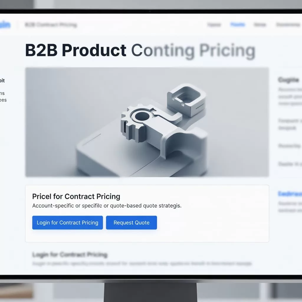
A strong product page usually gives the buyer four things near the price:
- The current price state, such as public, contract, or quote only
- A short reason for that state
- A next action, such as sign in, request a quote, or contact a rep
- A fallback path if the buyer needs help fast
That small cluster removes doubt. It also avoids the feeling that the site is hiding something.
The strongest pages keep the pricing message close to the action button. They do not bury it in a tab or in the footer. They also use plain language. “Your contract price after sign-in” works better than internal policy language that only the sales team understands.
Visual hierarchy matters too. If the product name, image, and price block fight for attention, the page feels busy. If the price area sits in a clean column with one clear action, the page feels more certain.
For tiered offers, a well-structured table can help. See designing effective tiered pricing tables for a deeper look at how B2B pages can show thresholds, included features, and add-on costs without overload. That kind of layout works best when the table answers real buyer questions, not just marketing goals.
Sales-assisted buying needs a visible path
Some B2B purchases should not end at the product page. That is fine, as long as the path stays clear.
Sales-assisted buying works best when the interface shows where automation ends and human help begins. A buyer should not wonder whether a cart can become a quote, or whether a quote can become an order. The page should make that handoff visible.
That matters most when the buyer is logged in, but the final price still depends on volume, freight, or approval. It also matters when the account has special terms that a public catalog cannot show cleanly.
A strong hybrid flow might do this:
- Show list price or a range for context.
- Reveal contract pricing after sign-in.
- Offer a quote button for complex orders.
- Keep the sales contact option close by.
This keeps the buyer moving without forcing a single path. It also reduces the number of dead ends in the buying journey.
For teams building this kind of flow, sales representative assisted ordering workflows are worth studying. The best versions keep the buyer and the rep on the same page, literally and figuratively.
Test pricing visibility with real buyer behavior
Pricing visibility should be tested the same way you test checkout or search. Watch where buyers hesitate, what they click, and what they ask sales afterward.
Use session recordings, support tickets, and win-loss notes together. If buyers keep opening quote forms on items with clear contract prices, the price messaging is not doing its job. If they log in and still contact sales for a basic reorder, the page probably hides the wrong detail.
A/B tests can help, but only if the goal is specific. Test the label next to the price. Test the position of the sign-in prompt. Test list price plus contract price against a fully gated display. Then measure what matters, such as product-view-to-cart rate, quote starts, and assisted conversions.
The cleaner the page, the less the buyer has to interpret. That is where trust grows.
Conclusion
B2B pricing pages work when they remove uncertainty without stripping away account logic. That means the page must show the right price state, explain it in plain language, and give the buyer a clear next step.
The best contract pricing visibility feels honest, useful, and easy to act on. Whether you use login-gated pricing, list price plus contract price, quote requests, or a hybrid flow, the page should never make buyers guess what comes next.
Start with the question the buyer is asking in the first three seconds, then build the pricing UI around that answer.